
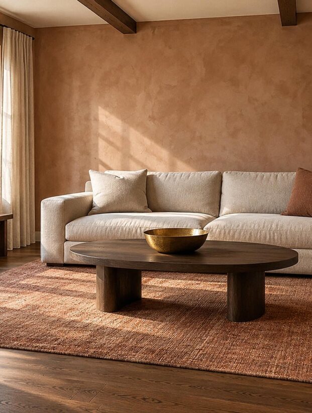
The paint chip isn't the color. It is a small promise made under store lighting, far away from your sofa, floor, windows, and lamps. Once that color covers four walls, it joins a much louder conversation.
That reverses the usual search for living room paint colors. Start with the room you already have, then let it narrow the field. The name on the card can wait.
A good choice does three jobs: it responds to the largest fixed elements, holds up through the room's daily light changes, and makes sense beside adjoining rooms. I call this the Anchor, Glow, Bridge method. It turns an endless swatch collection into a decision you can actually finish.
Give the Wall Color a Specific Job
"Make it cozy" is a pleasant wish, but it won't help you choose between mushroom, muted green, and brown-plum. Give the paint an observable assignment instead.
Name the current problem. Perhaps a charcoal sectional feels stranded against a thin gray wall. Maybe cream upholstery disappears into cream paint and cream carpet until the room resembles an unbuttered dinner roll. Or the living area stops abruptly beside a cool kitchen.
Write one sentence describing the change you want. Try one of these forms:
- Make the dark sofa feel grounded while keeping the room bright enough for daytime reading.
- Add color presence to a pale room without competing with the brick fireplace.
- Warm the walls without making the honey-toned floor look orange.
- Separate the living and dining zones while keeping their shared sightline calm.
Now you have a test. Any candidate that fails the sentence leaves the pile, even if its color name has excellent manners.
Let the Largest Anchors Narrow the Field
Your anchor is the element with the most visual weight and the least willingness to leave. Flooring, a large sectional, a stone fireplace, built-in cabinetry, and substantial wood trim usually matter more than a vase or throw.
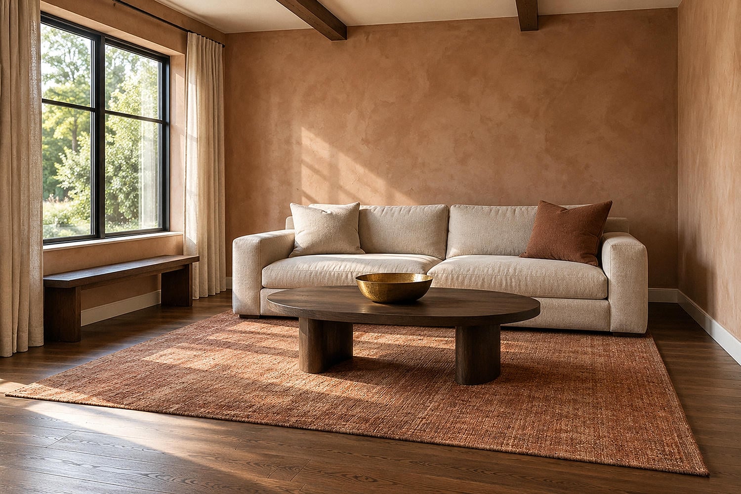
Size changes the vote. A rust-colored sofa and honey wood floor can pull a wall toward muted clay, soft mushroom, or a restrained warm neutral. A charcoal sectional beside cool stone may welcome pale putty for clear contrast, or deep olive for a closer, quieter relationship.
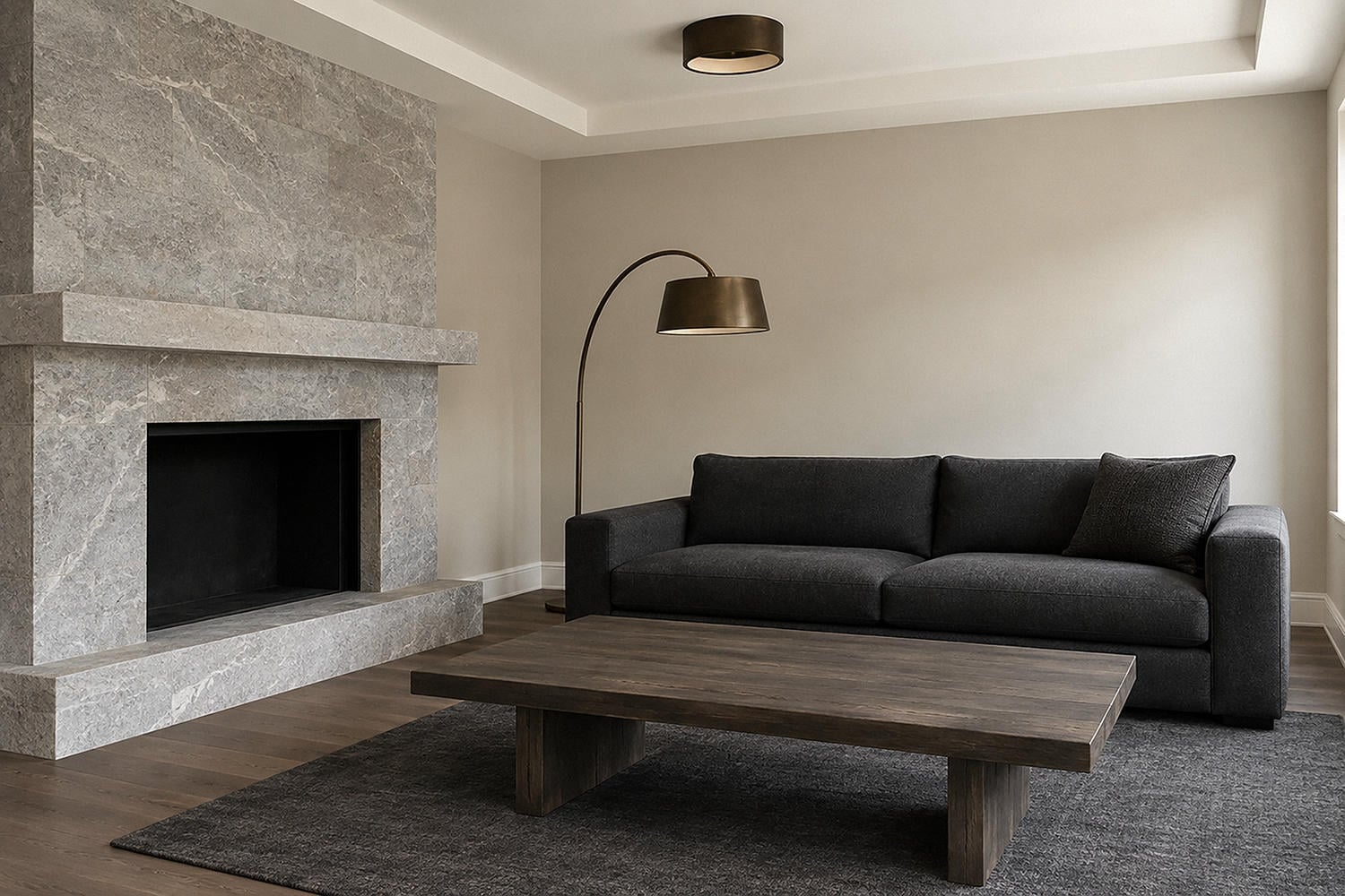
Look at anchors in descending order of area and permanence. Record whether each one feels warm, cool, or difficult to classify. Then notice depth: pale, middle, or dark. You don't need a color-theory dissertation. You need enough information to stop asking a tiny brass lamp to settle an argument between a black sofa and an entire oak floor.
To my eye, the weakest living room color schemes often hover timidly in the middle. The walls neither outline the furniture nor embrace it. Choose the relationship on purpose: a meaningful value gap for definition, or a related depth for an enveloping effect.
Judge the Glow at the Room's Worst Hour
A color that looks lovely at 10 a.m. may feel flat under a cloudy afternoon or unexpectedly yellow after the lamps come on. This isn't your imagination. The International Commission on Illumination notes that perceived color depends partly on the stimulus, its surroundings, and the observer's adaptation.
Test the dull hour too. That is often more revealing than the photogenic one.
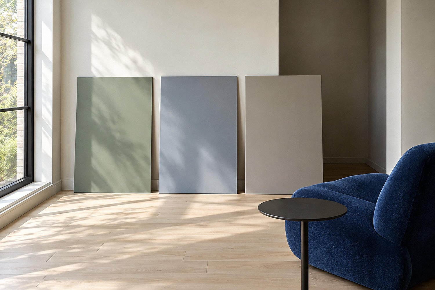
Use the Four-View Sample Trial with large movable samples of each finalist:
- Place each sample beside the largest sofa, cabinet, or wood anchor.
- Move it into the darkest corner and watch for a dull or unwanted undertone.
- Move it onto the brightest wall and see whether it loses too much presence.
- View it from the adjoining room, then repeat the circuit in morning, afternoon, and your normal evening light.
Tiny chips can mislead because color appearance may change with the size of the color field. CIE's review of the color-size effect also says real-room findings vary, which is exactly why this is an observation exercise rather than a prediction formula.
Live with the finalists long enough to catch an awkward period. Paint has no obligation to behave merely because Saturday afternoon is convenient.
Make Warm Neutrals Relational
Warm neutral living room paint colors work when their warmth belongs to something already in the room. "Beige" by itself is not a plan.
Try soft mushroom beside oatmeal upholstery and walnut. Consider a muted clay-beige with creamy trim and aged brass. A gentle putty can settle warm wood while leaving enough contrast for pale linen. These combinations feel connected because at least one undertone repeats and the surfaces still have visible depth differences.
Protect the separation. When the wall, trim, upholstery, and floor are all pale and nearly equal in depth, unrelated undertones become more obvious. One may flash pink while another goes yellow. A slightly deeper wall or clearer trim contrast can bring order without adding a bold hue.
And sample so-called neutral paint with every major anchor. Neutrals are sneaky little diplomats; they agree with everyone on the card and start a feud at home.
Choose Contrast or Kinship With Dark Furniture
Dark furniture creates a strong silhouette. Your wall can sharpen that edge or soften it.
For crisp relief, test pale putty, softened cream, mineral gray-green, or a restrained warm white. The aim is a clear value gap without a glaring, high-energy background. This route can be useful when the floor is also dark or the room needs daytime clarity.
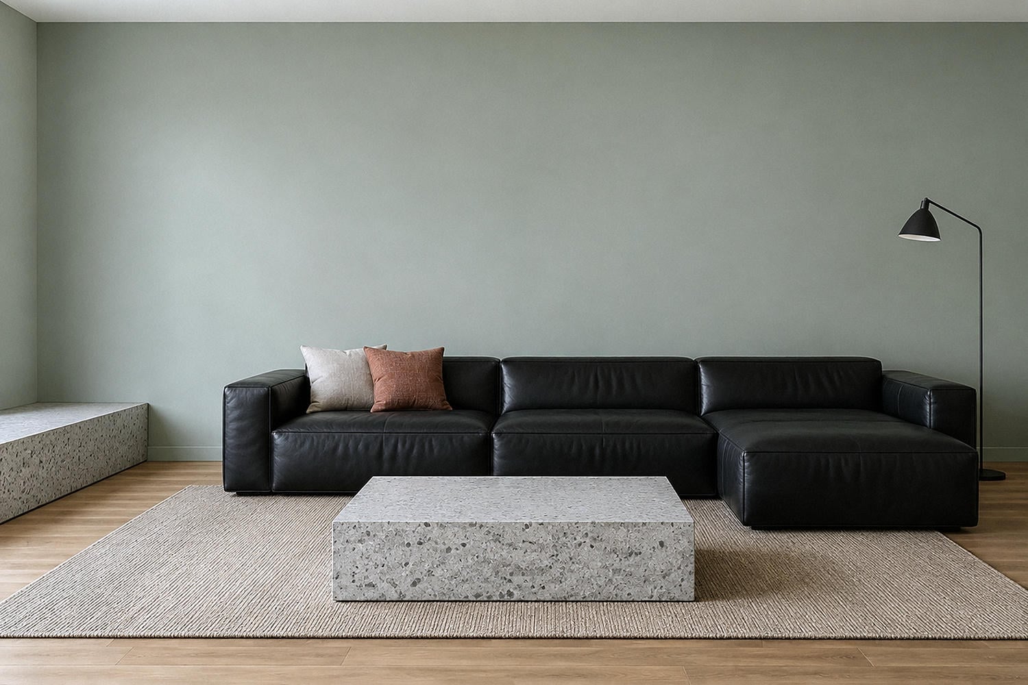
For kinship, move toward olive, inky blue, cocoa, or muted aubergine. The furniture becomes part of a deeper field, while lighter upholstery, window fabric, and pools of lamp light provide relief. This is often more convincing than a medium gray that leaves black furniture looking like it arrived early for another room.
Watch the floor. A dark sofa on a dark floor already creates a heavy lower half. If the walls are deep too, use contrast at human-use points: the reading chair, the route into the room, and the surface where drinks land. Those small zones matter more than distributing pale accessories everywhere.
Give Moody Colors Places to Breathe
Inky paint settles over a room quickly. Without relief, it can swallow every edge.
Keep the structure readable. An inky blue wall can sit beautifully behind pale linen seating and a focused reading lamp. Brown-plum may feel rich beside warm wood when the passage opening remains softly lit. Deep olive can quiet a black cabinet if the cabinet has enough material contrast to stay visible.
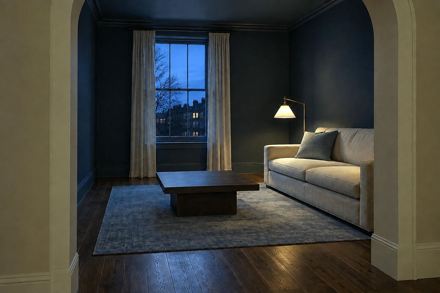
Place brightness where people look and move. A lamp near a chair, a pale textile across the largest seat, or a lighter ceiling plane can give the eye a resting point. You don't need a parade of tiny white objects marching around the room.
My strong opinion: dark paint is usually more persuasive when it commits to a complete plane. A random dark accent wall can look like the paint ran out of confidence at the corner. Let architecture, a fireplace mass, or the room's full envelope explain the decision.
A Small Living Room Does Not Owe You White Walls
In a compact living room, decide which kind of boundary you want: clearer edges, quieter edges, or an intimate enclosure.
Pale mineral green with low-contrast trim can keep the edges gentle while preserving daylight. A soft warm neutral can clarify the perimeter when the furniture carries more color. Deep cocoa across walls and built-ins can reduce stop-start contrast and make the room feel deliberately close.
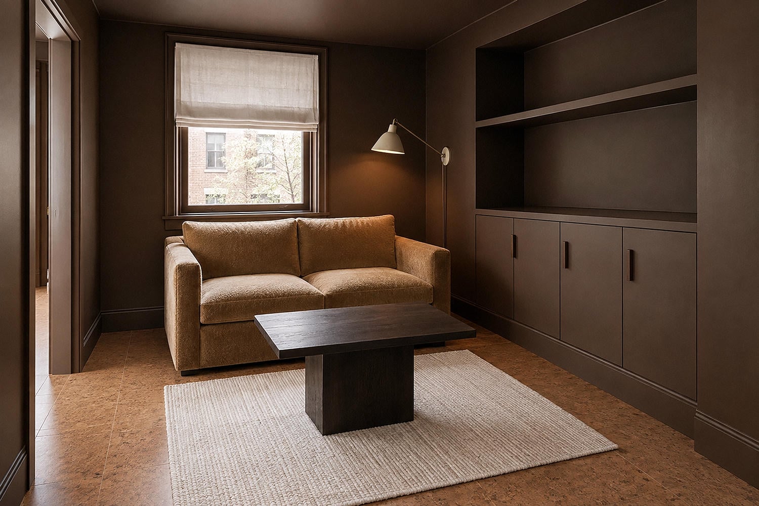
Fewer abrupt edges often matter more than chasing maximum brightness. If every wall, door, shelf, curtain, and cabinet changes color sharply, the eye keeps counting pieces. A compact room can feel calmer when bulky storage relates closely to the wall and one focal element receives the strongest contrast.
Be careful with the ceiling and trim decision. Matching them closely to the walls can create continuity; keeping them lighter can preserve crisp architecture. Choose based on the room's job, not a blanket rule about making it look larger.
Make Two-Tone Paint Explain the Architecture
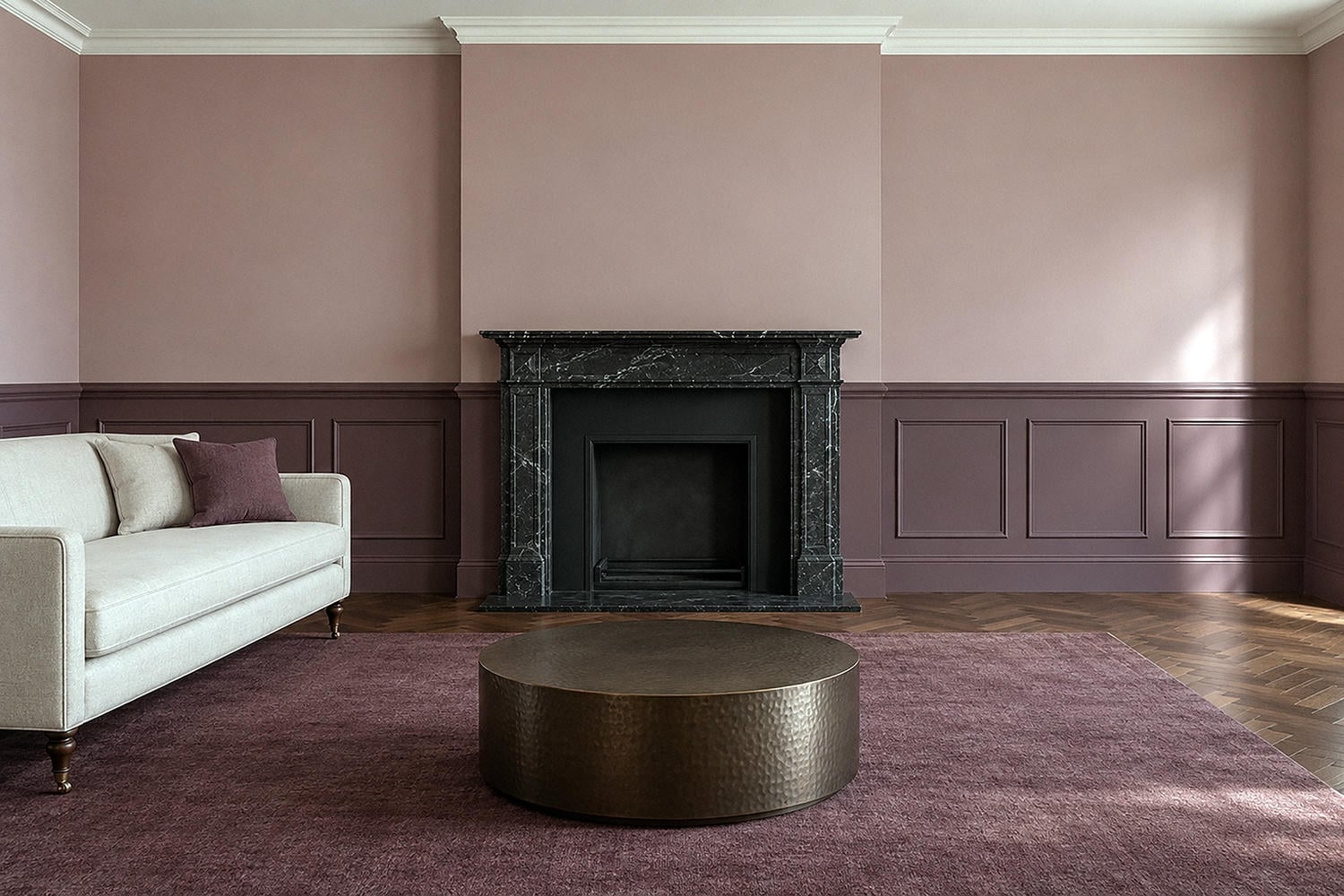
A second wall color draws a line whether you meant it to or not. Let that break land somewhere the room already recognizes. Existing panel molding is an easy boundary, as is a complete fireplace plane, a built-in wall, or a clear change between connected zones.
No boundary? Think carefully. A horizontal split across a plain wall creates a new edge, and that edge can make the wall feel shorter or busier. Aligning it with a consistent furniture height may work, but only if the line remains clear around the room rather than colliding with windows and doorways.
The two colors also need a relationship. Pair a deeper version of the same muted family, or repeat one undertone across different depths. The result should clarify proportions or function. Decoration alone is a rather flimsy alibi for cutting every wall in half.
Bridge an Open Floor Plan With One Shared Trait
Stand where the living room, dining area, and kitchen enter one view. Their wall colors can differ if one shared trait gives them kinship.
A muted green living area can connect to putty kitchen walls through a similarly softened undertone. Warm white circulation walls may bridge a clay living room and a muted blue dining zone. Two colors of similar depth can coexist when one transition color gives the eye a pause.
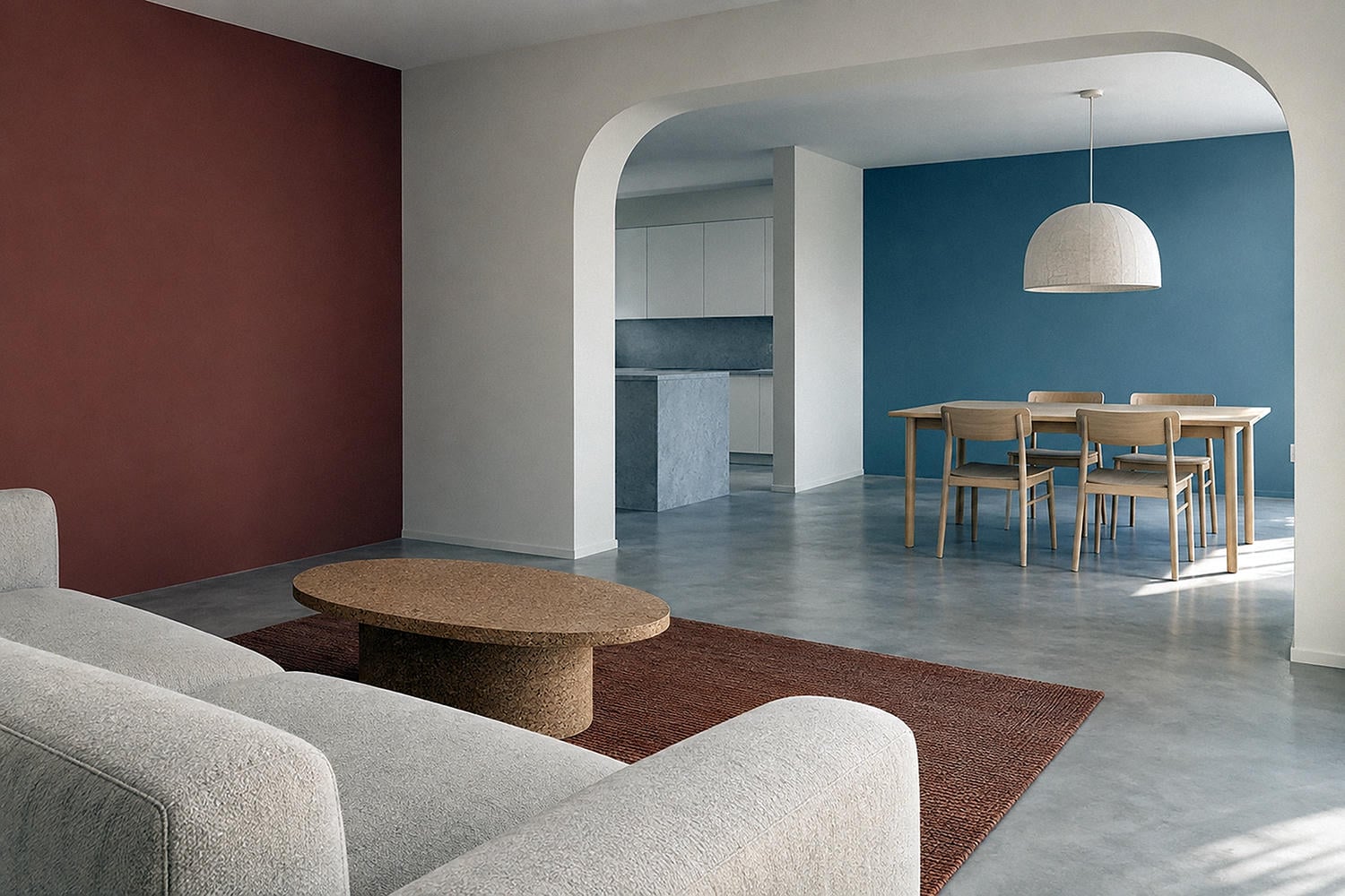
Stand at the main entry and the primary seat. Mark every wall seen at once, then locate a defensible stopping point: an inside corner, doorway, ceiling change, built-in edge, or complete architectural plane. If the transition floats across an uninterrupted wall, it may continue to look accidental after the furniture returns.
This is the Bridge part of the method. Repeat softness, undertone, or depth. One is enough.
Questions About Living Room Paint Colors
What are the best living room paint colors?
The best living room paint colors support the largest fixed elements, remain appealing through the room's real light cycle, and relate to visible adjoining rooms. Warm putty, softened green, muted clay, inky blue, and cocoa can all work; the room determines which family earns a full-wall sample.
What living room colors feel warm without looking yellow?
Test mushroom, muted clay-beige, gentle putty, or a softened green beside your flooring and upholstery. Warmth can come from a muted red, brown, or green influence, so you do not have to choose an obviously golden cream.
Should a living room be lighter or darker than the furniture?
Either can work. A lighter wall gives dark furniture a defined silhouette, while a related deep wall creates a closer, enveloping composition; a weak middle value can leave the relationship unresolved.
Can I use a dark paint color in a small living room?
Yes, especially when you want intimacy and can keep paths and seating areas visually clear. Sample the color in the darkest corner and under your normal lamps. If the room earns its mood in your actual light, you are allowed to choose depth over the usual pale advice.