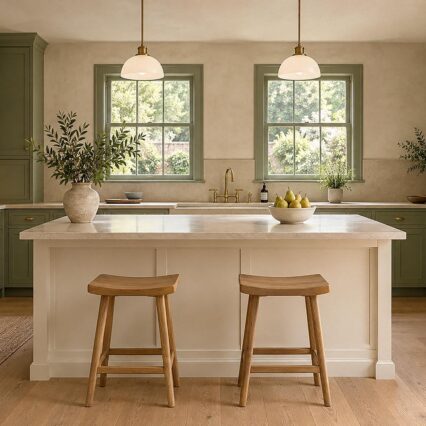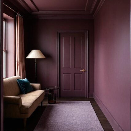
An Organic Modern Palette With Enough Warmth to Feel Human
I keep noticing the same divide in organic modern rooms. One group feels quiet, grounded, and almost edible -- oat-colored plaster, olive wool, blackened metal, wood with visible grain. The other looks as if someone furnished a white box using only objects called "natural."
The difference is usually color structure. An organic modern palette needs restraint, though it also needs depth. Cream without brown can turn sugary; brown without black gets sleepy; black without texture feels severe. Put all four in conversation and the room starts breathing.
Begin With Cream That Has a Little Dirt in It
Pure white can work, especially in a bright room with warm wood floors. For my money, a softened cream, bone, flax, or pale mushroom gives this style more to hold onto.
Look for a base color that sits comfortably beside linen, unbleached wool, pale oak, and aged stone. If it turns yellow next to those materials, go quieter. If it looks blue, move toward a warmer undertone.
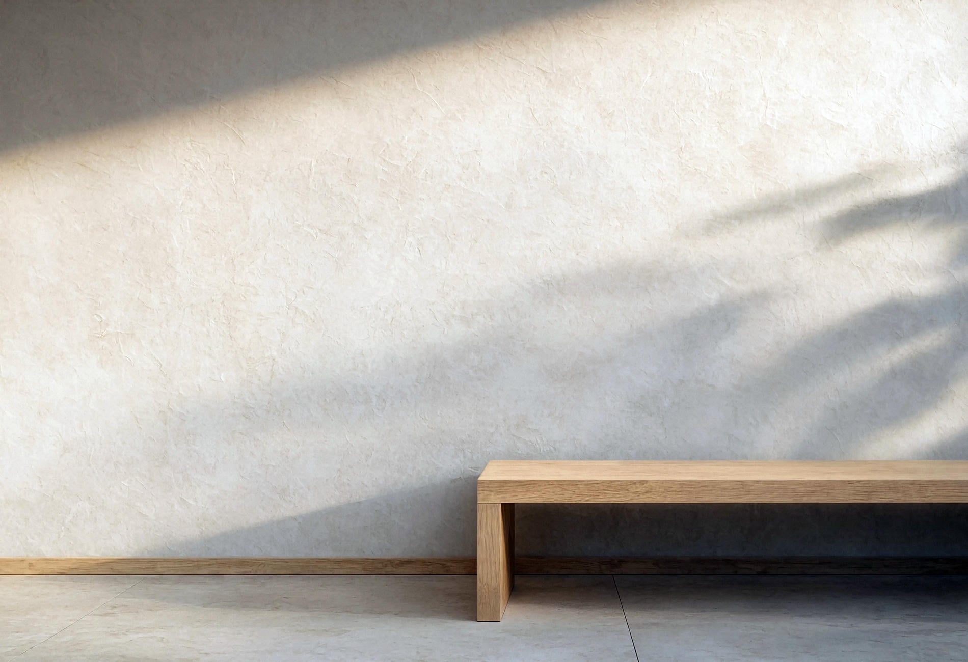
Test broad samples because the wall is the largest color field in the room. Morning light may make cream look chalky; late light can pull out honey or peach. You want a version that changes gently rather than performing a full costume change by dinner.
An earthy neutral color scheme gets its calm from closeness. The values sit near each other, then a dark accent draws a clean line through the softness.
Add Olive as a Material Color
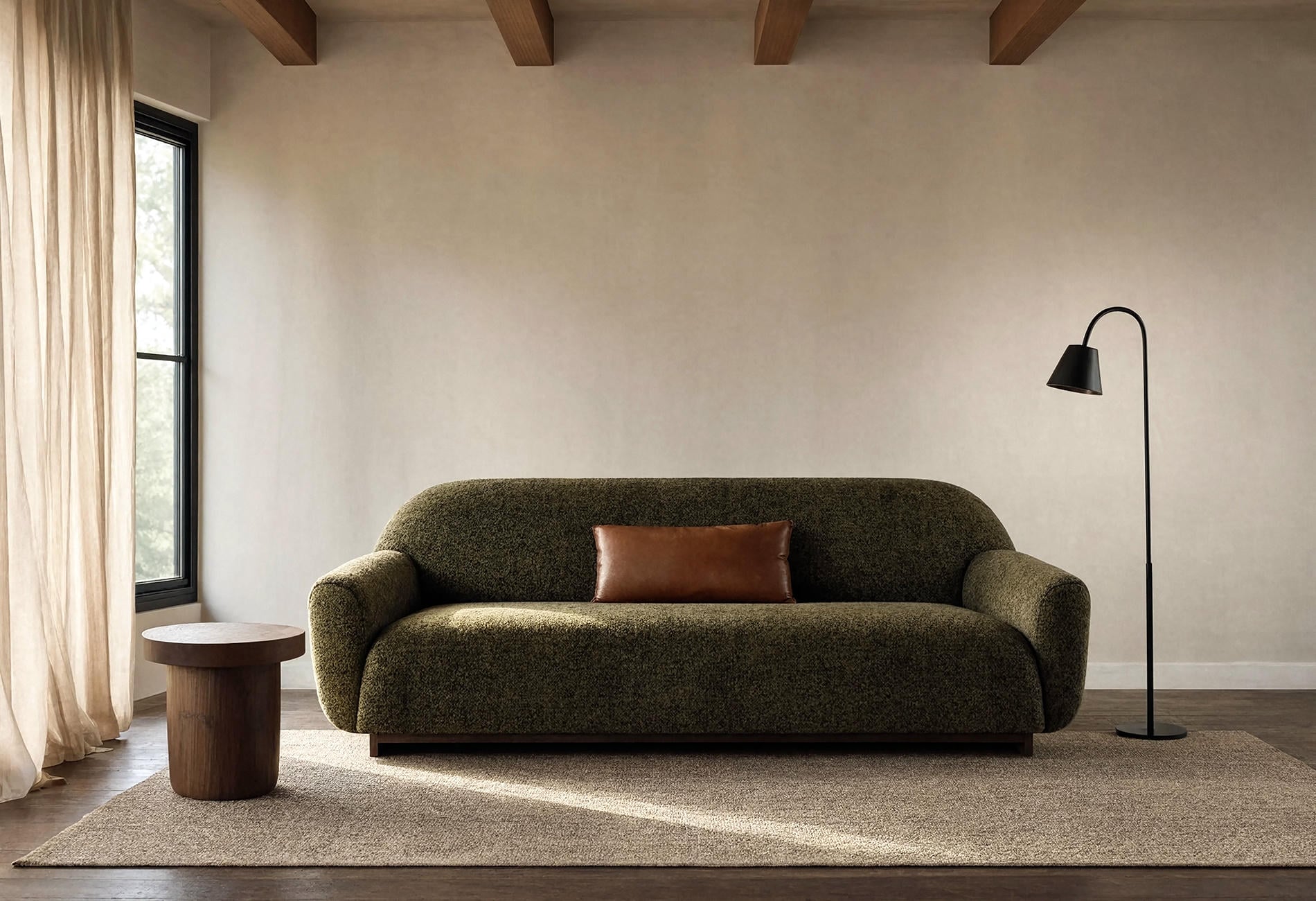
Olive earns its place because it behaves almost like a neutral while still giving the eye somewhere to land. Use it on a broad surface: a sofa, a painted cabinet, a headboard wall, or full-length curtains.
Tiny olive accessories scattered everywhere feel fussy. One large olive field looks assured.
The shade matters. Dusty olive with brown underneath feels settled beside walnut, limestone, rust, and cream. A sharper yellow-green can look lively in daylight, though it moves the room away from the hushed mood most people want from organic modern decor.
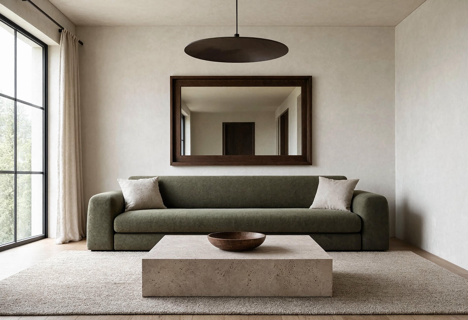
In a living room, I'd choose an olive wool sofa against cream walls, then let wood and stone carry most of the remaining color. In a bedroom, the same green could move to the headboard wall while the bedding stays parchment and tobacco.
Black Is the Punctuation Mark
Does black go with organic modern decor? Absolutely, and I think the style needs some version of it. Without a dark note, all those beige-adjacent colors can blur into one long bowl of oatmeal.
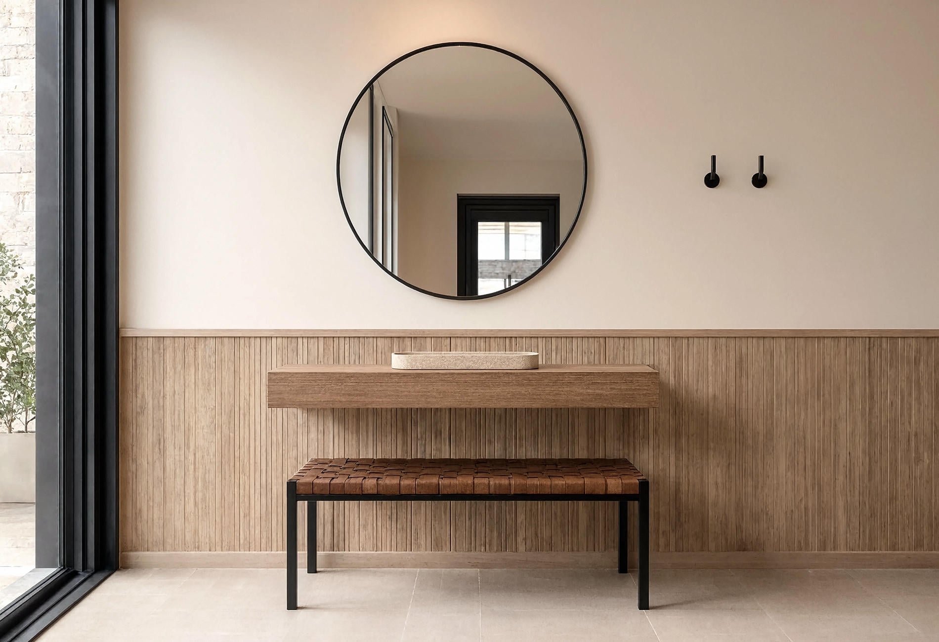
Keep black narrow and structural. Window frames, a slim floor lamp, cabinet pulls, a low table base, or one simple mirror frame can outline the room without chopping it into pieces.
Matte black feels crisp; blackened iron and smoked wood feel softer. If the room has delicate architecture or limited daylight, use fewer dark lines and give them breathing room. You are drawing the edges, not filling them in.
Let Natural Texture Do the Work of Pattern
The colors in warm minimal rooms can seem plain on a swatch. Texture is what makes them worth looking at for longer than six seconds.
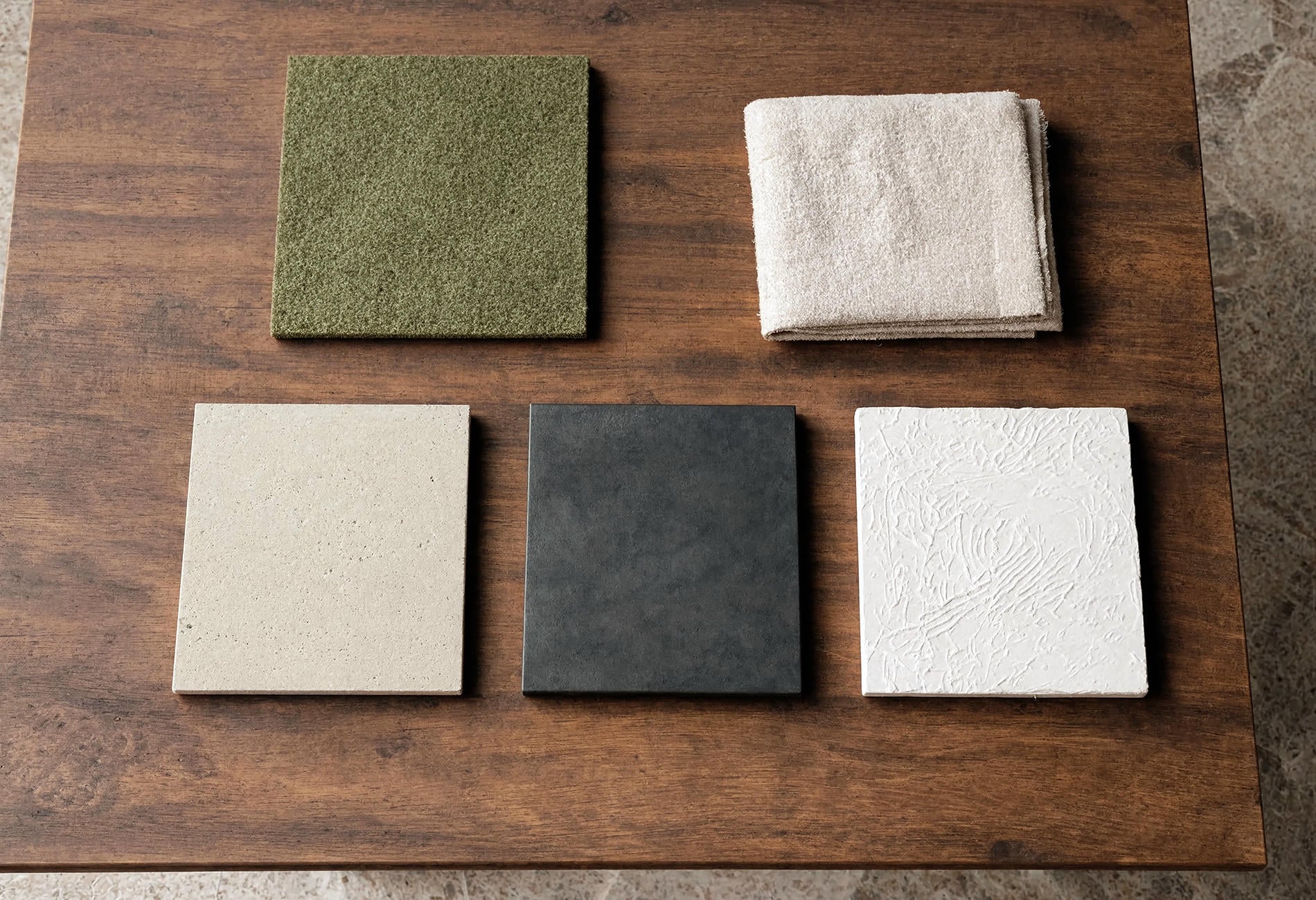
Pair a hand-troweled wall with tightly woven upholstery. Put nubby wool against smooth stone, or pale oak beside a dark metal edge. Variation in sheen matters too: matte paint, honed stone, soft linen, and a small glint of aged metal create movement without a busy print.
Natural textures should remain visibly different. If every item is pale, fuzzy, and rounded, the room starts resembling a basket shop after closing. Add one harder plane, one straight edge, or one dark weight.
Build the Palette in Four Layers
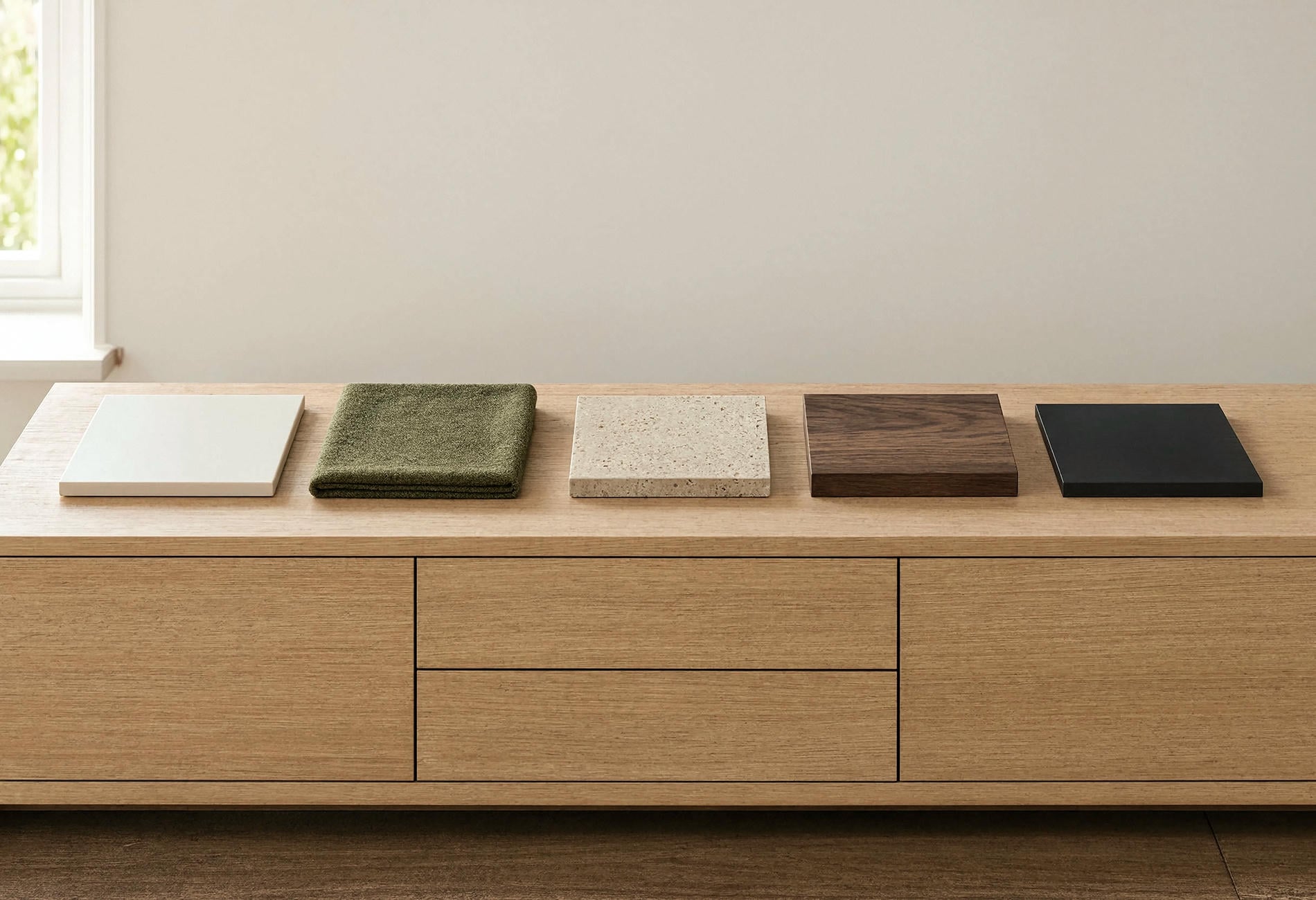
Here's the framework I'd use when learning how to create an organic modern color palette:
- Choose a warm pale base for the largest surfaces.
- Add one earthy midtone such as olive, clay, tobacco, or mineral blue.
- Bring in two natural materials with clearly different grains or textures.
- Finish with a small amount of black, charcoal, or dark bronze.
This gives every choice a job. You can swap olive for muted clay or mineral blue and keep the structure intact.
Notice that "natural" isn't a color. Stone may be cool grey, pink-beige, chalky cream, or brown with rusty veining. Wood can lean yellow, red, ash, or smoke. Name what you actually have before choosing the wall paint.
The Living Room Needs Contrast Somewhere
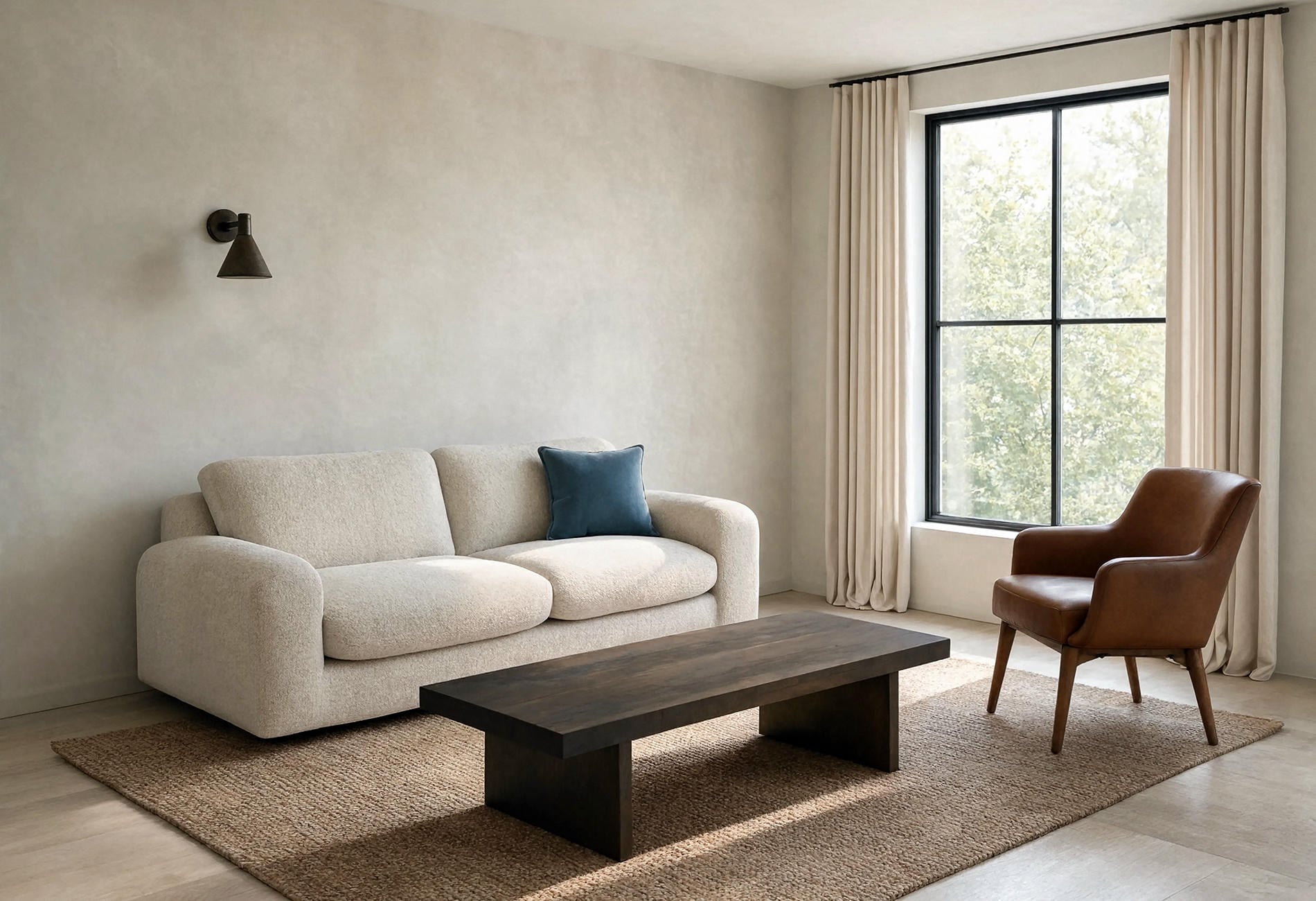
A living room with cream walls and pale furniture may look lovely in close-up photos, then disappear into itself in person. Contrast can come from value, texture, or shape. You don't need all three at full volume.
Try mushroom walls with a cream sofa and dark oak table. Or use warm white walls, an olive sofa, and black metal details. A darker ceiling can also make a tall room feel more contained, depending on its light and architecture.
If you already own a beige sofa, don't panic-buy another beige sofa in a slightly more spiritual shade. Add a deep textile, darker table, and a wall color with enough undertone to separate from the upholstery.

The Bedroom Version Should Feel Softer
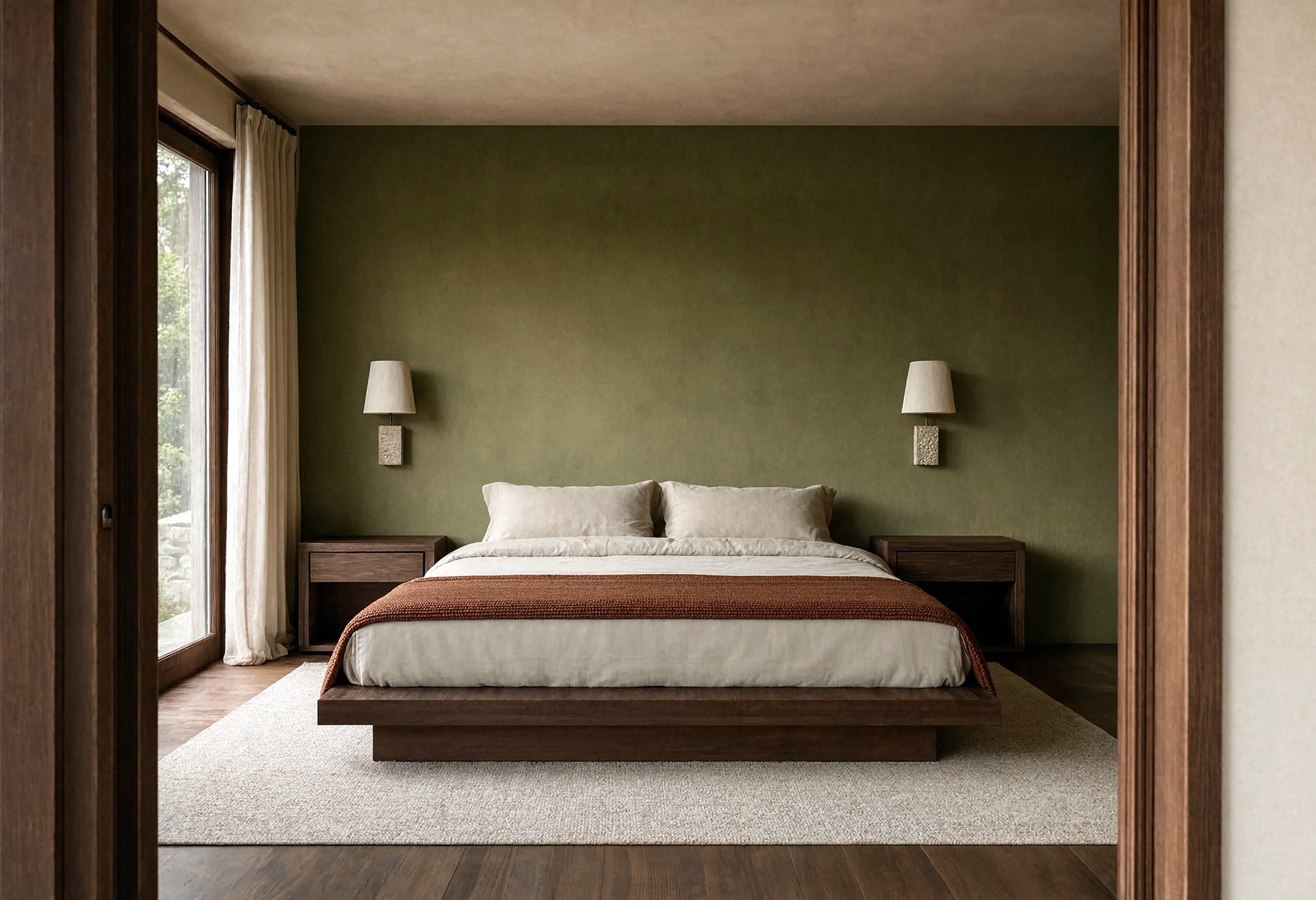
An organic modern bedroom palette can reduce the black and deepen the tactile materials. Think clay-plaster walls, a low smoked-oak bed, cream linen, and one moss or tobacco textile across the foot.
Keep the nightstands simple and let the wall behind the bed carry a broad, calm color. Strong contrast beside your face can feel visually busy; lower contrast in the bedding makes the room quieter to my eye.
The loveliest moment is often where daylight crosses a rough wall and catches the crease of washed linen. Nothing shiny. Nothing begging to be noticed. The room just holds still for a minute.
Change the Recipe for Your Light
North-facing rooms may make cool stone and greyed cream feel colder. Warm the base slightly, test olive carefully, and use wood with visible amber or tobacco notes. Bright south-facing rooms can handle chalkier creams, darker olive, and a stronger black edge.
Artificial light changes the palette again. Test painted boards beside the actual sofa, rug, cabinetry, and stone after sunset. Preferences genuinely differ, and the right bulb for one household may feel too yellow or too stark in another.
Watch reflected color as well. A red-brick wall outside the window may warm the cream; dense green foliage can cast a cool tint across pale paint. The sample that looked perfect at the store has never met your trees, floor, or evening lamps, so let it spend a few ordinary days in the room before it gets promoted.
If your current palette feels close but dull, change one category at a time. Deepen the wood, roughen the textile, or add a dark metal edge. Replacing every pale item at once makes it hard to tell which change actually gave the room its pulse.
Questions People Ask About Organic Modern Color
What are the best organic modern paint colors?
Warm cream, bone, mushroom, muted olive, clay, and soft charcoal all fit the look. The better choice depends on your fixed wood, stone, daylight, and the amount of contrast you enjoy.
How do you create an organic modern color palette?
Start with a warm pale base, add one earthy midtone, layer two clearly different natural materials, and finish with a restrained dark accent. Test the colors together in the room instead of judging each swatch alone.
Does black go with organic modern decor?
Yes. Black works especially well in slim structural details such as metal frames, lighting, hardware, and table bases, where it gives cream and wood a clean boundary.
Can an organic modern palette include blue?
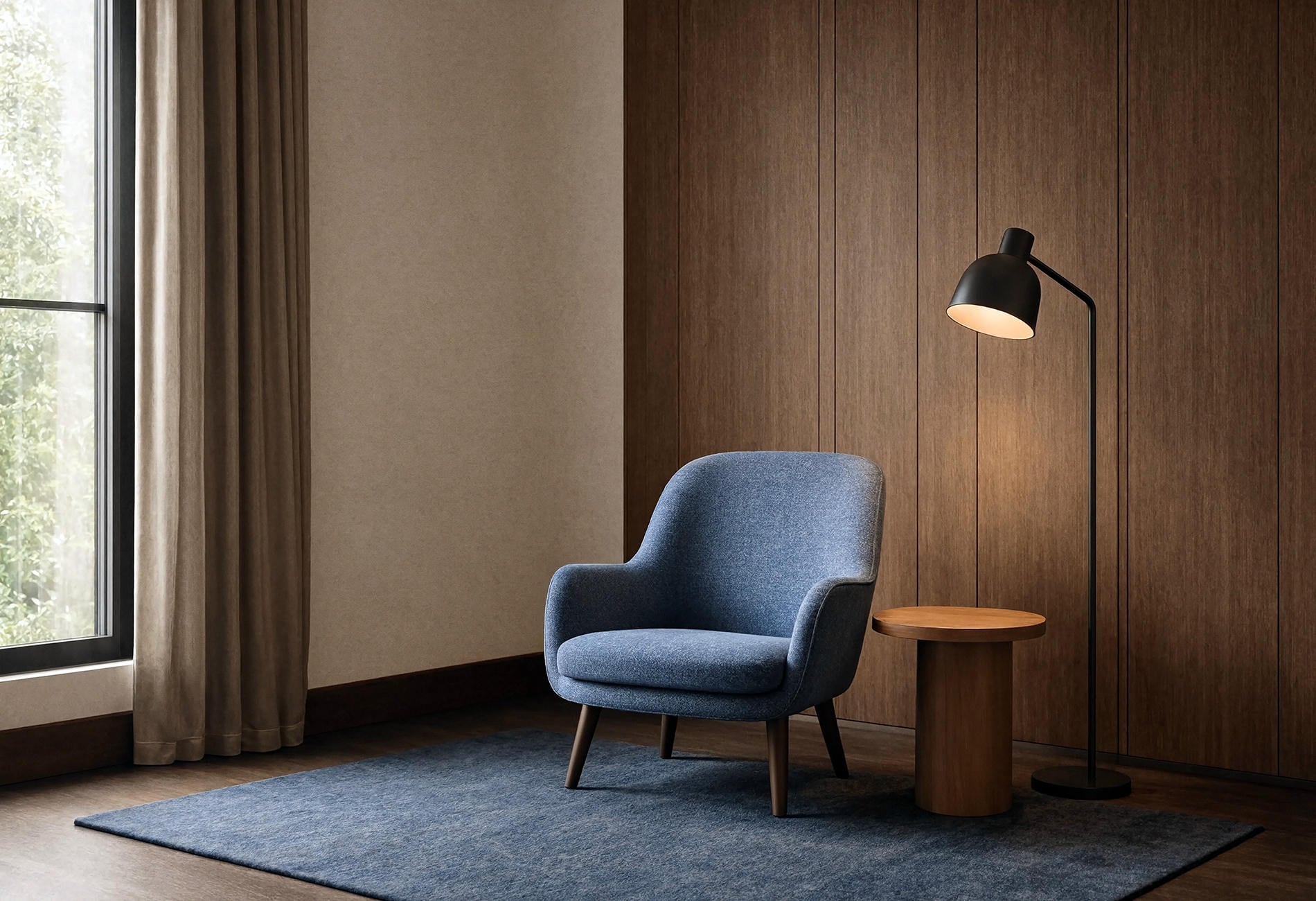
It can. Choose a mineral, slate, or dusty blue with a softened undertone, then pair it with cream, dark wood, and a small black note so it remains grounded.
To begin today, put four materials on one table: your wall sample, a wood tone, an earthy textile, and one dark finish. The awkward piece will announce itself fast.