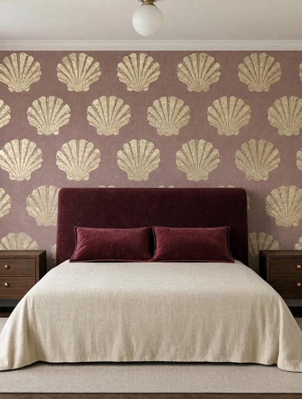
To my eye, timid Art Deco wallpaper is worse than no Art Deco wallpaper at all. If the fans, shells, or stepped arches apologize for themselves, the whole point has already left the room.
The pattern should bring rhythm, contrast, and maybe a flash of shine. It still has to survive ordinary lamplight and the furniture you already own, which is why a sample taped to the wall at 7:14 p.m. matters: the gold may turn brassy, and a neat little fan motif may start vibrating behind the sofa like it drank too much coffee.
The useful question isn't "Do I love this pattern?" It is "Can this room support what this pattern is doing?" Once you answer that, the glamorous part gets much easier.
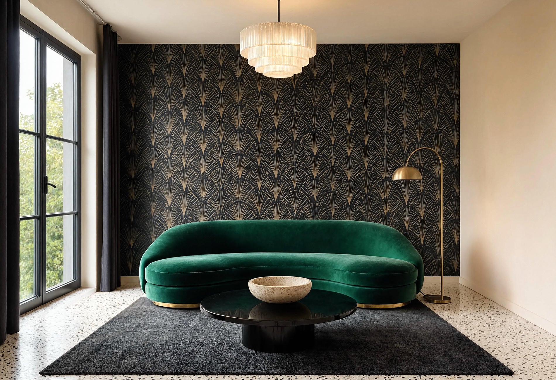
What Is Art Deco Wallpaper Style, Really?
Look first for geometry with a sense of ceremony. Fans, scallops, shells, sunbursts, stepped lines, diamonds, and long vertical arches all belong to the vocabulary; many vintage 1920s wallpaper patterns also use repetition that feels almost architectural.
Symmetry matters. So does movement. A good pattern seems to rise, radiate, or unfold across the wall, which is why a metallic shell motif wallpaper can feel lively even when its palette is restrained.
The costume-drama version piles black, gold, velvet, mirrors, marble, and a chandelier into one room until everyone needs a lie-down. To my eye, the modern version edits harder. Let the wallpaper carry the period reference, then bring in furniture with cleaner lines and materials that have some visual quiet.
That tension is the sweet spot. One foot in a cinema lobby, one foot in an ordinary Tuesday night with takeaway on the coffee table.
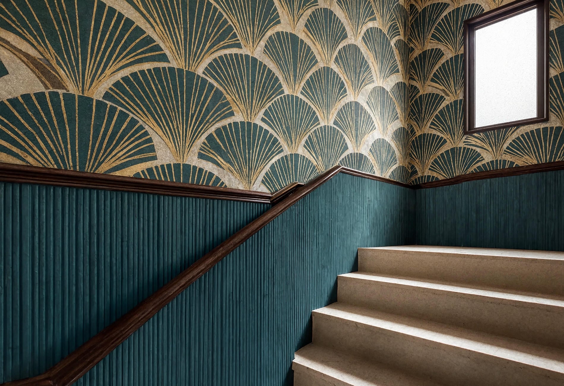
Choose the Pattern Scale Before You Fall for the Color
Stand across the room from your sample, then step into the doorway. A pattern that looks elegant from six inches away may dissolve into nervous confetti at normal viewing distance.
I use a simple three-part test: read the wall, read the furniture, read the light. Yes, that happens to be tidy. Wallpaper itself is already doing enough visual tap dancing, so the decision tool can behave.
Read the wall
Broad, uninterrupted walls can take a larger fan or arch. A chopped-up wall with doors, windows, and a television usually benefits from a motif that remains legible after those interruptions.
Corners matter too. Lay two samples at a right angle if the paper will wrap around the room. Some geometric repeats turn the corner gracefully; others collide in a way that makes the wall look faintly seasick.
Read the furniture
Curved sofas, fluted cabinets, and rounded headboards echo Art Deco lines without copying them exactly. If your furniture already has channel tufting, strong veining, or a busy textile, choose a wallpaper with more breathing room between motifs.
Tiny pattern plus tiny objects can make a room feel restless to my eye. I would rather see one generous arch behind a simple sofa than thirty miniature shells competing with five throw pillows.
Read the light
Move the sample through a whole day before ordering. Metallic ink behaves differently in flat morning light, sharp afternoon sun, and warm lamplight; sometimes it flashes, sometimes it reads like a soft shadow.
Check the actual finish, not just the printed color. A matte black ground can look velvety and deep. A slick black ground may throw back every lamp, window, and passing elbow.
Give a Living Room One Decisive Wall
Art Deco wallpaper for a living room works best when you can name the wall's job in one sentence. It might anchor the sofa, frame a fireplace, mark a dining zone in an open-plan room, or turn an awkward alcove into the point everyone notices first.
A wallpaper accent wall looks convincing when architecture gives it boundaries. Corners, cabinetry, molding, or a shallow recess provide a natural stopping point; a random rectangle behind the television tends to look like the paper ran out.
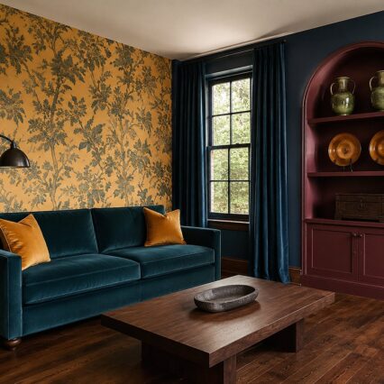
For black and gold Art Deco wallpaper, I would keep the largest upholstered piece in a solid color. Emerald velvet is the obvious flirt, but rust, tobacco brown, mineral blue, or a warm oatmeal weave can feel less stage-set. Choose one metallic family for the main accents, then stop counting. A room is allowed to contain more than one metal without filing paperwork about it.
And leave some surfaces bare. The wallpaper is already supplying line, repetition, and gleam. A coffee table with one broad stone bowl will hold its nerve better than a scatter of little objects.
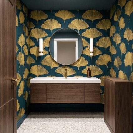
Gold Art Deco wallpaper doesn't need to sparkle from the hallway. A muted brass line on cream, clay, or deep teal gives you the geometry with a quieter voice, especially in a room that gets strong daylight.
Quick test: Photograph the sample from the doorway in daylight and again with the lamps on. The camera often catches glare and pattern density your eye has politely decided to ignore.
In a Bedroom, Lower the Contrast and Let the Pattern Settle
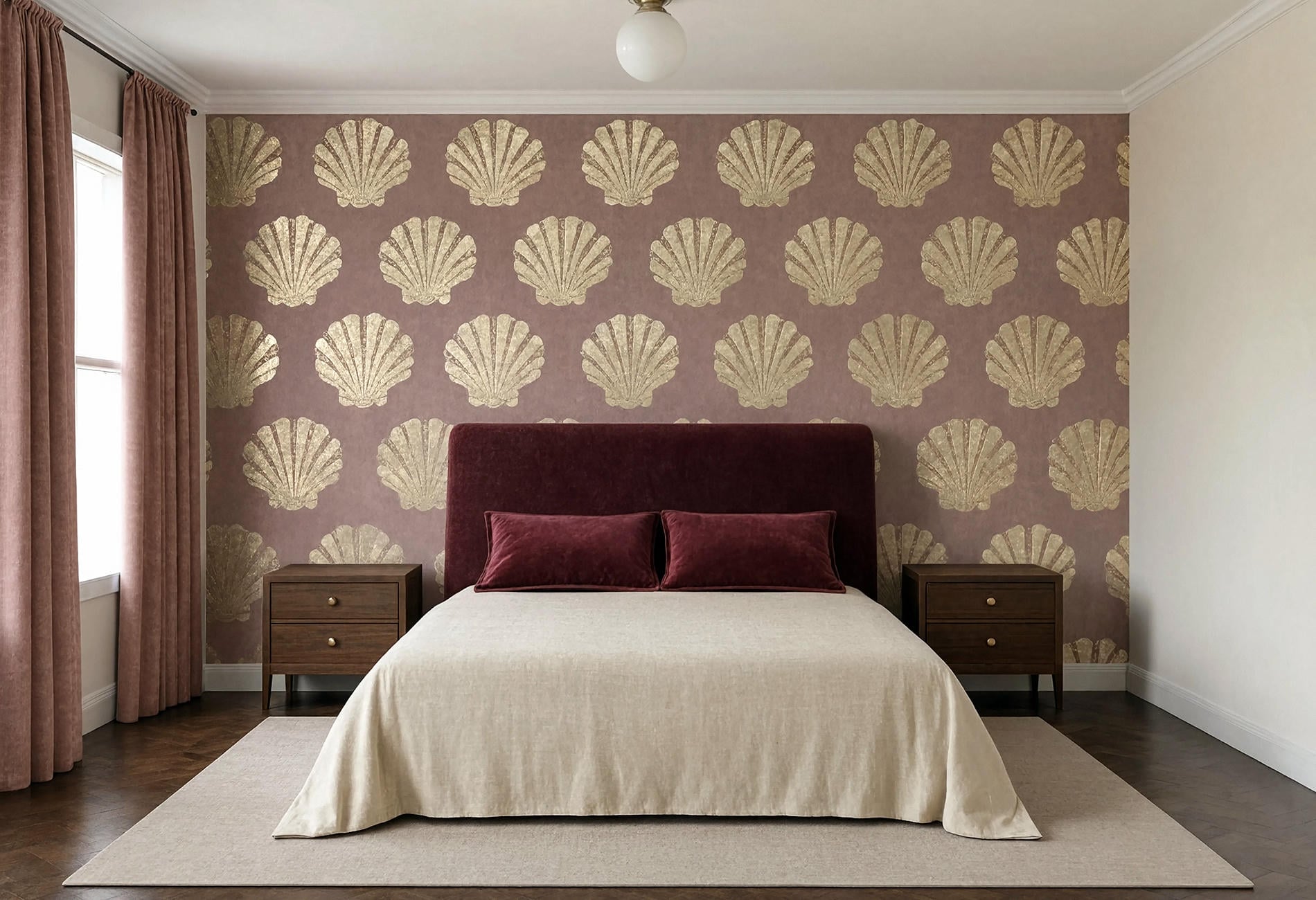
Bedrooms tend to reward a softer hand. Put the pattern behind the headboard, where it gives the bed a frame, and let the other walls carry a related matte paint color.
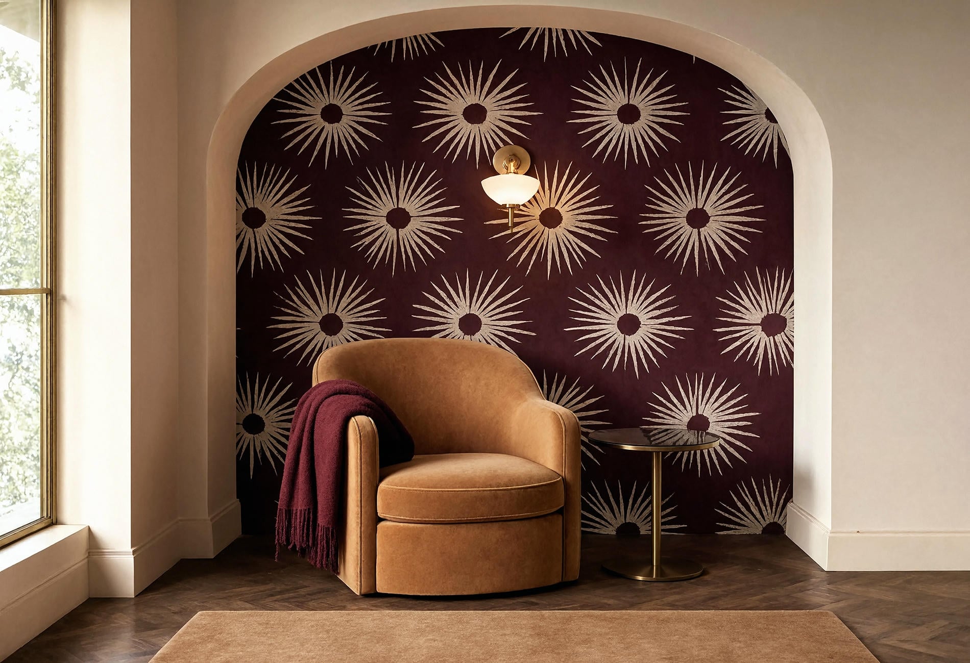
An Art Deco wallpaper bedroom can still be moody. Oxblood shells on dusty rose, deep teal arches on charcoal, or parchment fans outlined in aged gold all feel rich without turning bedtime into a cocktail lounge.
For my money, the headboard should interrupt the repeat rather than disappear into it. A plain upholstered curve, dark timber rectangle, or low fluted panel gives the eye one large resting shape. Keep bedding mostly solid, with contrast coming through texture: washed linen beside velvet, or crisp cotton against a wool coverlet.
Dark Art Deco wallpaper also likes warm pools of light. If you are considering hardwired sconces, I am not an electrician and this isn't professional advice; hire a licensed pro because wiring carries shock, fire, and code risks. Plug-in sconces or table lamps can give you the same low evening glow with no wall wiring.

Peel-and-Stick Can Look Grown-Up
Press a removable sample onto the wall you actually plan to cover. Paint texture, humidity, wall condition, and the paper's own construction may affect how it sits and releases, so follow the maker's surface guidance and test an inconspicuous patch first.
Art Deco peel-and-stick wallpaper is especially useful for renters, short-term rooms, and people whose tastes change faster than their furniture budgets. The trick is choosing a print with a generous repeat and a finish that doesn't read like shiny contact paper.
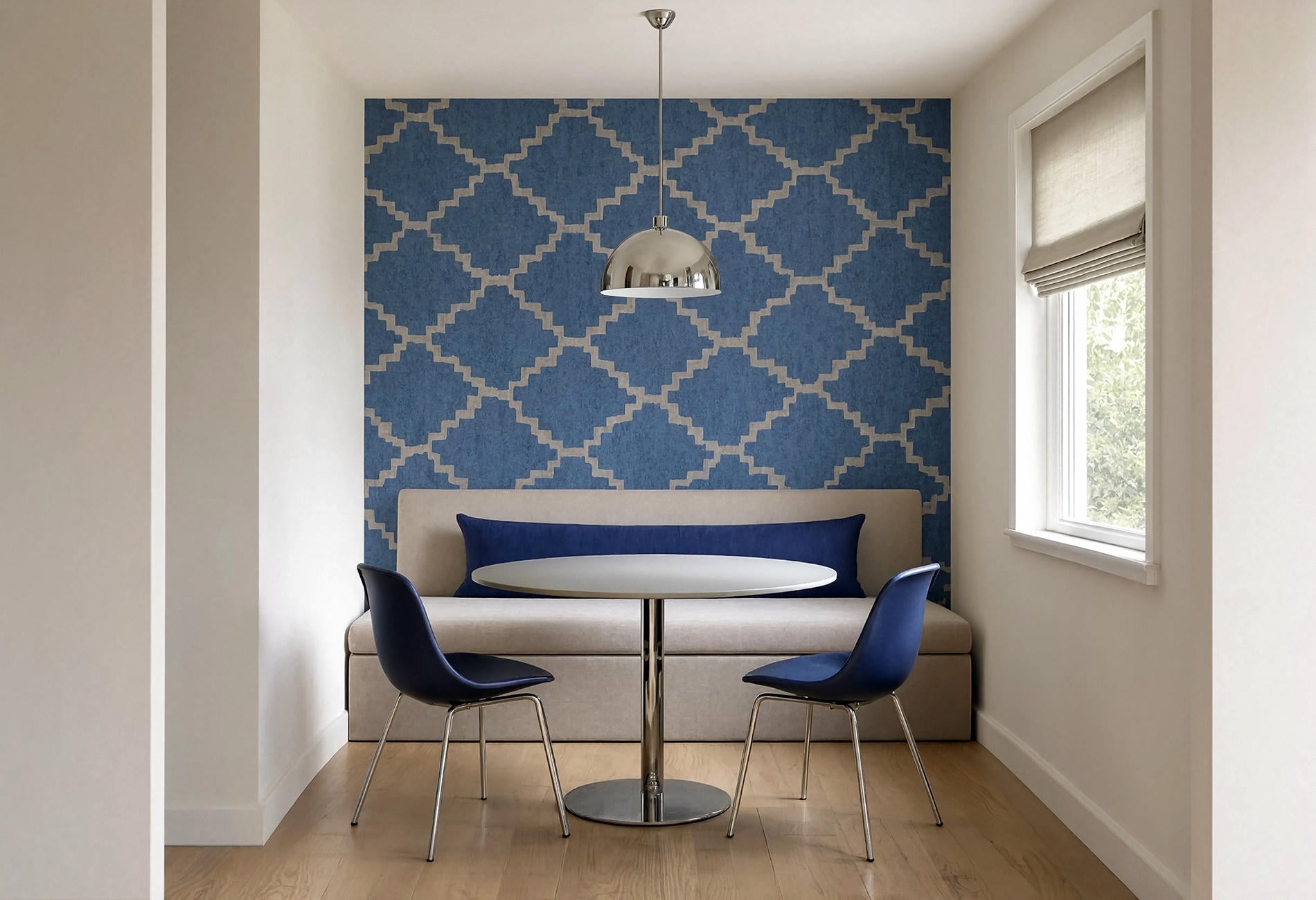
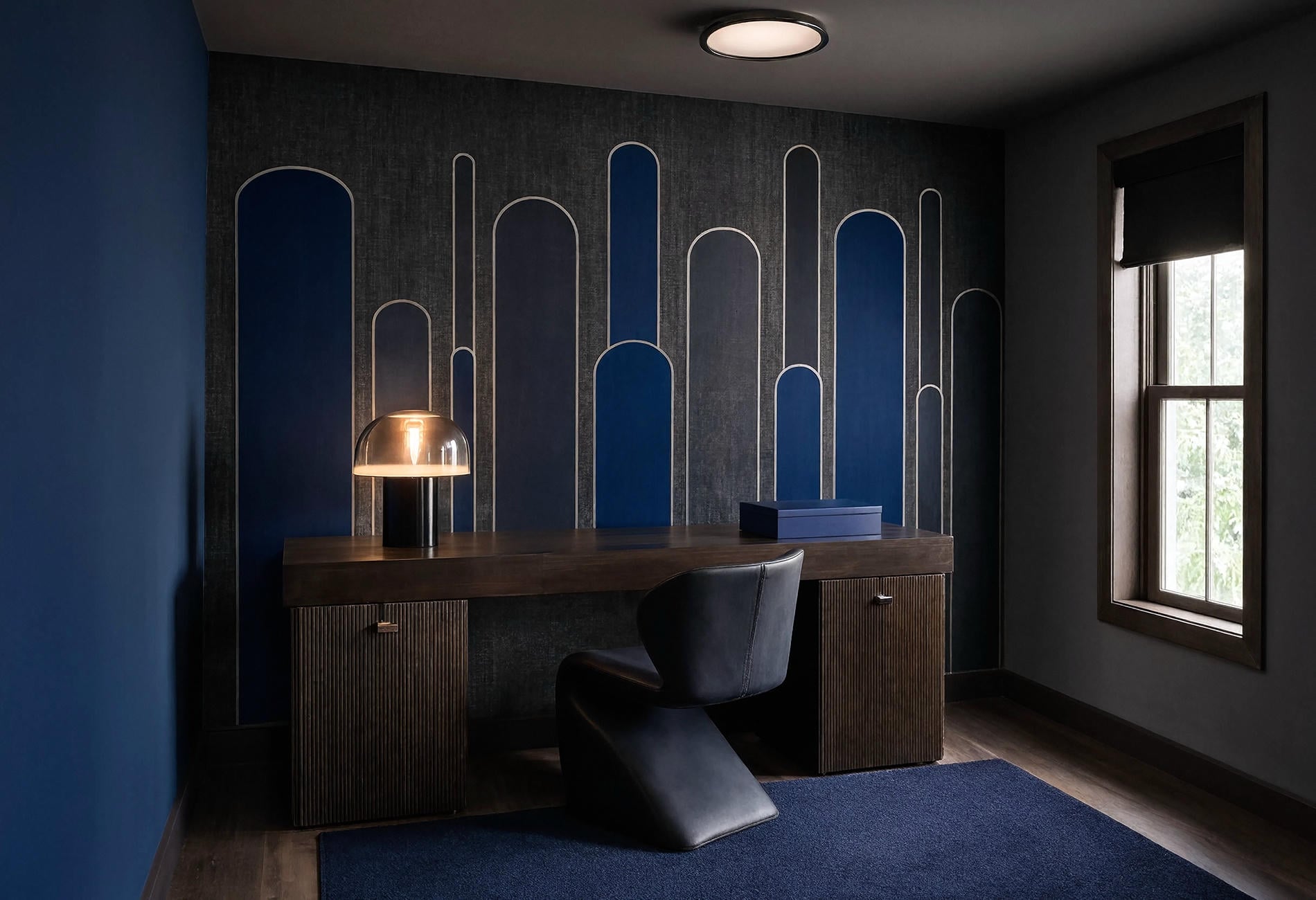
Use it where the edges have a believable reason to end: inside a wide alcove, behind a freestanding headboard, across the back of a closed-door office, or above existing paneling. In a dining nook, one blue-and-parchment geometric wall can hold the whole arrangement together while the table, bench, and pendant stay plain.
Preparation is boring and visible. A wall with dust, peeling paint, or pronounced texture may telegraph every flaw through the paper; a sound, clean, dry surface gives the material a better chance to lie neatly. If removal could affect your lease or finish, get the relevant permission and care guidance before committing.
Make a 1920s Pattern Live With Modern Furniture
Here is where restraint earns its keep. Choose one clear Art Deco gesture, then let most of the room belong to the present.
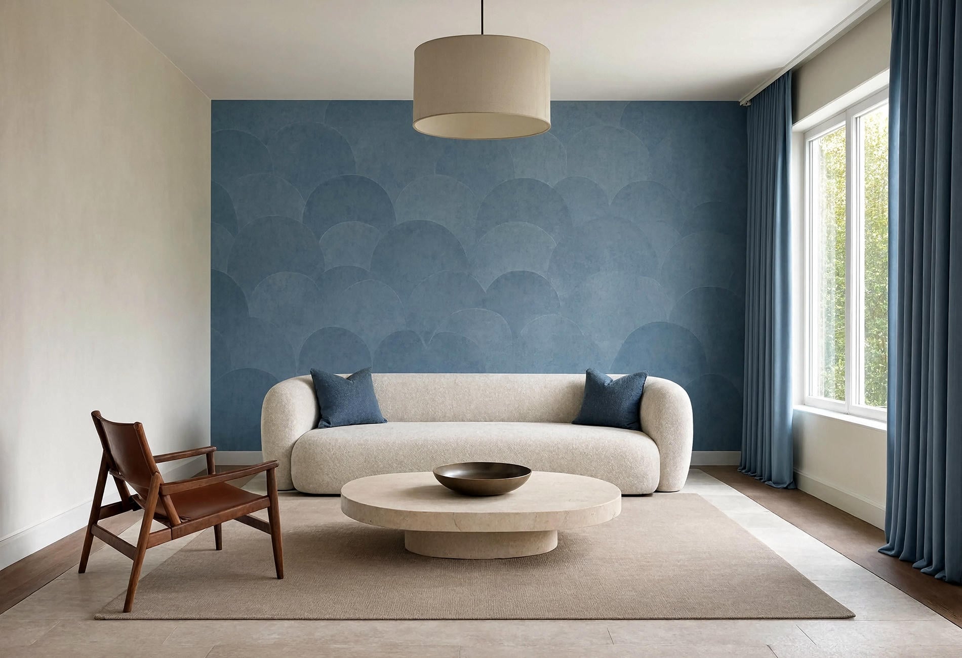
A large-scale fan wall can sit beautifully behind a low, boxy sofa. A shell pattern can sharpen a very simple bedroom. Stepped gold lines can give a plain home office enough swagger that the desk no longer feels stranded against a wall.
How to use Art Deco wallpaper in a modern home comes down to contrast and repetition. Contrast the ornate rhythm with calm furniture; repeat one curve, metal, or color elsewhere so the wallpaper doesn't feel like a visitor. Two echoes are plenty. Four starts to look as though the room has a theme song.
Watch the undertones as closely as the motif. Yellow gold beside icy grey can feel disconnected, while aged brass often sits more easily with mushroom, oxblood, cream, and smoky blue. Chrome or silver linework looks crisp beside charcoal and sapphire.
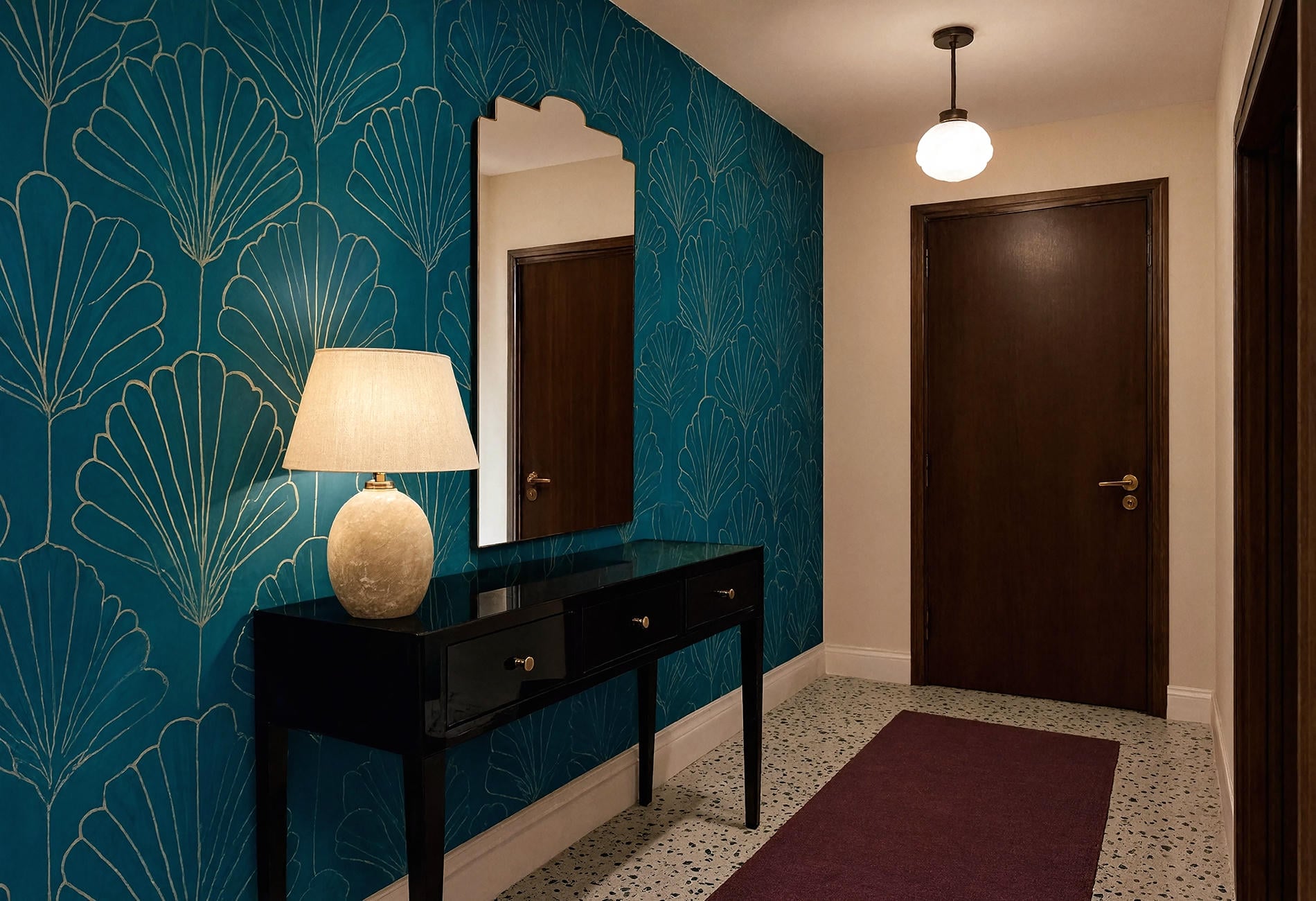
Bring home several samples and tape them where the seams, corners, and largest furniture pieces will meet. Then remove every sample except the one you keep glancing at after you've stopped "evaluating" them. That second look is useful.
Art Deco Wallpaper Q&A
Is Art Deco wallpaper in style?
Yes, though the versions that feel current to my eye are edited and architectural. Large motifs, tonal palettes, and restrained metallic linework sit more comfortably in modern homes than a room packed with period references.
Can you use Art Deco wallpaper on every wall?
You can, especially in a compact room where an all-over pattern creates a cocooning effect. Test the repeat around corners and openings first, and consider a lower-contrast colorway if the motif will surround you.
What colors work with black and gold Art Deco wallpaper?
Emerald, burgundy, warm cream, rust, and tobacco brown can all work, depending on the room's light. I would choose one substantial color for upholstery and keep smaller surfaces quieter so the wall remains readable.
Where should Art Deco wallpaper go in a modern home?
Start with a wall that already has a clear purpose: behind a sofa, headboard, dining bench, or desk. At night, the metallic lines catch a lamp's low glow, then disappear again when you move past them. That little flicker is enough.