Three blue paint cards are taped beside the kitchen window. One looks crisp at breakfast, one goes oddly purple by lunch, and the third has acquired the emotional temperature of a parking garage.
This is why choosing blue by the prettiest sample is a trap. Blue is reactive. It borrows from daylight, cabinet wood, countertop veining, flooring, and even the warm glow of bulbs after dark, so the blue you loved on a screen may behave like a completely different color once it enters your kitchen.
The useful question isn't simply, "Which blue is prettiest?" You need to know what job the blue is doing, how much visual weight the room can carry, which fixed finishes it has to live beside, and when you see the kitchen most. Get those decisions right and blue can feel settled and a little bit delicious.
Watch the Blue Change Before You Name It
At 8 a.m., a north-facing kitchen can pull the grey from a smoky blue; later, warm indoor light may bring out green or violet underneath. Paint a large sample board and move it beside the window, the darkest corner, the cabinets, and the backsplash over the course of a day.
Large matters here. A tiny chip is basically a postage stamp trying to explain the ocean.
Look at the color against the finishes that will stay. Honey-toned wood tends to sharpen a cool blue's contrast, while red-brown flooring can make a green-blue feel livelier to my eye. Crisp white nearby may expose muddiness that seemed sophisticated in isolation.
And don't judge blue while the walls are reflecting an old beige or yellow paint. Hold the painted board in front of a clean white sheet of paper first to isolate the color, then return it to the room. That little reset helps your eye see the undertone instead of the existing wall color's gossip.
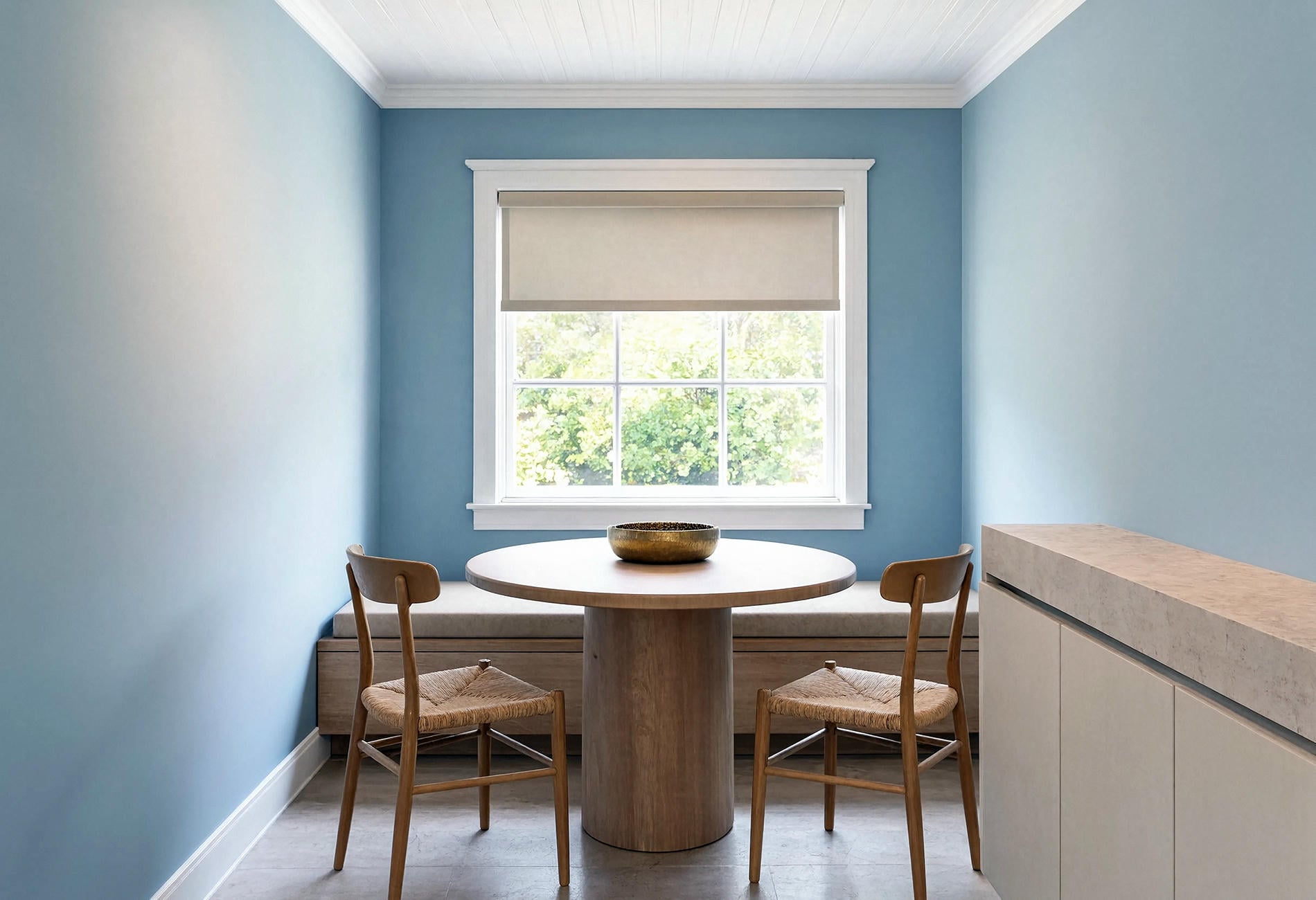
Let the Fixed Finishes Choose the Blue Family
Before you name a favorite shade, set your countertop, backsplash, floor, and cabinet sample together in one small pile. Those materials are the loudest voters in the room, especially stone with pronounced grey, cream, rust, or green movement.
Sort your possibilities into four loose families:
- Clear navy with little visible grey
- Smoky denim with a softened, dusty cast
- Airy blue with a grey or green undertone
- Teal that lands decisively between blue and green
If your counter has cool grey veining, a greyed navy or mineral blue may look more connected to my eye than a highly saturated royal blue. Cream stone can welcome blue with a little green in it. Those are starting points, though; the actual samples get the final vote because daylight varies wildly.
My strong opinion: don't pick a vague blue that seems designed to offend nobody. In kitchens, an apologetic mid-blue can look more dated than a deep navy or a pale wash with real conviction. Choose a lane.
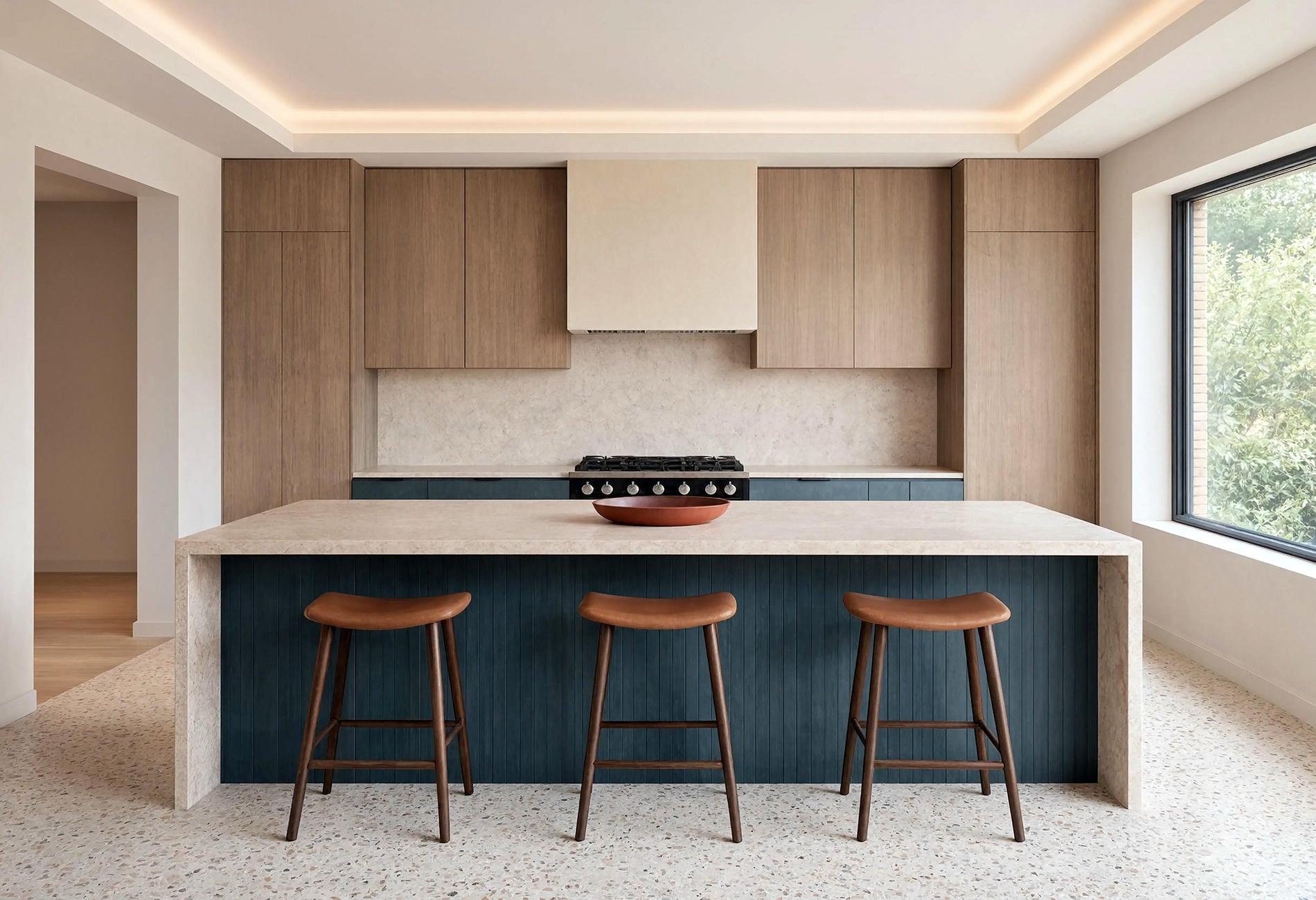
Navy Cabinets Need Texture Around Them
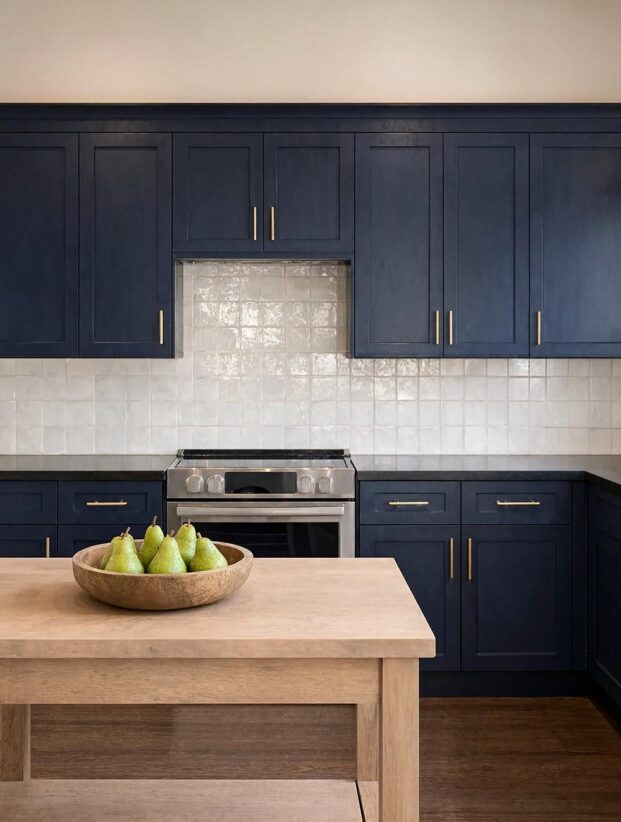
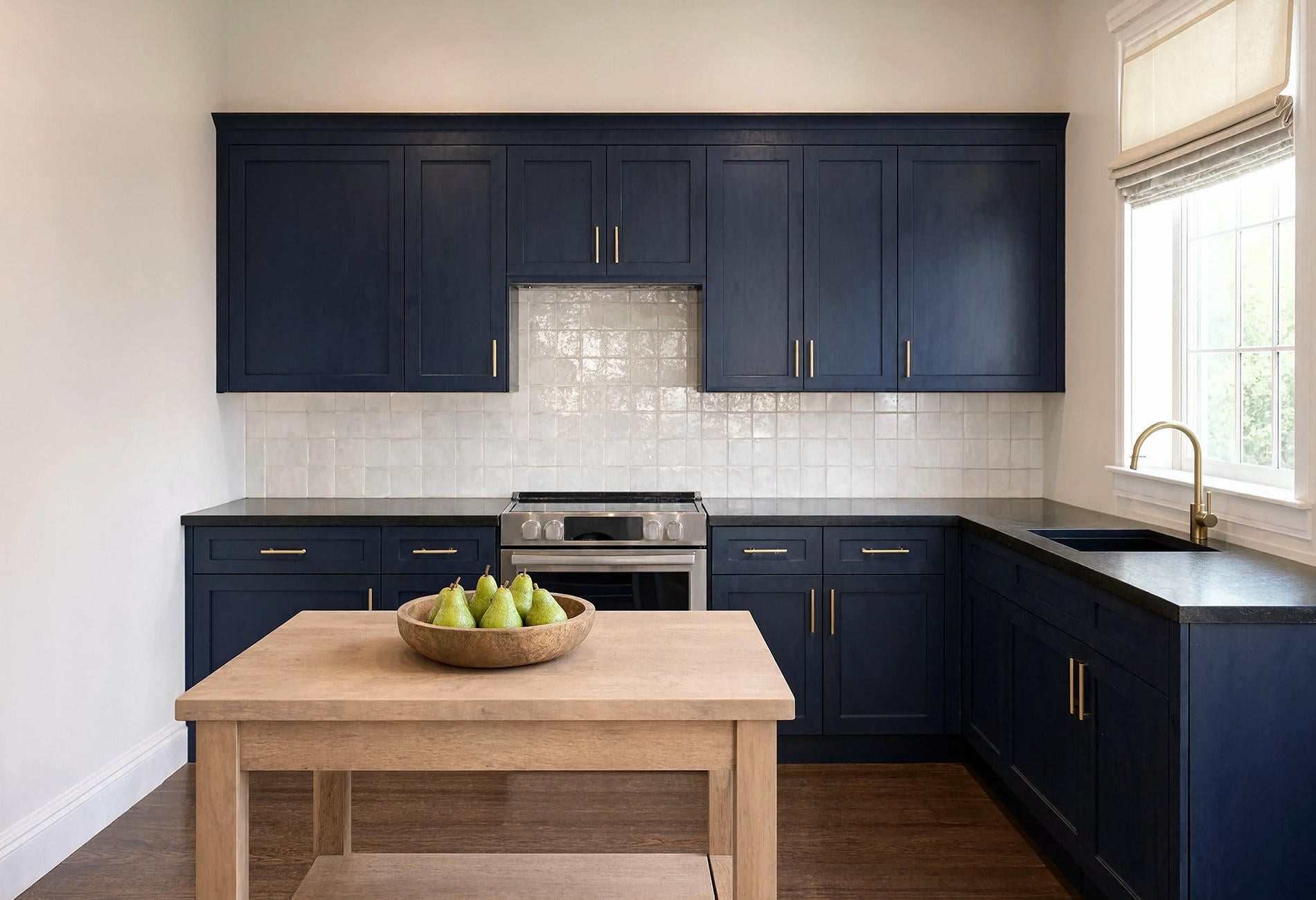
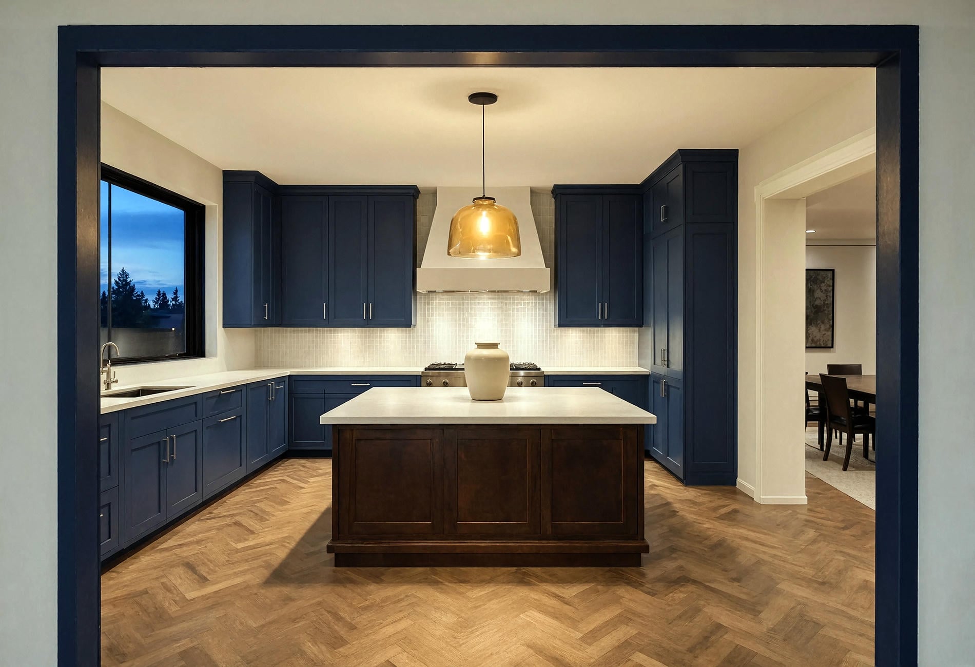
Navy cabinets can carry a kitchen with almost architectural weight, particularly when the door profile is simple and the finish has a low, touchable sheen. The risk isn't that they'll feel too bold. It's that a wall of dark blue can become visually flat if every neighboring surface is equally smooth and dark.
Bring in texture and something that catches light. Honed stone, pale oak, handmade tile, or unlacquered-looking metal gives the eye somewhere else to land. For my money, navy blue kitchen cabinets look richest with hardware that feels substantial in your hand rather than tiny dots scattered across the doors.
A two-tone plan can be easier in a kitchen that gets limited daylight. Keep the tall cabinet wall navy, then let an oak island or warm-white upper cabinets take some weight off the room. You still get the inkiness, just with breathing room.
There is one navy pairing I find especially hard to love: icy blue-white walls, blue-black cabinets, and a cool grey floor. It can make breakfast feel like a tax audit. Add warm wood, aged metal, cream stone, or a clay-colored textile and the whole conversation gets friendlier.
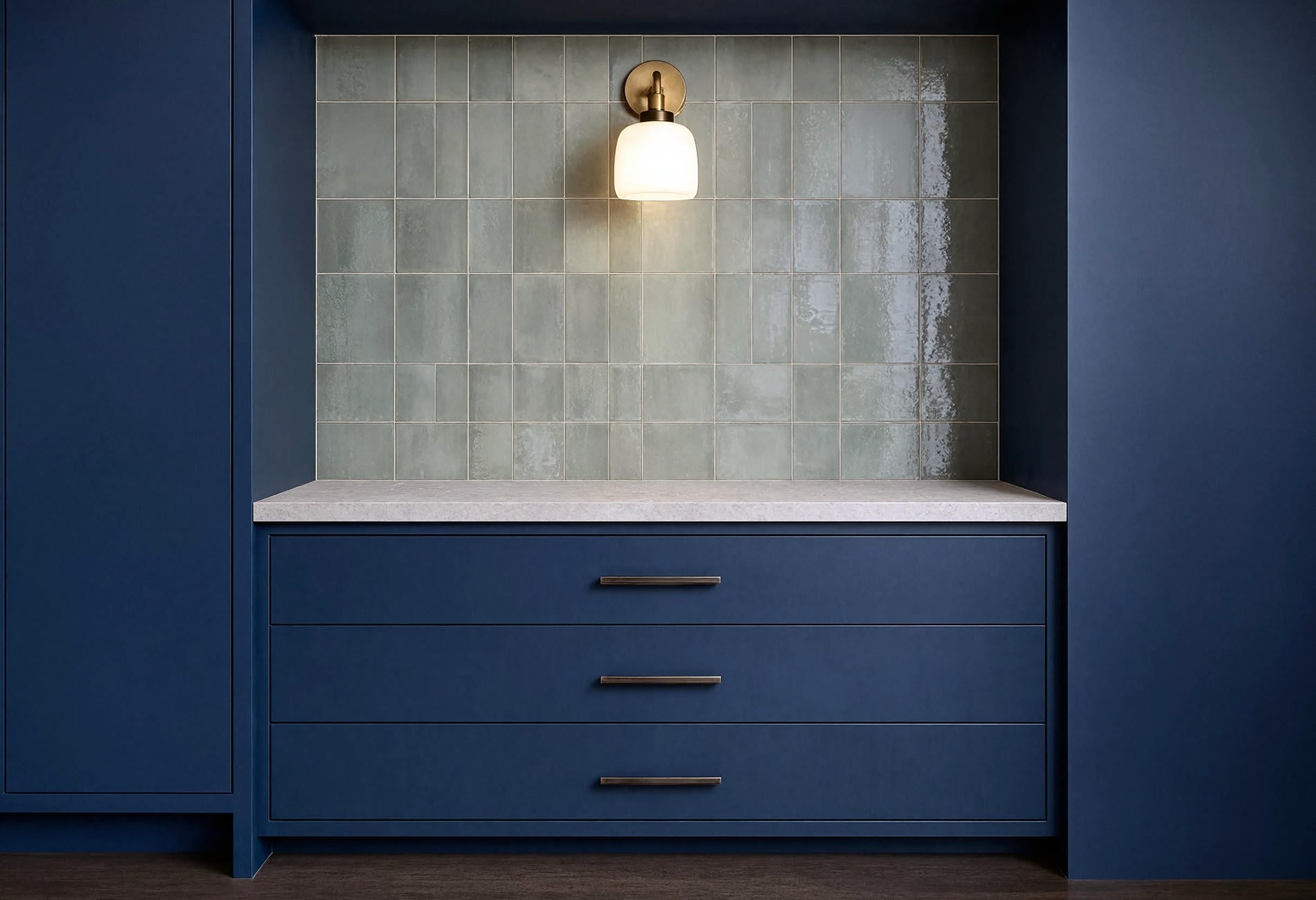
Pale Blue Walls Should Feel Washed, Not Sugary
A pale blue wall works beautifully when it reads like sky through thin cloud rather than nursery candy. Look for a softened shade with enough grey or green to keep it grounded beside cabinetry and food surfaces.
Light blue kitchen wall paint is especially useful when you want color without repainting every cabinet. Try it with warm-white cupboards, natural oak, charcoal lowers, or cream stone. The wall becomes a quiet field around the working parts of the room, which is often plenty.
Paint finish changes the impression, too, and I tend to prefer a washable eggshell on kitchen walls because its mild sheen catches daylight gently, though your room and paint line may call for something else. Carry the color onto a pantry door or the back of a breakfast nook if you want it to feel intentional. Stop before every stool and cereal bowl starts matching; a kitchen isn't a themed birthday party.
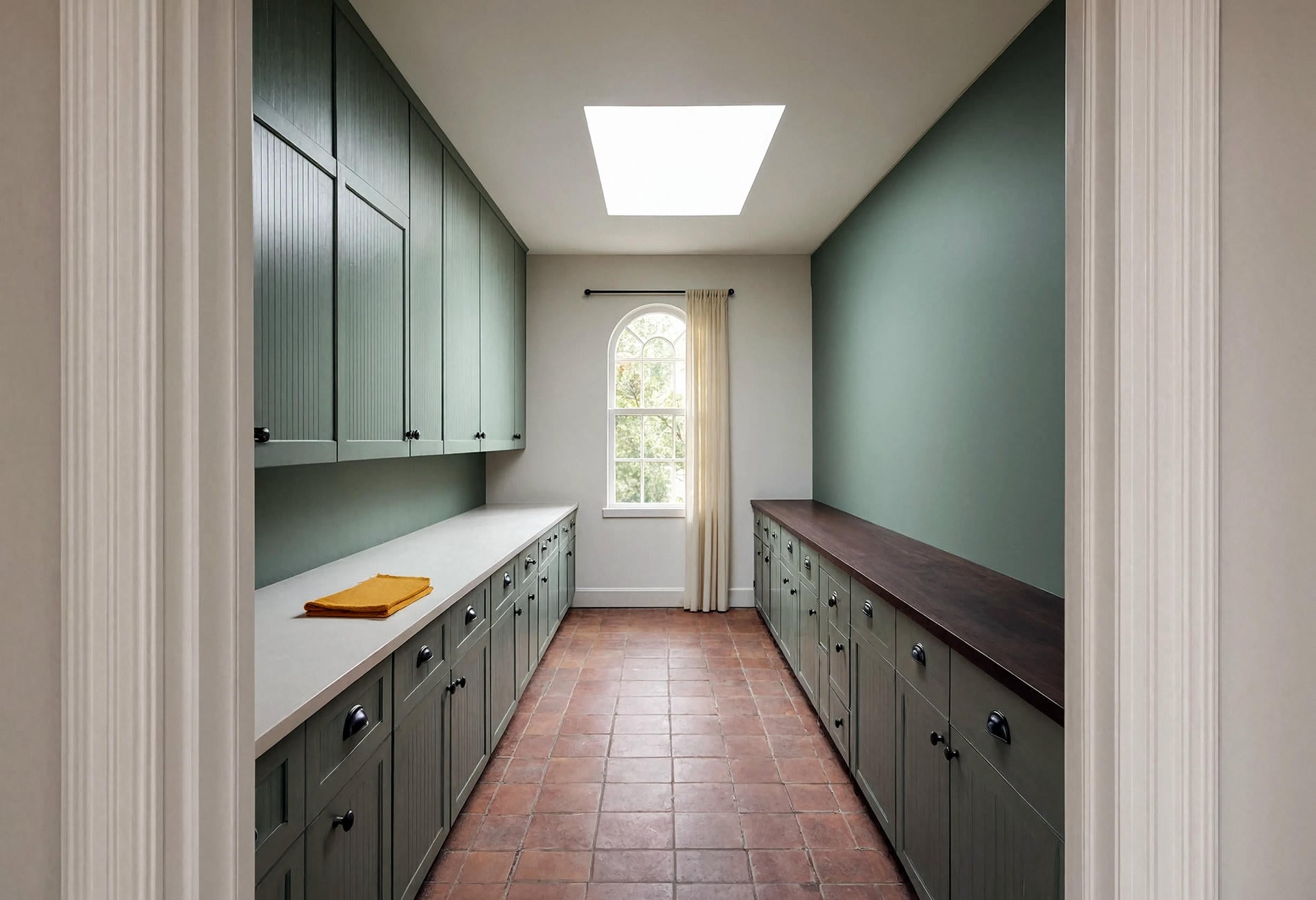
Teal Works Best With a Firm Boundary
Teal has appetite. Give it an island, one cabinet wall, the lower cabinets, or the whole galley, and it can make ordinary stone and wood feel more alive to my eye. Scatter it across six small accents and it starts nibbling the room to pieces.
For teal, a convincing color scheme needs a clear temperature plan. Pair a deep blue-green with red clay or smoked oak for warmth; use bone, charcoal, pale stone, or warm white when you want the teal to read sharper. Keep the remaining colors disciplined.
Texture decides if teal feels deep or loud. A matte cabinet finish absorbs some glare, while glazed tile throws light around and reveals more green. Put both in the same room only when one is clearly the lead and the other stays quiet.
Then repeat the teal once, subtly. A narrow painted door frame or the edge of a Roman shade is enough. Repetition should feel like an echo across the kitchen, not a parrot following you from counter to counter.
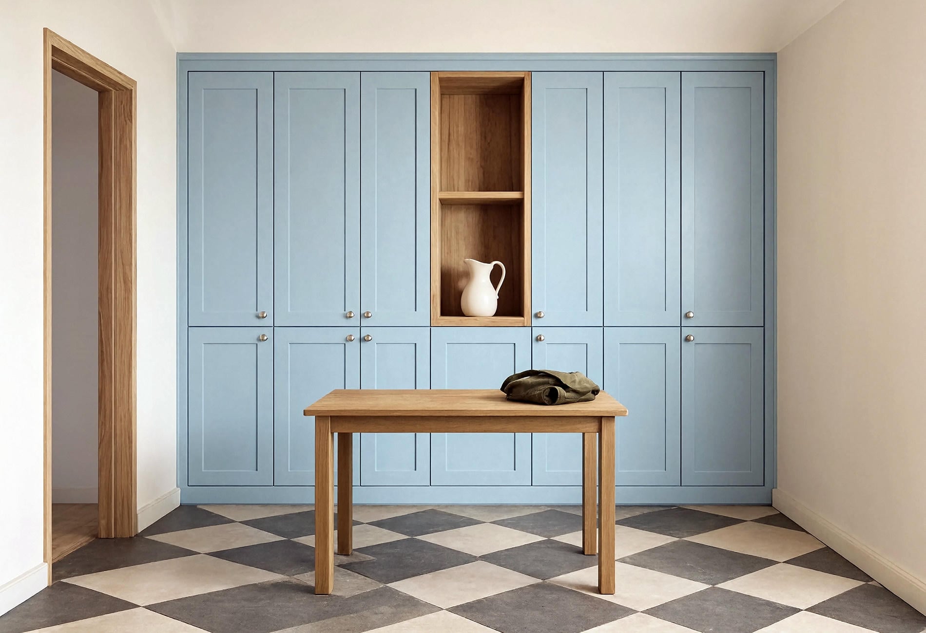
Match the Countertop to the Mood, Not a Formula
Set a blue sample vertically and the counter sample flat, exactly as they'll meet in the kitchen. Seeing the samples in those positions gives you a better sense of how the colors will relate under your kitchen's actual lighting.
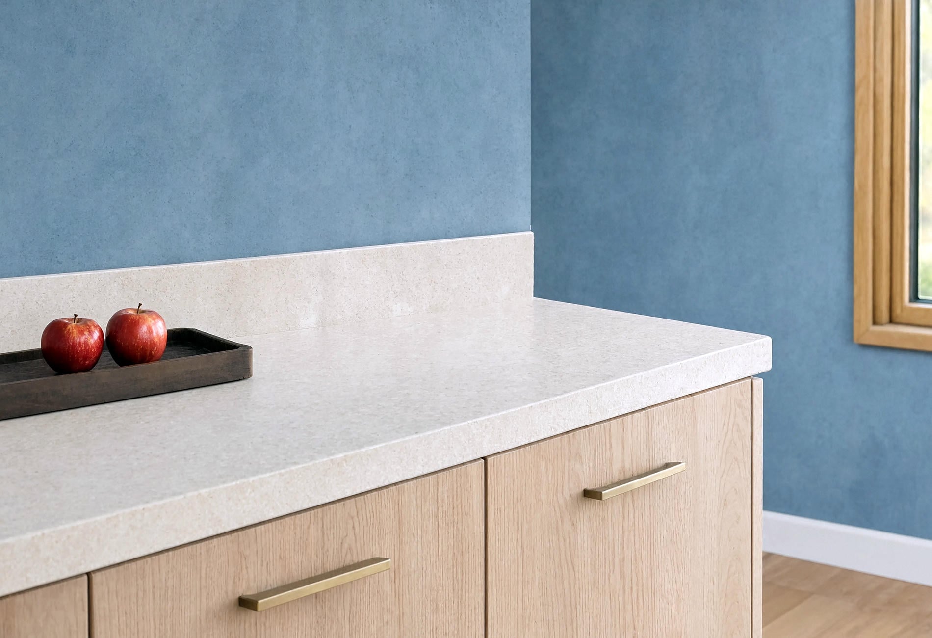
Beside blue kitchen walls, start countertop selection with the mood you want:
- Warm white or creamy stone keeps navy welcoming and suits traditional rooms
- Pale quartz with restrained grey movement gives dusty blue a quieter, cleaner edge
- Soapstone or dark charcoal makes powder blue look crisp and slightly unexpected
- Butcher block brings visible warmth to teal, especially beside matte painted surfaces
Busy stone asks for a quieter blue. If the counter has dramatic veining in several colors, choose one undertone from the stone and let the wall or cabinet paint whisper it back. Adding a second show-off color usually creates a room where every surface is speaking into its own microphone.
I also like a nearly bare counter with saturated cabinetry. Deep blue already gives you visual interest; it doesn't need an army of canisters performing backup vocals.
Decorate a Blue Kitchen With Materials, Not More Blue
To my eye, one wooden board, a folded rust-colored linen, a blackened-steel tray, and a broad bowl of green pears can do more for blue cabinetry than a shelf full of coordinated accessories. You want contrast in material and shape, with enough open counter left for the kitchen to function.
When you're figuring out how to decorate a blue kitchen, look for four supporting notes: one warm natural material, one metal finish, one light neutral, and one small color that isn't blue. Terracotta, mustard, olive, and oxblood can all work in modest amounts, depending on the undertone you've chosen.
Keep visible objects generous in scale. To my eye, a heavy crock or a woven tray is calmer than twelve tiny things arranged with tweezers. Also, if your open shelving requires a ladder and a dusting schedule worthy of a museum registrar, perhaps the shelf has won.
Blue looks particularly lovely at the edge of the day. Window light fades across the cabinet faces, the dark color holds its shape, and warm wood begins to glow. That's the version of a blue kitchen worth designing toward: useful at noon, magnetic after dinner.
Blue Kitchen Questions, Answered
What is the best blue paint for a kitchen?
The best choice is the blue that stays pleasing beside your fixed finishes in morning, midday, evening, and after-dark light. I'd begin with a clear navy, a greyed denim, a pale blue-green, and a deep teal, then test large movable samples before committing.
What countertops work with blue kitchen walls?
Warm white stone, pale quartz, charcoal soapstone, and butcher block can all pair well, depending on the blue's undertone and the mood you want. Put the physical samples together under your own kitchen light; a cream vein or green cast can change the decision quickly.
Can you mix light blue walls with teal cabinets?
Yes, if one color leads and the other is softened enough to support it. I'd keep the teal deeper, choose a pale wall blue with a related green undertone, let wood add warmth, and quiet the remaining finishes with bone-colored stone.
You don't have to choose the blue a resale brochure would approve. Choose the one that makes you pause in the doorway. Tape up a generous sample and let your own kitchen have a point of view.