A Quiet Luxury Neutral Palette Without the Beige Blur
If you're choosing neutral paint because you want the room to feel expensive, pause before ordering five gallons of the palest beige on the card. Quiet luxury lives in the half-steps: cream against putty, brushed wool beside smooth stone, old wood beside paint that shares its warmth.
The look is low contrast, though it isn't vague. Every material needs a clear voice because color isn't shouting over it. A flat beige room feels unfinished; a layered neutral room makes you notice the nap of the sofa, the shadow inside the molding, and the small shift from chalky wall to satin trim.
Quiet Luxury Is More About Editing Than Price
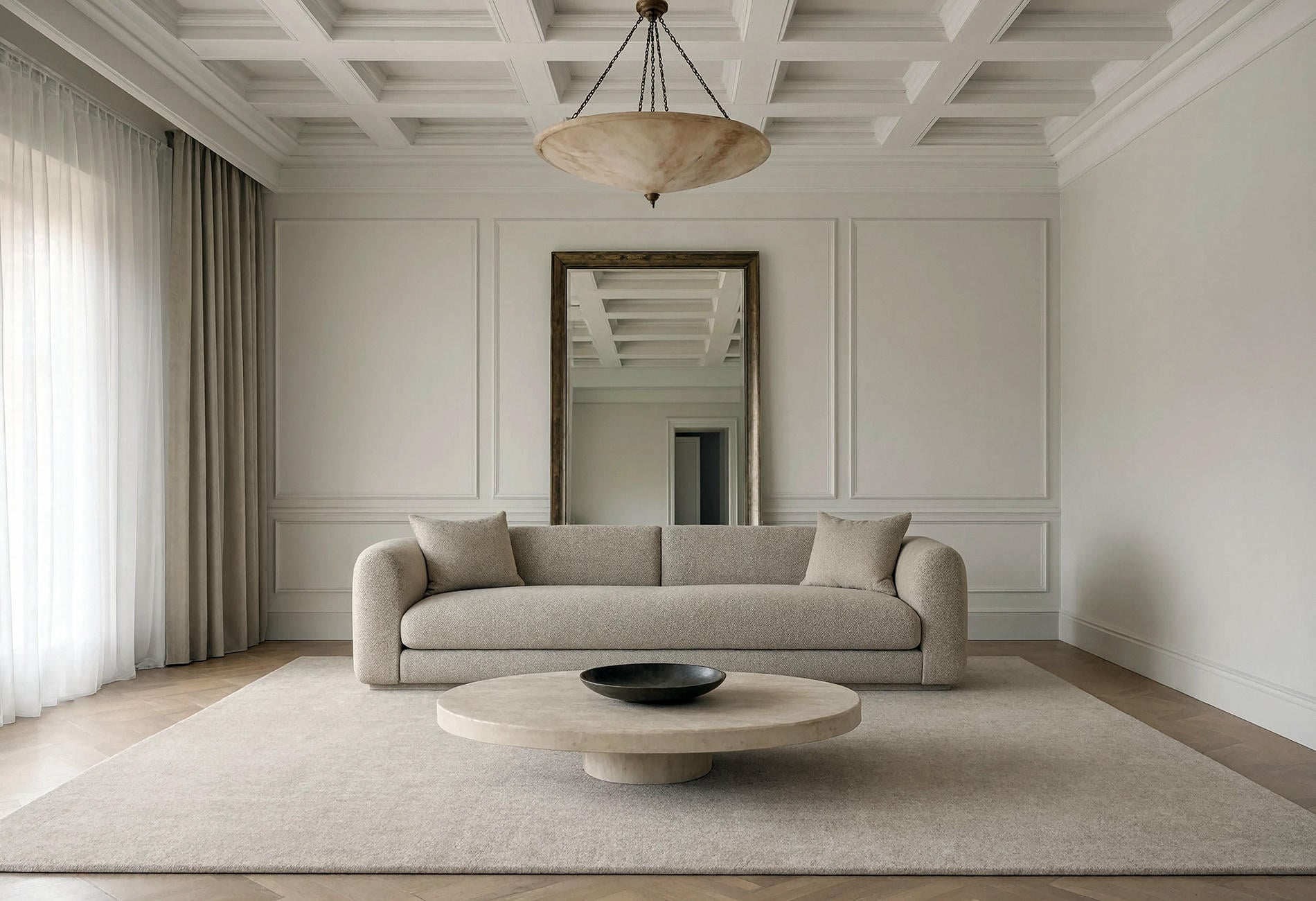
To my eye, quiet luxury is a preference for restraint, good proportion, subtle texture, and materials that don't need a logo or a loud pattern to announce themselves.
The old-money room colors people save online tend to sit close together: soft cream, warm beige, mushroom, camel, parchment, muted taupe, and elegant greige. Darker notes appear in wood, bronze, or charcoal, then stop before they become a graphic theme.
You can build that feeling with ordinary materials if the palette is disciplined. One substantial wool rug reads better to me than six little luxury-coded objects lined up on a console. The room should feel chosen slowly, even if you chose it on a Tuesday night with forty-seven browser tabs open.
Find the Neutral Already Living in the Room
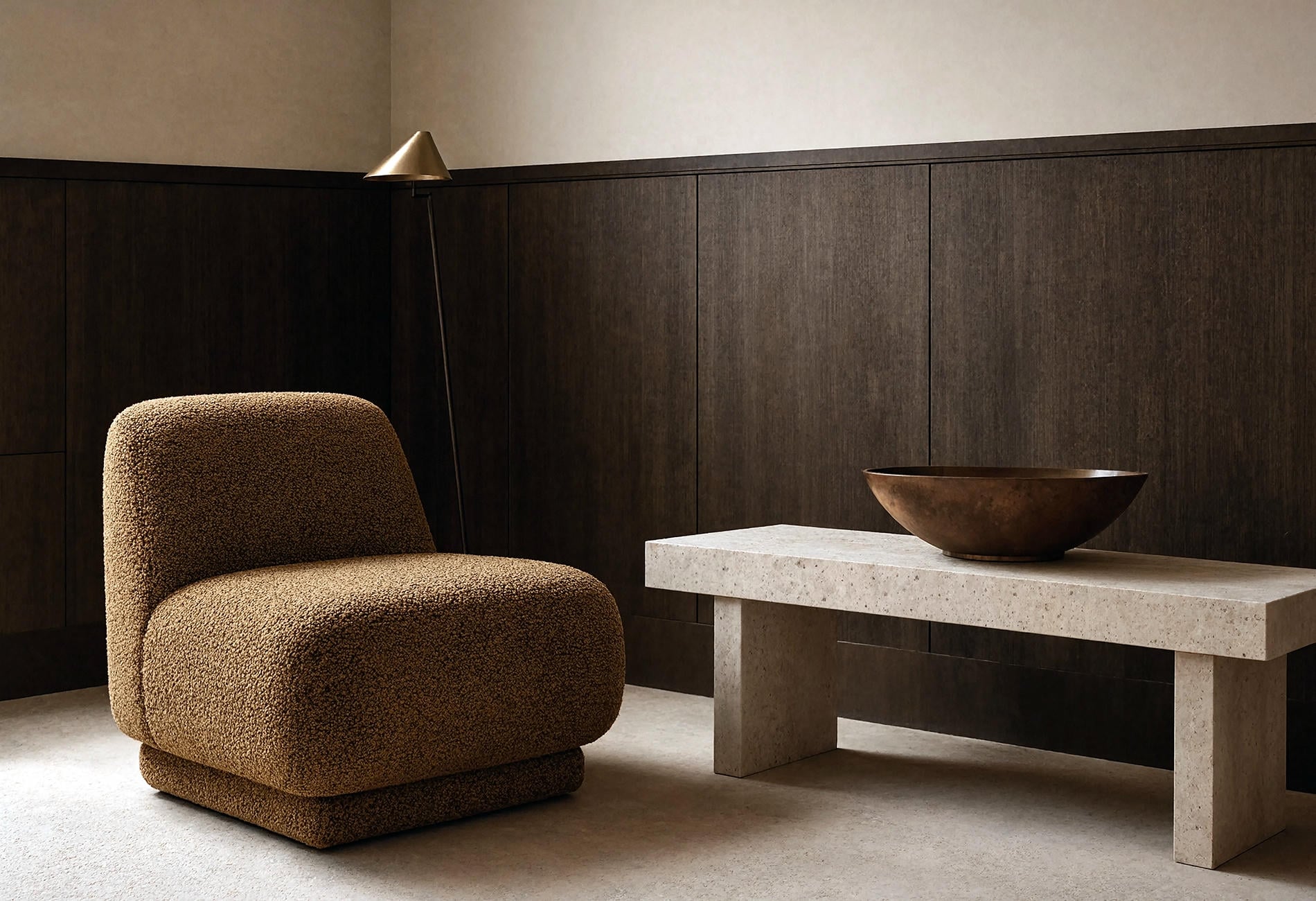
Stone, flooring, woodwork, and upholstery contain the undertone clues. Pull a warm beige from the quiet background of the rug, a chalky cream from the stone, or a grey-brown from the wood grain.
This keeps the palette connected to the house. It also prevents the odd effect of a fashionable greige floating above honey floors as if the two have never met.
Hold samples vertically because paint changes when light hits a wall rather than a tabletop. Compare them in daylight and lamplight. The expensive-looking neutral is the one that makes the fixed materials look intentional, in my opinion; it isn't automatically the palest or the newest.
Build Depth With Temperature, Sheen, and Texture
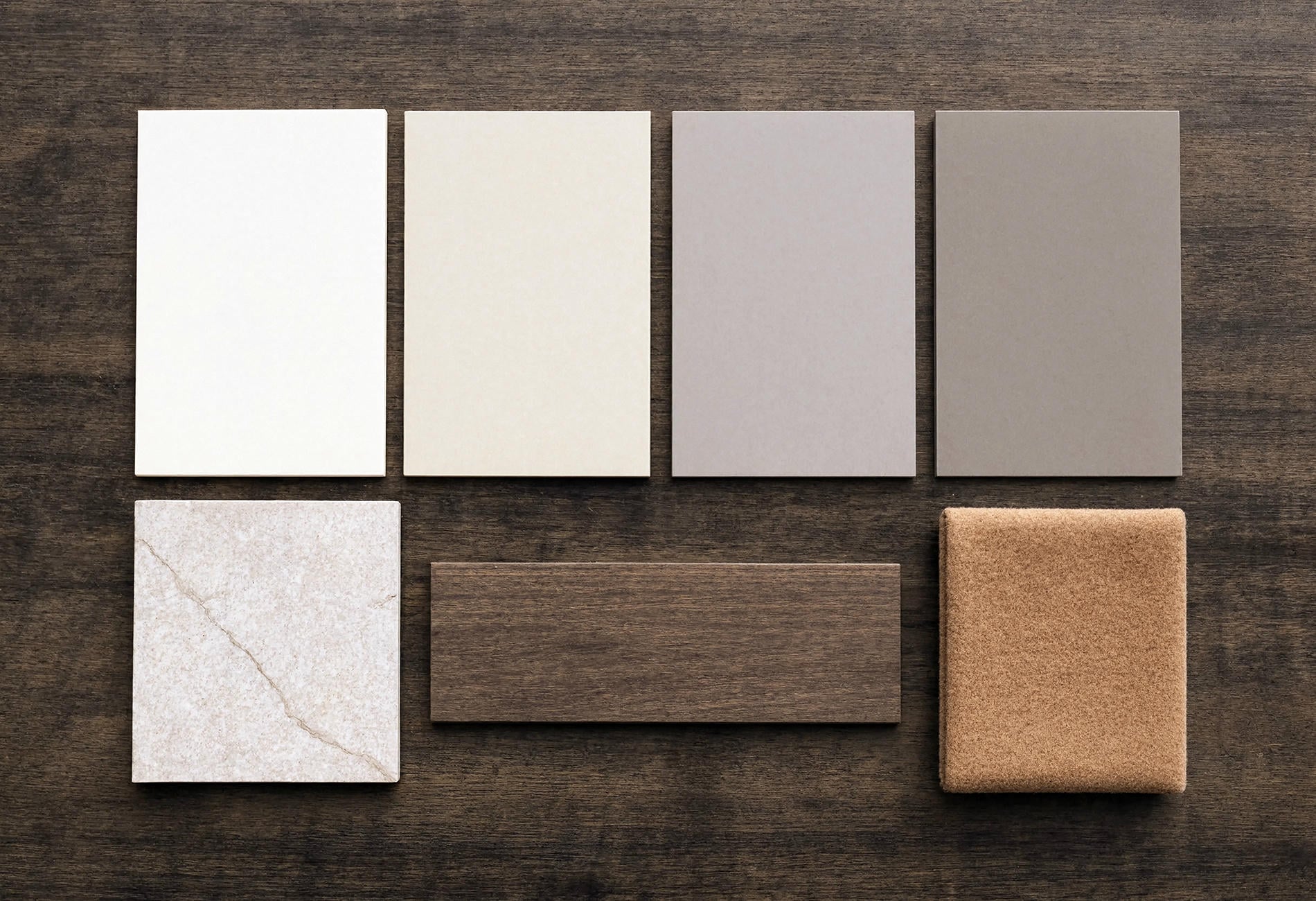
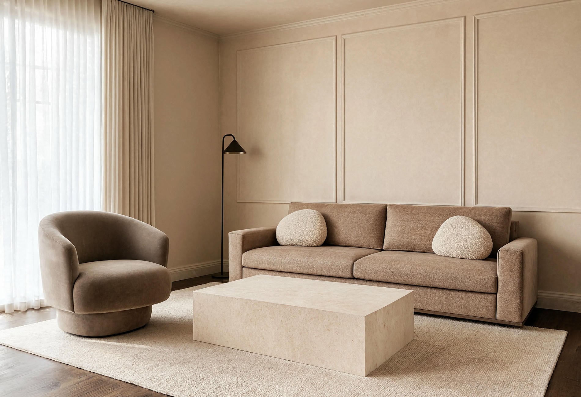
A monochromatic beige living room needs differences you can feel. Pair matte plaster walls with a tighter woven sofa, a nubby wool rug, honed limestone, and one polished or brushed metal detail.
Temperature creates another layer. A camel chair can warm a mushroom wall. A pale grey-beige curtain can cool a honeyed floor. Keep the shifts small enough that the room still reads as one family.
Then vary sheen carefully. Matte walls absorb light; satin trim catches the edge of it; stone holds a dull glow; metal gives one brief flash. That tiny glint is enough. Quiet luxury and a chandelier with the emotional volume of a drum solo are uneasy roommates.
Soft Creams Need Something Heavier Beside Them
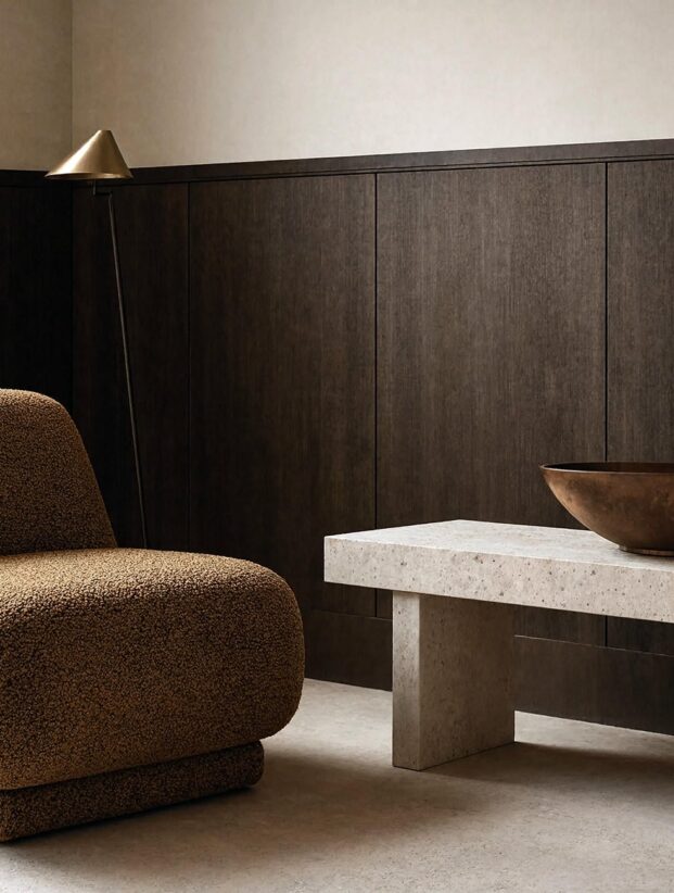
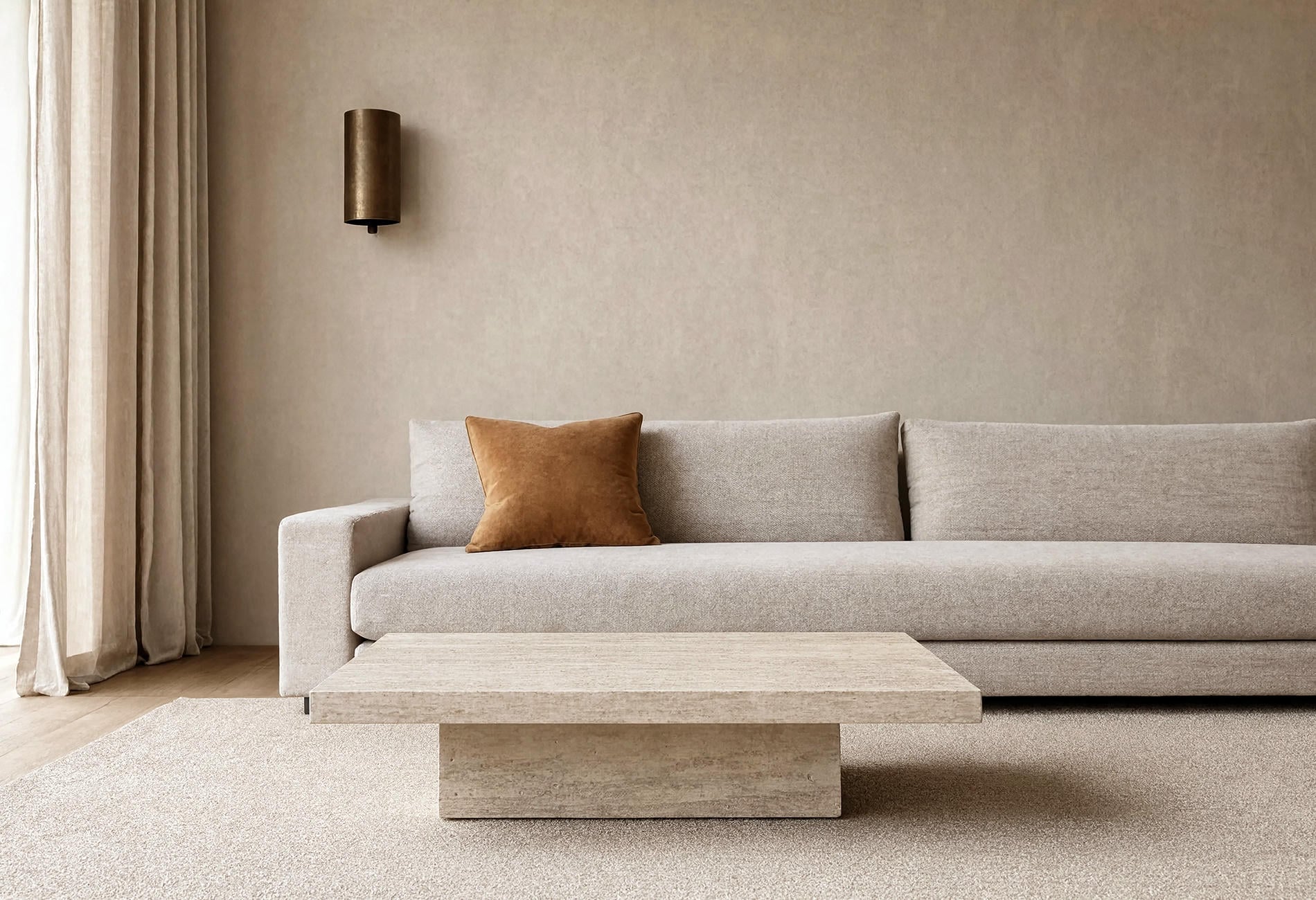
Cream can look thin when every neighboring finish is equally pale. Give it weight with smoked oak, walnut, dark bronze, deep taupe, or one broad camel textile.
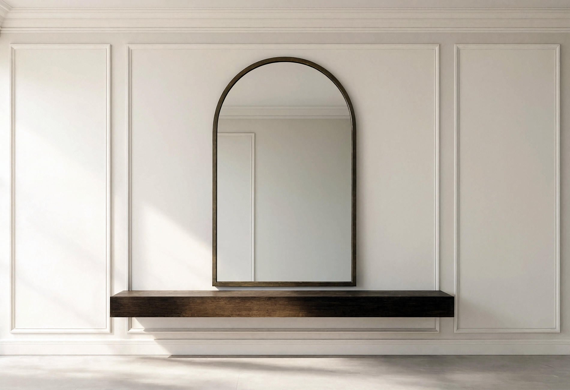
The contrast should feel softened at the edges. Choose brown-black over a crisp pitch black, a dark wood frame over a glossy black one, or bronze that reads nearly charcoal in shadow. These darker materials outline the room without turning it into a checkerboard.
In an open plan, repeat the dark note two or four times across the sightline: a table base, slim lamp, door hardware, and window frame. Small repetition makes the palette feel deliberate.
Warm Beige Looks Better When the Shapes Stay Clean
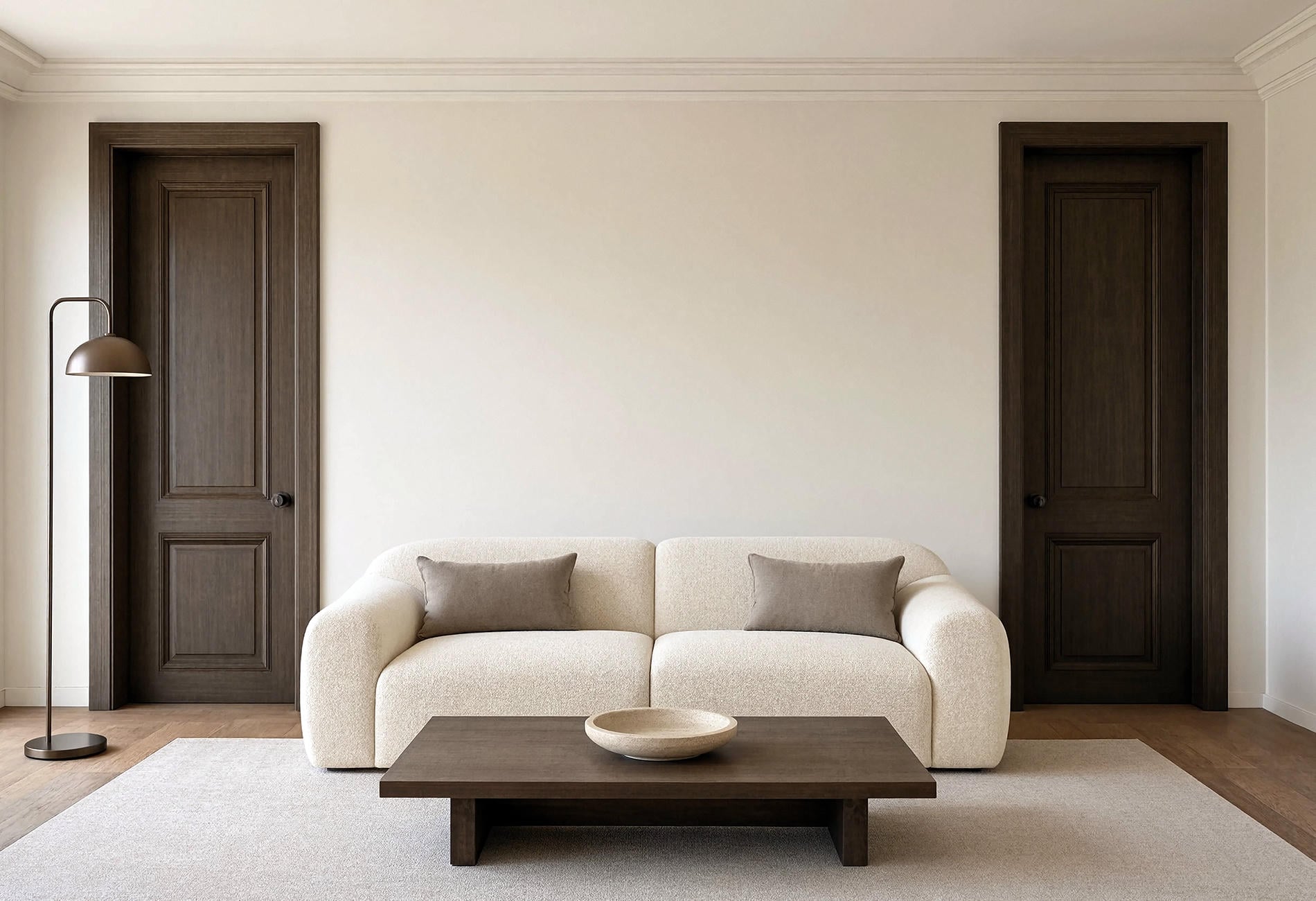
Beige already carries softness. Add too many scallops, gathered skirts, rounded accessories, and pillowy objects, and the room can feel puffy.
I'd balance warm beige with a straight-edged stone table, tailored sofa, broad linen curtains, and simple millwork. One curved chair or rounded ottoman brings relief. The tension between soft color and clean form keeps the room alert.
This is also where subtle texture earns its place. A slubby linen curtain reads from across the room; a dozen tiny woven boxes just look like visual crumbs. Go larger and fewer.
Elegant Greige Has to Pick a Side
Greige becomes useful when you can tell which way it leans. A warm greige with brown or violet underneath may sit beautifully beside walnut and cream. A cooler stone greige can calm reddish wood or warm tile, depending on the light.
The indecisive middle greiges are harder. They can look dull beside both warm and cool finishes, especially in rooms with weak daylight. Sample against the actual baseboard, floor, sofa, and adjoining wall.
For a whole-home palette, choose one greige as the bridge and vary its value rather than collecting several near-matches. One can go wrong in an interesting way. Five can look like the house has a printing problem.
Luxury Lives in the Transitions
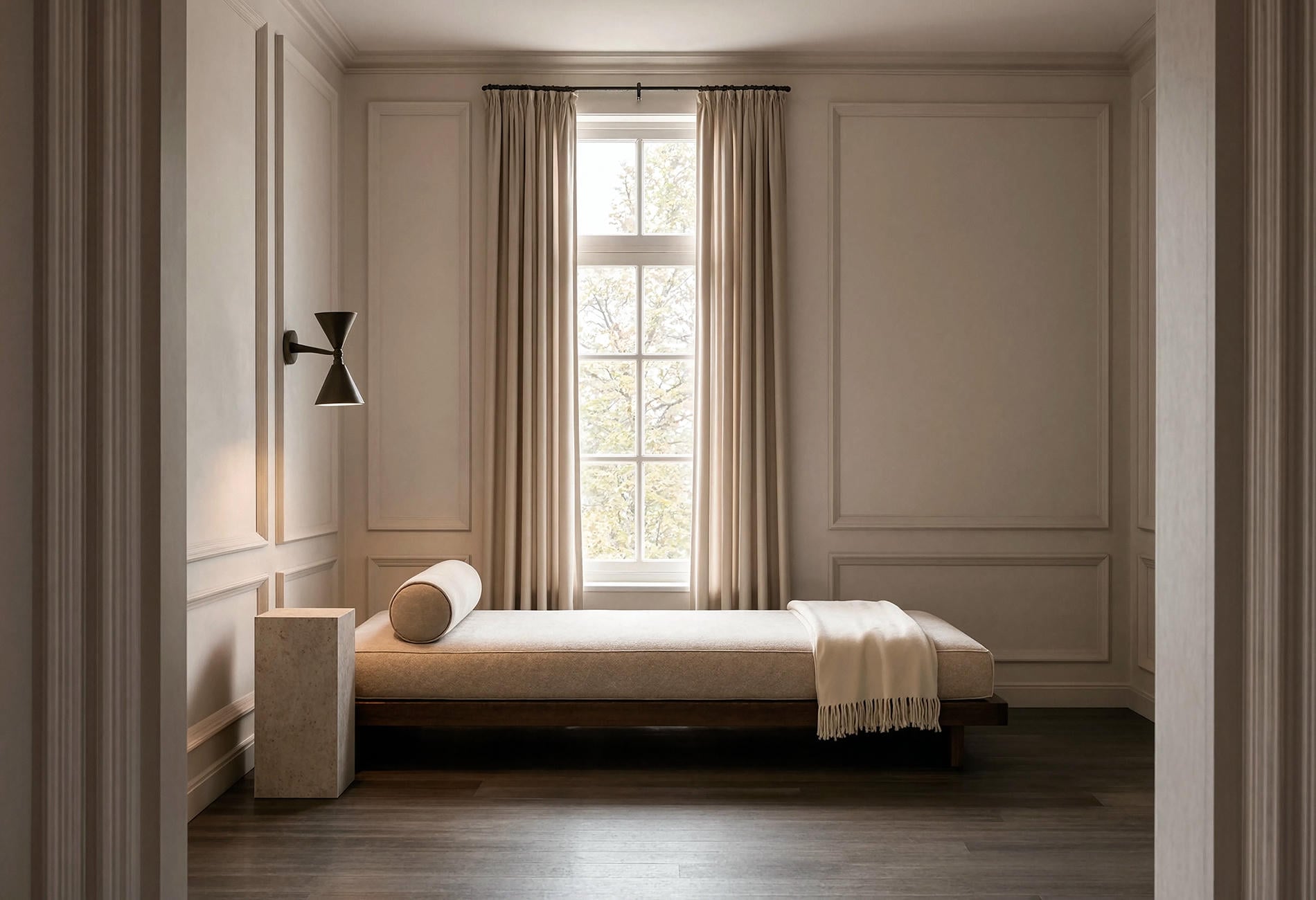
Notice where materials meet. A wool rug ending cleanly beneath a sofa, full-height curtains touching the floor, trim painted one step away from the wall, and a stone top with a quiet edge can make a neutral room feel resolved.
Some of those details may involve custom work or hardwired lighting. Quick honest note: I'm not an electrician or a contractor, and nothing here is professional advice. Hire a licensed pro for wiring or structural changes because shock, fire, and code risks deserve real expertise; plug-in lamps and battery lights can test the mood safely before any permanent decision.
Paint can help with transitions too. Try the trim in the same family as the wall, shifted slightly lighter or darker. Lower contrast lets molding register through shadow instead of a bright outline.
A Simple Room-by-Room Recipe
Start with one wall neutral, one trim companion, one upholstery midtone, and one dark material. Carry those roles through connected rooms while changing which color dominates.
In the living room, warm beige may cover the walls while cream fills the sofa and walnut grounds the tables. In the bedroom, cream can move to the walls, mushroom to the headboard, and dark wood to the bed. Same family, different emphasis.
Keep one room quieter than you think it needs to be. Negative space gives texture somewhere to register, and it leaves room for the ordinary things of life -- a cup, a sweater, the mail you meant to open.
Then repeat one material across rooms in different scales. Walnut may appear as a living room table, a slim bedroom frame, and a small tray in the hall. Cream wool can move from a large rug to a single chair. That repetition is quiet enough to miss on the first pass, which is rather the point.
Before buying anything, photograph the room in black and white. If every surface collapses into one grey field, the values are too similar. Deepen one wood tone or add a midtone textile, then switch the color back on and see how much more clearly the room reads.
Questions People Ask About Quiet Luxury Neutrals
What is the quiet luxury interior design trend?
It's a restrained decorating approach built around proportion, material quality, low contrast, and subtle detail. The palette often uses cream, warm beige, greige, wood, stone, and softened dark accents.
Which neutral paint colors look expensive?
No single neutral guarantees that effect. The colors that look richest to my eye have an undertone connected to the room's wood, stone, floor, and light, plus enough depth to reveal trim and texture.
How do you make a neutral room look luxurious?
Use fewer, larger pieces; vary texture and sheen; keep the undertones related; and pay attention to material edges. A restrained palette needs precise scale and good transitions because color isn't hiding weak choices.
Can quiet luxury include dark colors?
Yes. Smoked wood, deep taupe, charcoal, brown-black, and aged bronze can ground pale neutrals without creating harsh contrast.
The last choice is personal: do you want the room to impress someone at the doorway, or reward the person who sits there long enough to notice the light moving across the wall?