
Halfway up the stairs, the blue sample that looked polished beside the front door has turned vaguely purple. Three steps higher, it goes flat and grey. By the landing, it has recovered and is acting as if nothing happened.
Hallways and stairwells expose paint in a way square rooms don't. Light arrives from one end, corners interrupt it, glossy trim throws it back, and every doorway introduces another color. Blue makes all of those shifts visible.
That's exactly why I like it here. A well-chosen blue can turn the parts of a house you normally hurry through into a sequence with real atmosphere. For my money, choose for the darkest turn in the route, rather than the brightest patch on the sample card.
Follow the Blue Through the Whole Route
Tape large painted boards near the entry, halfway along the hall, at the stair turn, and on the upper landing. Leave them there through morning and evening. A color that charms beside a window may lose its green undertone a few paces away.
Pay attention to what the blue meets at each stop. Oak flooring can pull warmth forward, black railings sharpen contrast, cream carpet softens it, and a red-brown door may make a teal note suddenly obvious.
For my money, the winning shade is the one that remains interesting in the dimmest area. It doesn't have to look identical everywhere. In fact, that slight shift from airy to moody is half the pleasure.
And use a generous sample. A tiny blue chip in a long corridor is a goldfish trying to describe a river.
Pale Blue Needs a Little Dust in It
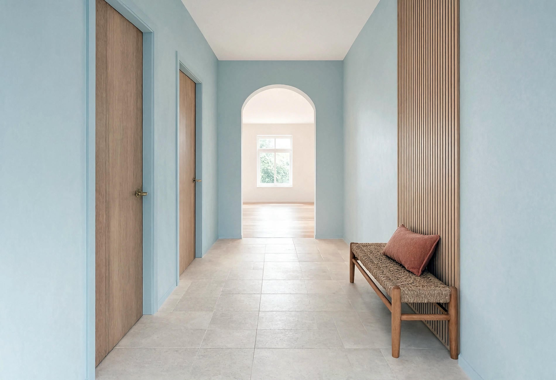
A pale hallway blue can look clean and calm when it carries enough grey or green to keep it from becoming sugary. Think rain-washed sky, faded denim, blue smoke, or the pale underside of a eucalyptus leaf.
In a narrow hall, I like the wall color to continue across the doors when there are several close together. That broad field reduces the stop-start rhythm of white rectangles, especially when the ceiling and baseboards stay quiet.
Finish matters. An eggshell wall may catch enough light for everyday wiping while still looking soft, though you should test the actual finish in your own hall. Higher sheen can expose every patch and roller mark, which is a fairly rude way for paint to behave.
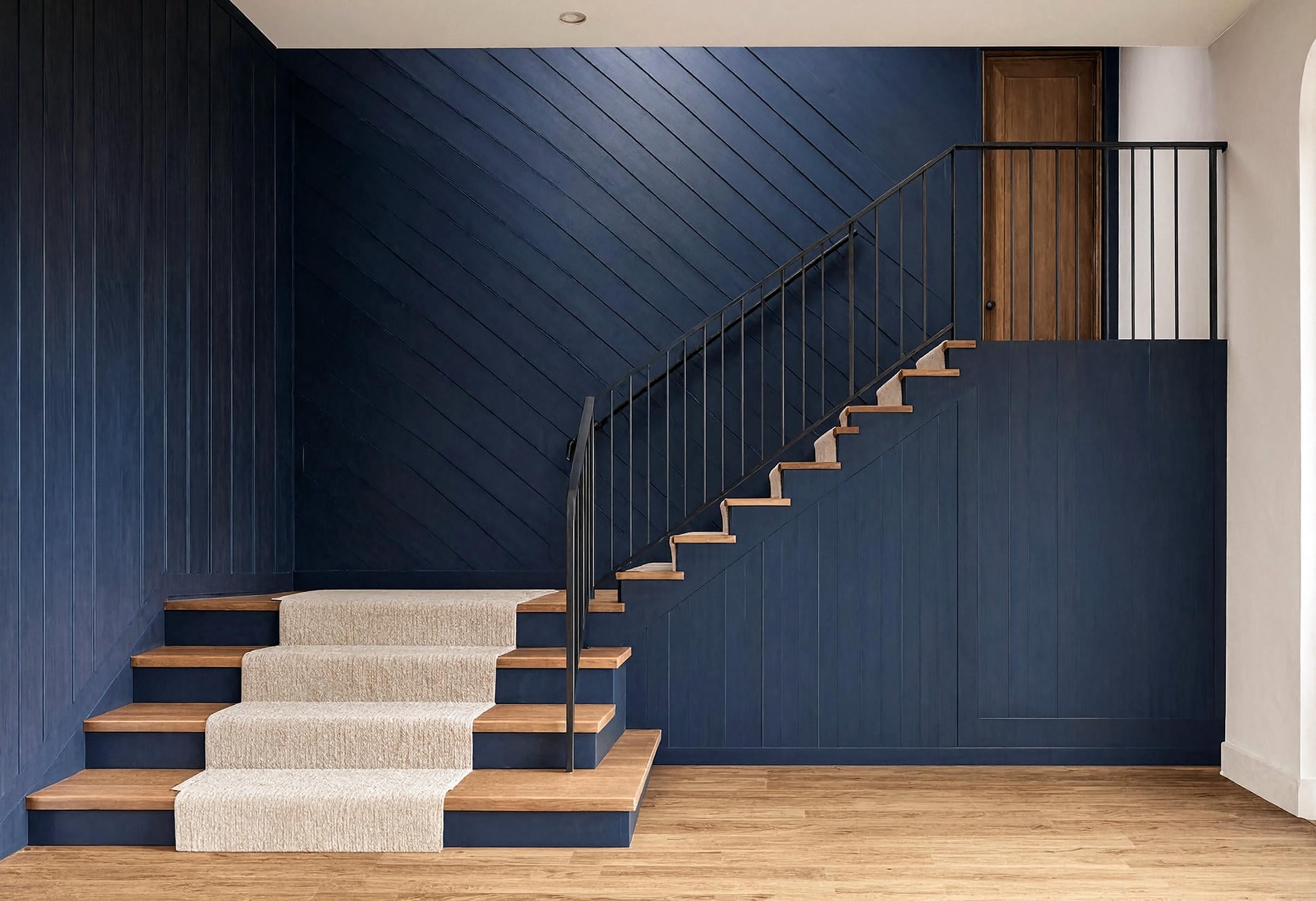
Put Navy Where the Architecture Has a Strong Line
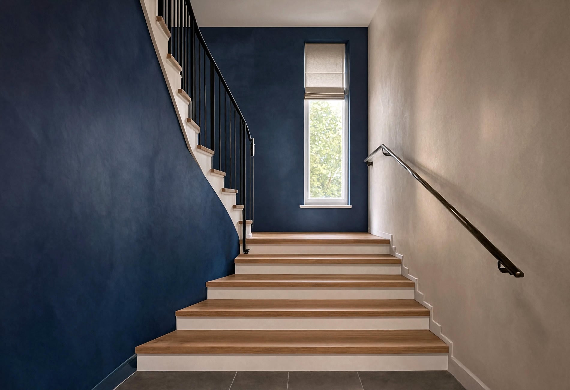
A staircase already has direction, so a deep navy wall can follow that diagonal and make the railing feel more deliberate to my eye. Paint the full stair wall or the paneled section below the handrail. A small navy shape floating under the stairs tends to look hesitant.
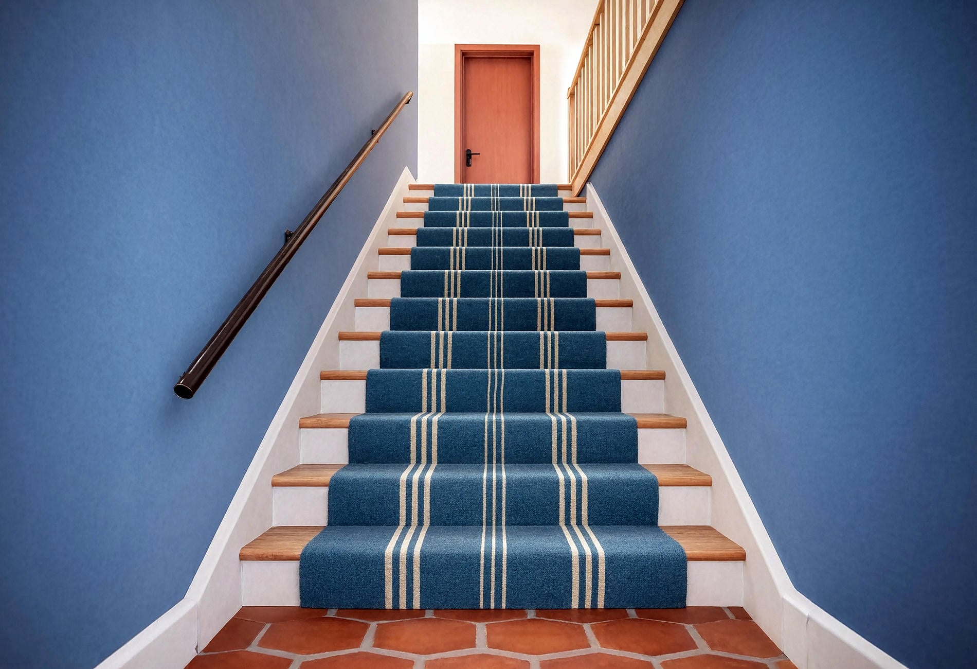
Warm wood treads give dark blue some necessary material contrast. Bone-colored risers, a dark-bronze rail, a broad flax runner, or a cream ceiling can keep the stair readable without weakening the wall color.
A navy stair wall is most convincing when it reaches a natural edge: a corner, landing, door frame, or change in paneling. Stop at an architectural seam. Painter's tape cannot invent one, no matter how confidently it is pressed down.
Quick honest note: I'm not an electrician, and nothing here is professional advice. Any hardwired stair or hallway lighting belongs with a licensed electrician because shock and fire risks are real, and local code matters; battery picture lights, rechargeable lamps, plug-in fixtures, and motion-sensor step lights can add light without touching the wiring.
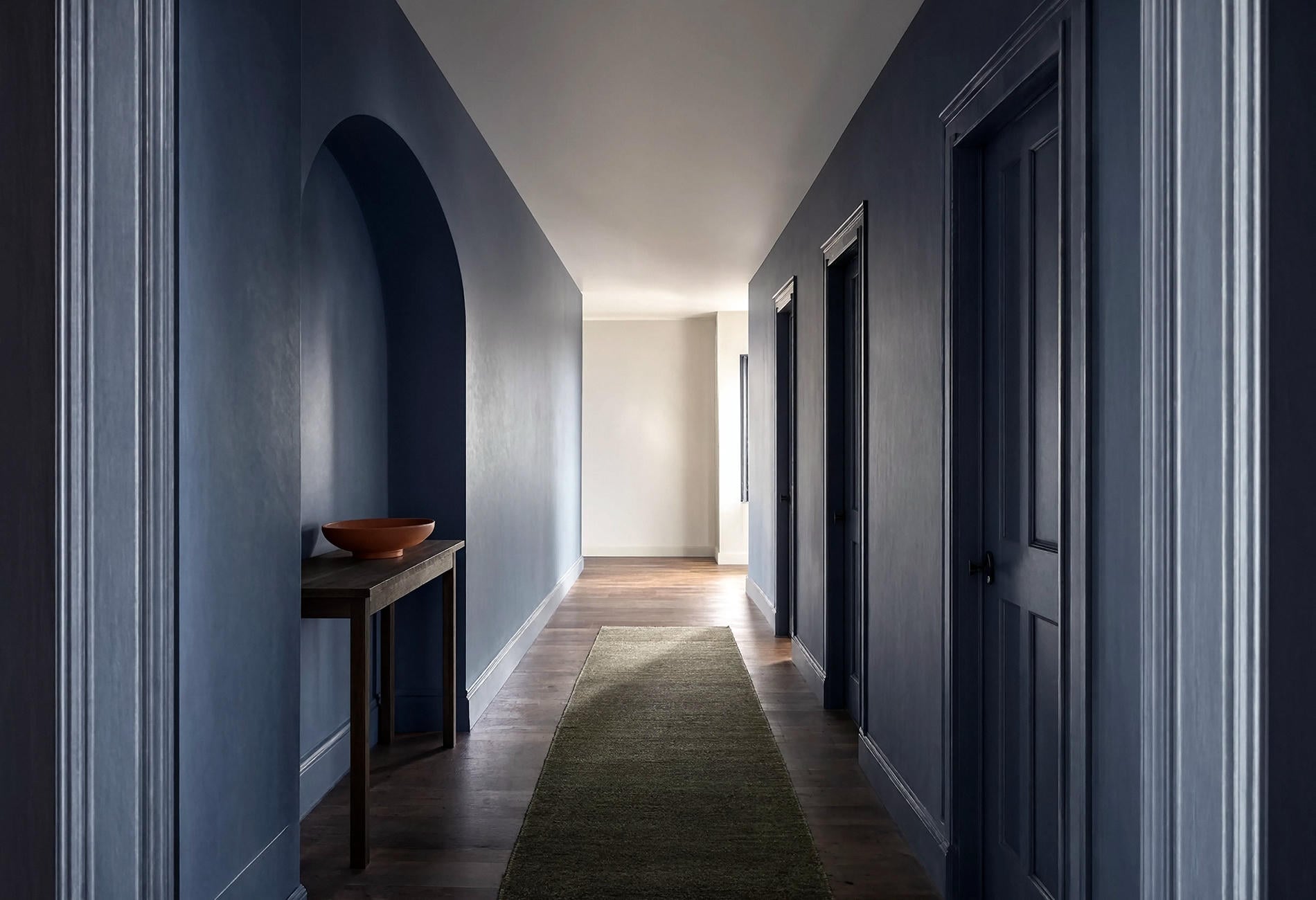
Slate Blue Is the Great Connector
Between a warm entry and a cooler upstairs landing, slate blue can bridge the change without feeling indecisive. It has enough grey to sit beside stone and enough color to stand up to timber.
Build a slate corridor palette with four parts: blue-grey walls, warm-white trim, smoked oak, and one small rust or olive note. Those materials give the paint context, which is far more useful than asking if slate is "warm" or "cool" in the abstract.
Don't overcomplicate it. A runner in a broad stripe or a plain woven texture can carry the hall, while the walls stay free of a fussy gallery arrangement. The shadows between doorways already make a pattern.
At certain hours, slate almost disappears into the dimness and then catches silver near the window. Quiet drama. Hallways are good at that.
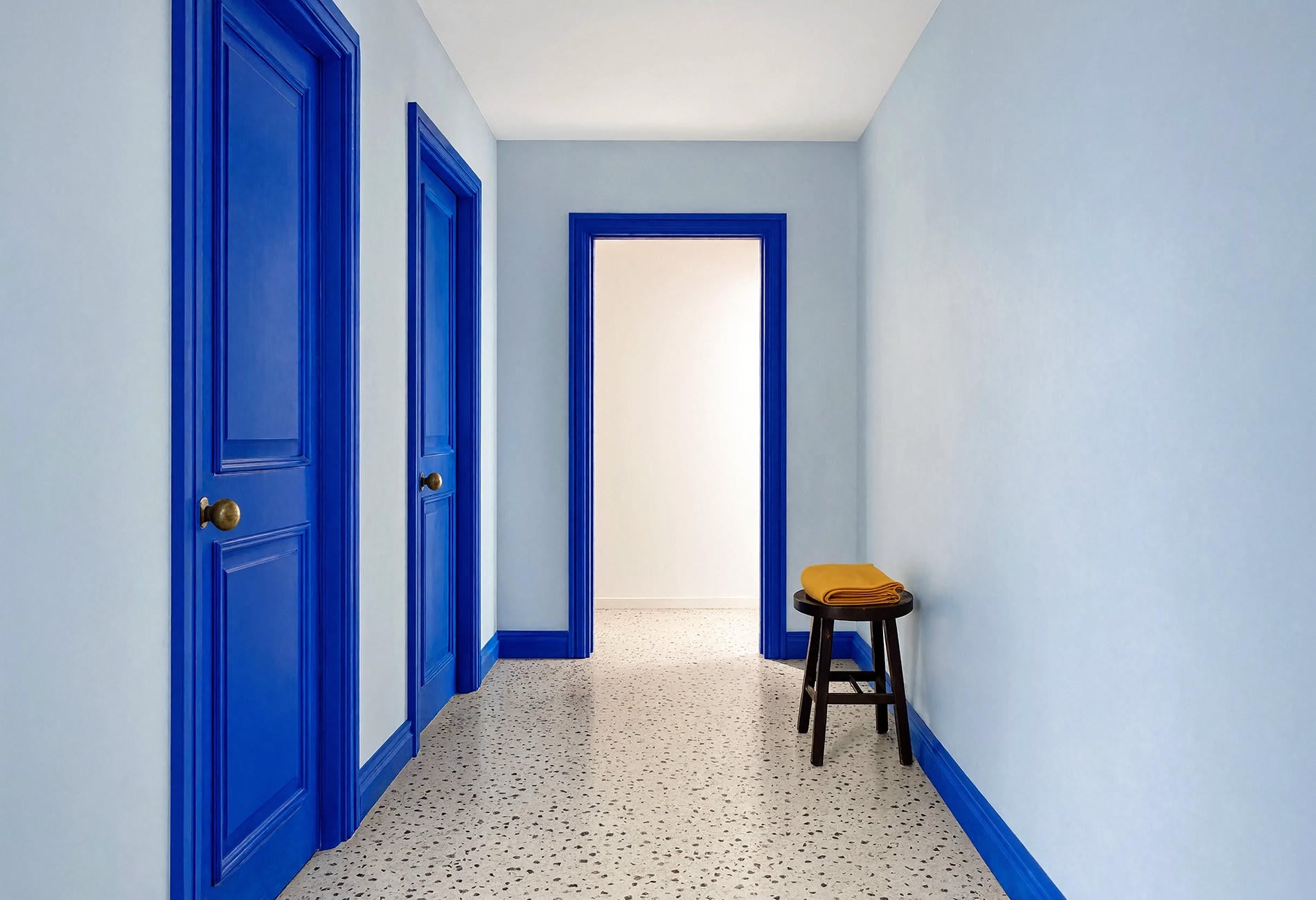
Let the Trim Decide How Crisp the Blue Feels
Set your wall sample beside four trim directions before choosing: clean white, parchment, stained wood, and the same blue in a satin finish. To my eye, each one changes the mood more than its little strip suggests.
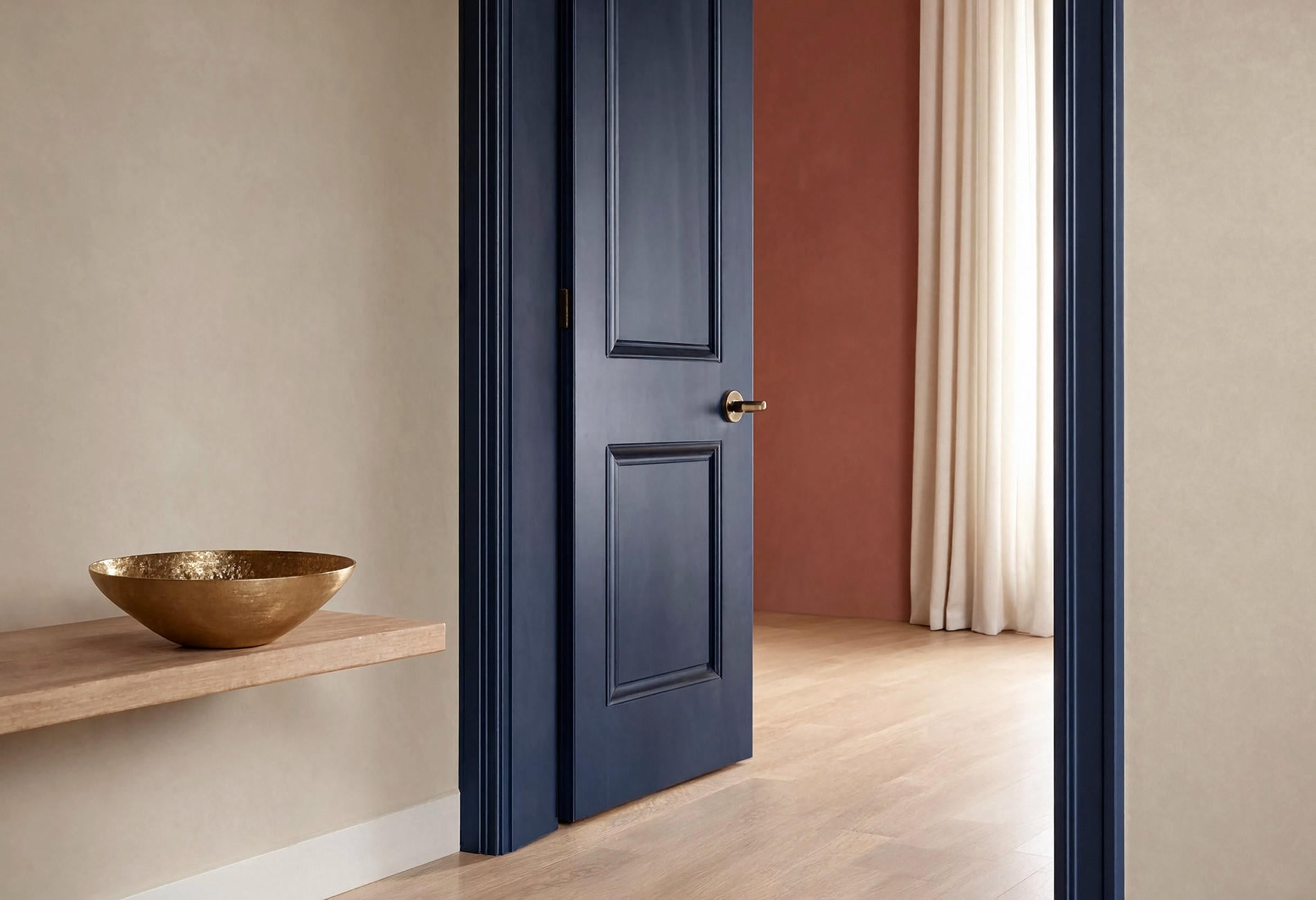
Clean white gives blue a sharper outline, which I like in bright halls with simple doors. Cream or parchment can soften navy and teal. Natural oak trim brings warmth, while color-drenched blue trim lets the corridor read as one continuous volume.
Watch undertones carefully here. A yellowed cream beside violet-blue paint may look dingy to my eye, and a blue-white trim can make a green-blue wall seem murkier. Put the samples together under the light you use most.
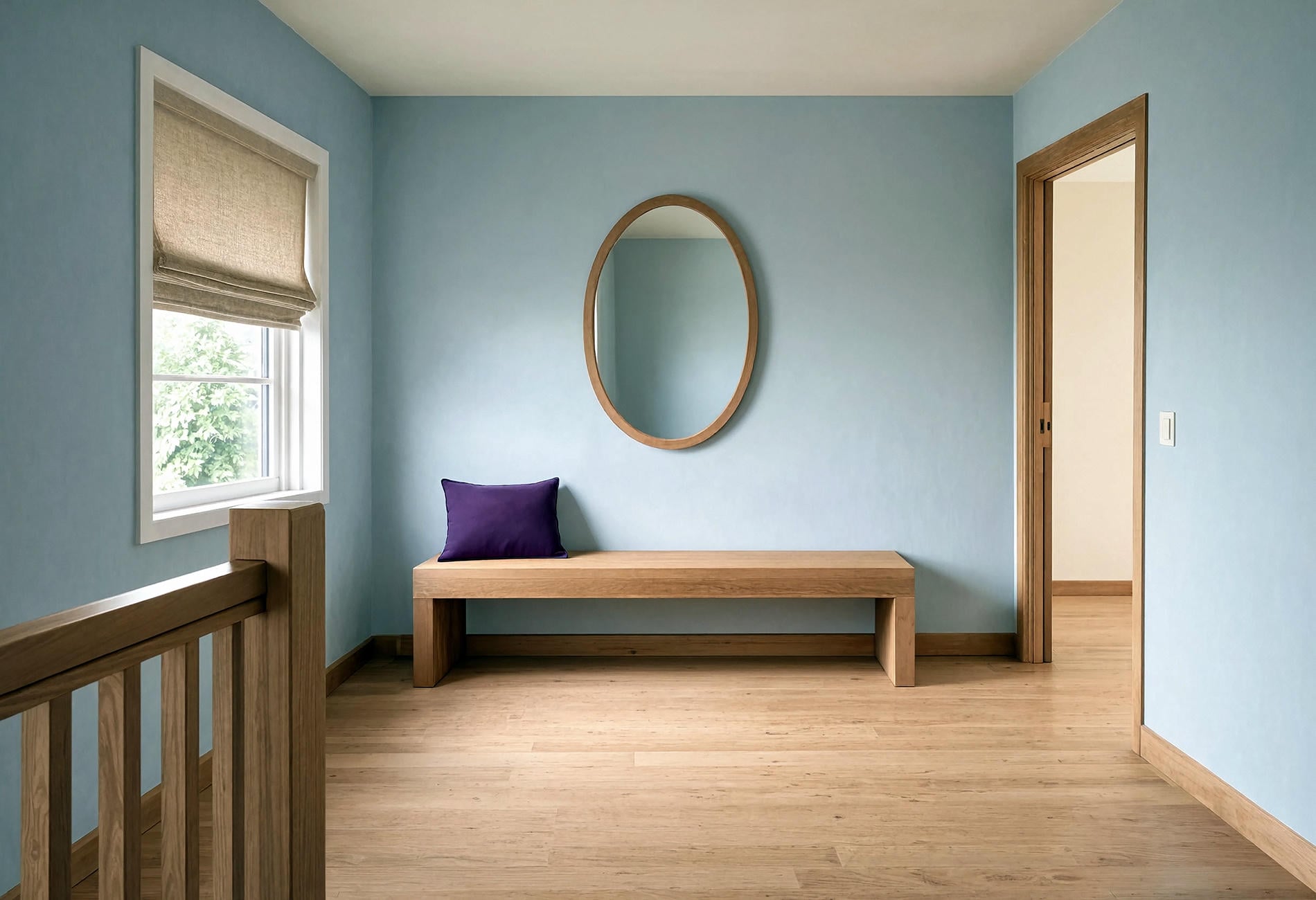
Give the Landing a Different Kind of Pause
At the top of the stairs, the view often opens just enough for color to breathe. A sky-blue landing with a wide oak bench or one large mirror can feel like a small destination instead of leftover floor between bedrooms.
Keep the furniture shallow and the path clear. One substantial piece gives the landing a job; a collection of tiny tables turns it into an obstacle course with aspirations.
If the stair wall is navy, let the landing shift several steps lighter within the same blue family. The change will feel connected as long as the trim, flooring, wall finish, or rail carries through. I prefer that tonal handoff to matching every blue exactly, which can make the route feel oddly staged.

Use Pattern Underfoot When the Walls Stay Quiet
On warm wood stairs, a broad teal-and-bone runner can bring color through the hall without asking the walls to do everything. Keep the pattern large enough to read from the bottom step; tight motifs can dissolve into visual grit at a distance.
Safety and fit matter more than the pattern. A stair runner should be measured and secured by a qualified flooring professional so it lies flat and works with your particular treads. Enjoy choosing the stripe; let the pro handle the part where gravity gets a vote.
With patterned stairs, I'd keep nearby walls to mineral blue, warm white, muted clay, or parchment. Pick one related color from the runner and repeat it once on a door or landing wall. Then stop.
Light the Dark Turns, Not Just the Ends
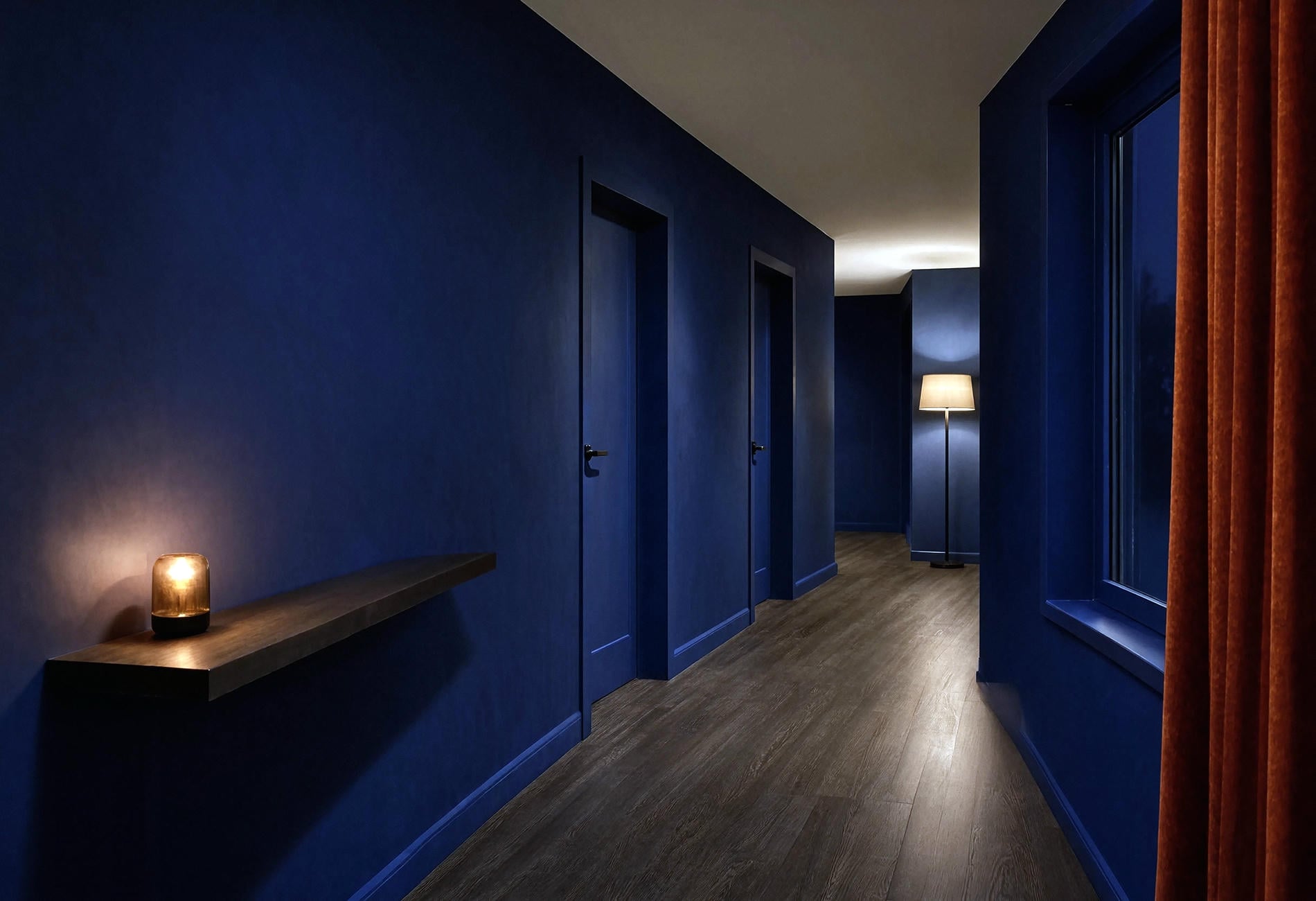
In the evening, a long hall can have a bright pool near the entry and a murky middle where navy turns almost black. Move a rechargeable lamp or plug-in floor light toward that middle section and watch the paint regain its color.
Light should reveal the wall surface without producing a row of harsh hot spots. I like a soft shade that spreads a warm glow across matte paint, especially near a stair turn where a single ceiling fixture may leave deep shadows.
And keep your practical lighting comfortably bright for movement. Mood is lovely. Missing the last step is less poetic.
Blue Hallway Questions, Answered
What is the best blue paint for a hallway?
The best choice is a blue that holds its character in the darkest section and works beside your flooring, trim, doors, and nearby rooms. Start with large samples of pale blue-green, slate, clear navy, and smoky denim, then view them across the full route.
How do you lighten a dark blue staircase?
Add contrast through lighter risers, a broad runner, pale trim, or warm wood, depending on the stair. Rechargeable lamps and plug-in lighting can also reveal the paint color in shadowed turns without requiring electrical work.
What color trim goes with blue hallways?
Clean white looks crisp, parchment feels softer, stained oak adds warmth, and blue-on-blue trim creates a continuous effect. Test the pairing in your own light because the wrong white undertone can make the wall look greener or more violet.
Can the hallway and staircase be different shades of blue?
Yes. Keep one shared element, such as the trim, rail finish, flooring, or undertone, and the transition can feel intentional. A deep stairwell opening into a lighter landing often has more life to my eye than one exact blue used everywhere.
You don't owe a hallway safe white simply because it connects the interesting rooms. Paint the passage blue and let the stairs be dramatic. It's your house, not an airport corridor.