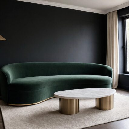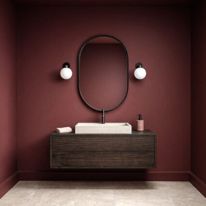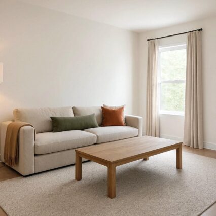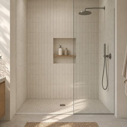
The paint didn't betray you. The surprising part is that it may be perfectly consistent while looking blue on one wall and oddly beige after dinner.
Paint color isn't a still picture. Your view of it changes with daylight direction, the hour, nearby finishes, and the lamps you switch on at night. A chip held under bright store lighting has met almost none of the conditions that will shape it at home.
So I don't choose paint from chips. I use large movable sample boards and follow them through the room's ordinary lighting cycle like a mildly suspicious detective. The method costs little compared with repainting and, to me, tells you much more than a memorized rule about which undertone is "supposed" to work.
The Wall Is Part of the Test
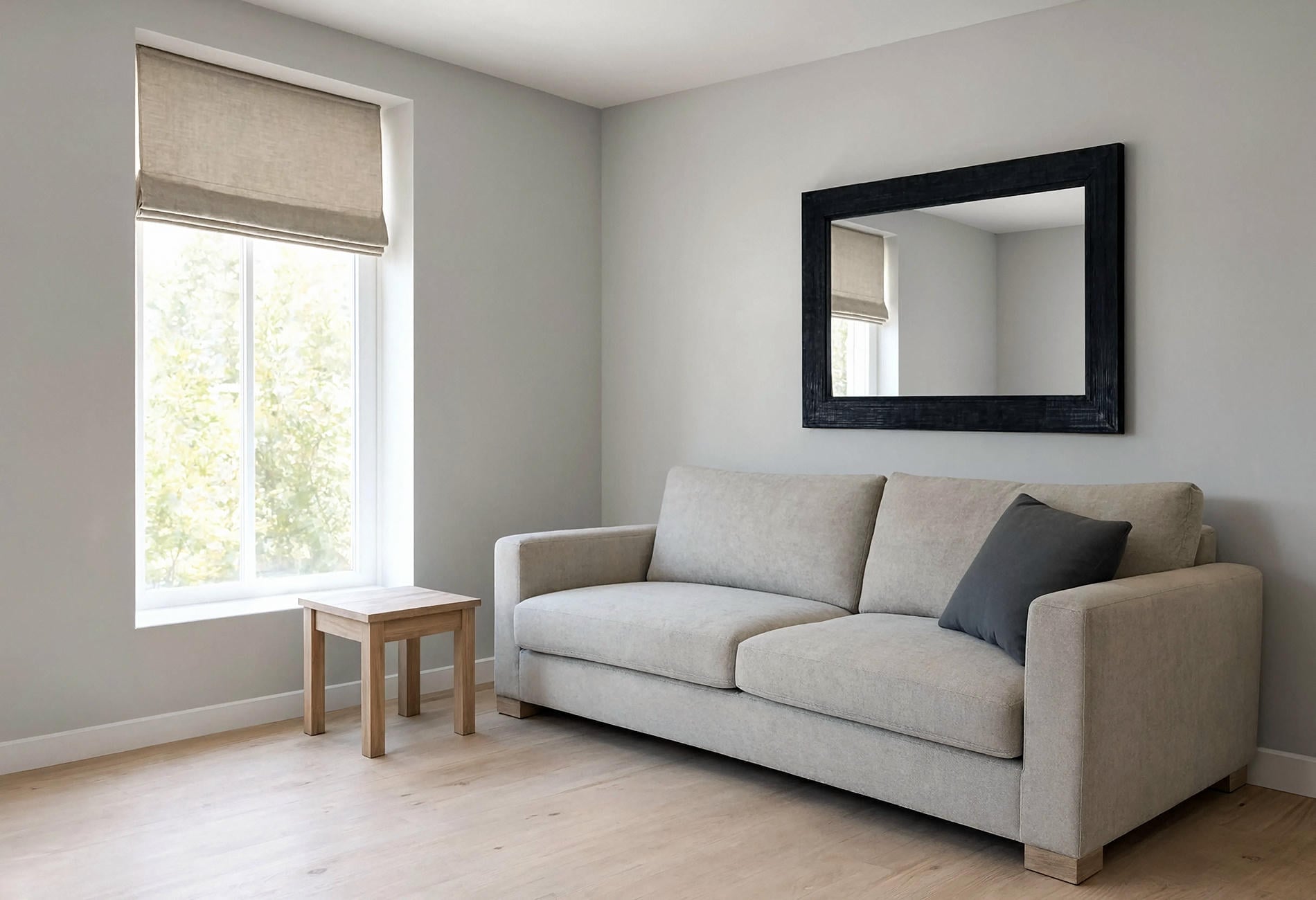
A color can appear different on two walls in the same room because each plane receives light from another angle. One faces the window, one catches a narrow side glow, one sits behind the sofa, and one spends most of the day in shade.
Move the same painted board between those positions. Don't paint four little rectangles directly on the wall and assume you're comparing the color fairly; the existing paint around each patch can influence how the sample looks to your eye.
I also hold the board beside the floor, trim, largest fabric, and countertop or fireplace material when present. Those are the colors the paint will live with, and a warm oak floor may make a cool undertone seem more obvious.
No single position gets the final vote. You're looking for the color that behaves acceptably across the room, including the corner where daylight goes to sulk.
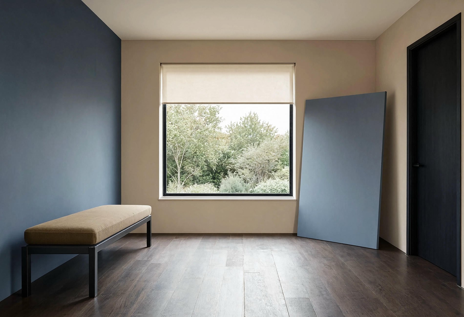
North-Facing Rooms Reward Deliberate Warmth
To my eye, north-facing daylight can make blue, green, gray, and violet undertones more noticeable, especially on overcast days. A pale neutral that looked creamy elsewhere may feel cooler here.
That doesn't mean a north-facing room needs yellow paint. I often prefer a softened warm white, muted mushroom, pale clay, or gray with a gentle red-brown undertone. Test them beside the actual flooring and fabric rather than chasing a generic online list for a cool-facing room.
Color lovers can lean into the coolness instead. Mineral blue, dusty lilac, deep teal, or eucalyptus green may feel wonderfully atmospheric when you choose the effect on purpose. For my money, intentional cool color is much better than a timid neutral that keeps trying to become blue behind your back.
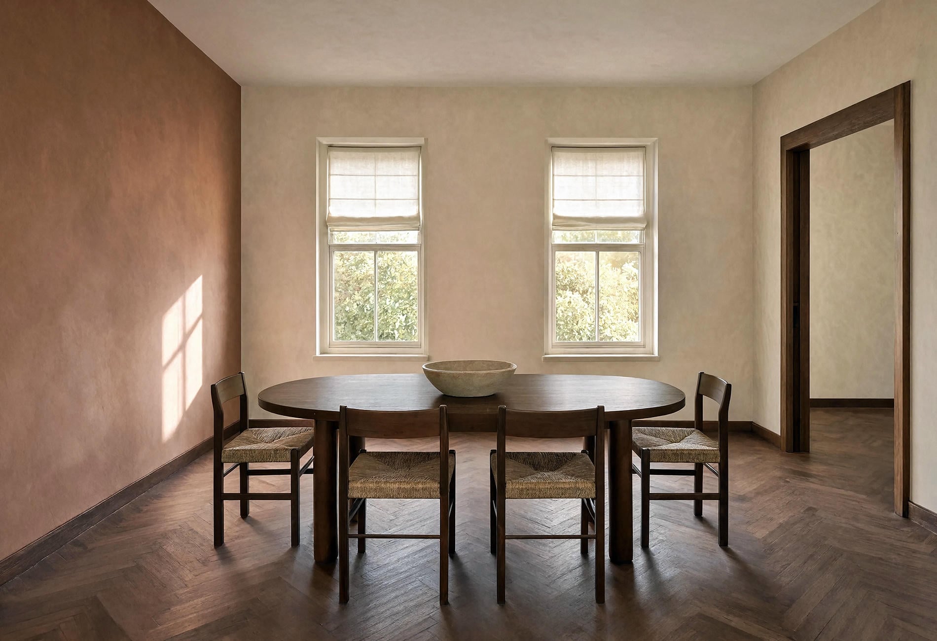
South-Facing Light Can Expose Hidden Warmth
Across the day, a south-facing room may receive stronger warm light, depending on season, time of day, window placement, and what sits outside. Creams can look richer and clay notes may come forward. Some pale colors can feel brighter than expected.
Place the board where direct light lands and where it doesn't. If the color only works in the sunny patch, it hasn't passed the room. A sofa wall in shade deserves equal attention because that may be the surface you look at most.
When comparing south-facing paint colors, I like to include one option that seems slightly quieter on the chip. Bright daylight can give a restrained color more presence to my eye. Still, your windows and surroundings get the deciding vote; a leafy tree or deep porch can change the room's light considerably.
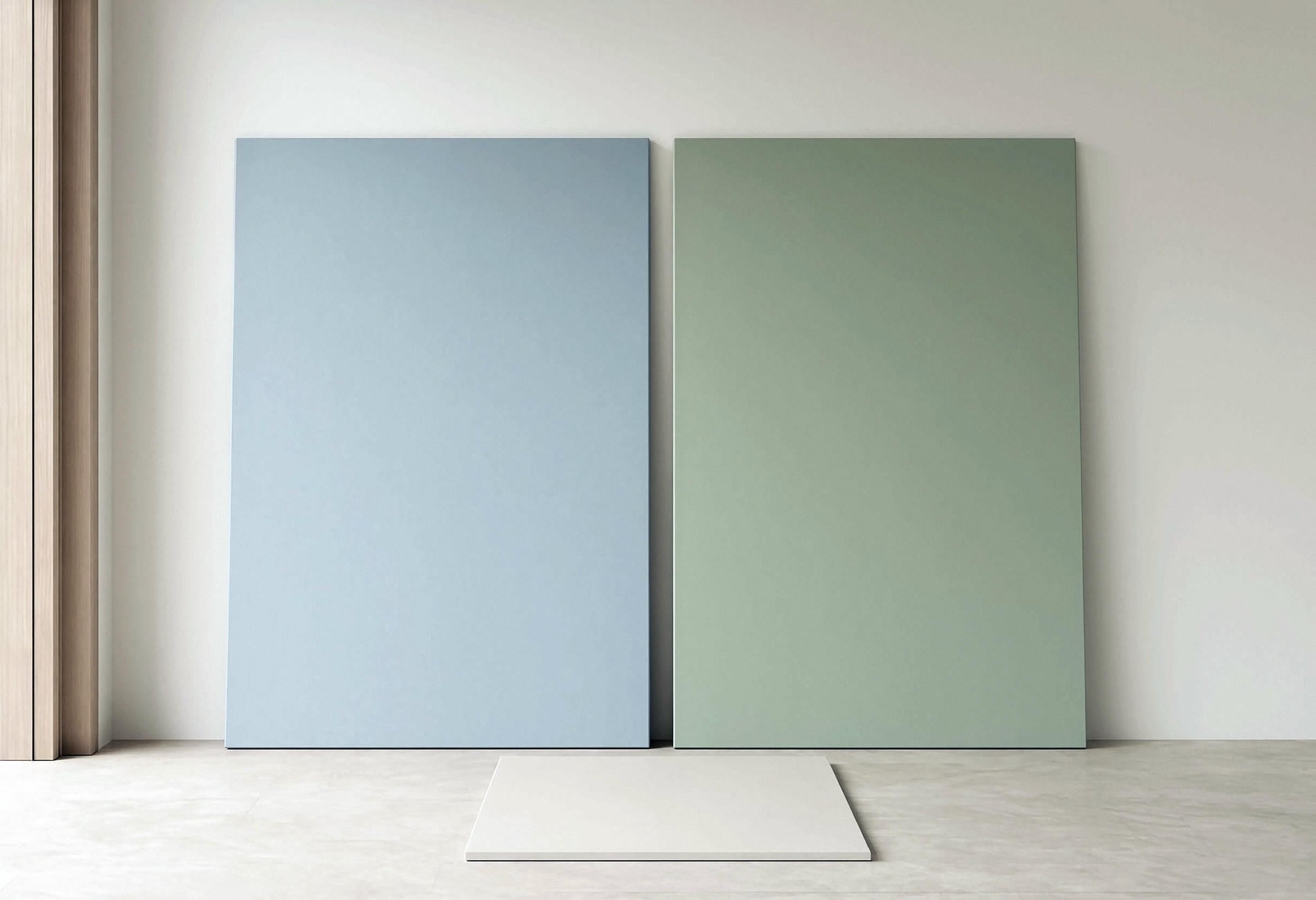
Gray Usually Has More Color in It Than You Think
A gray may look blue when its blue undertone becomes more visible under your room's light or beside warmer finishes. What reads as gray on a chip may lean blue, green, violet, or brown once you see it at home.
Put the gray sample beside plain white paper, then beside the floor, trim, and largest fabric. The white can help reveal its color bias, while the room materials show whether that bias belongs. This is observation, not a laboratory verdict.
And compare it with a second gray that leans differently. The first board may look neutral alone and unmistakably blue beside a green-gray. Paint samples are a bit like relatives at a wedding: their personalities become clearer in company.
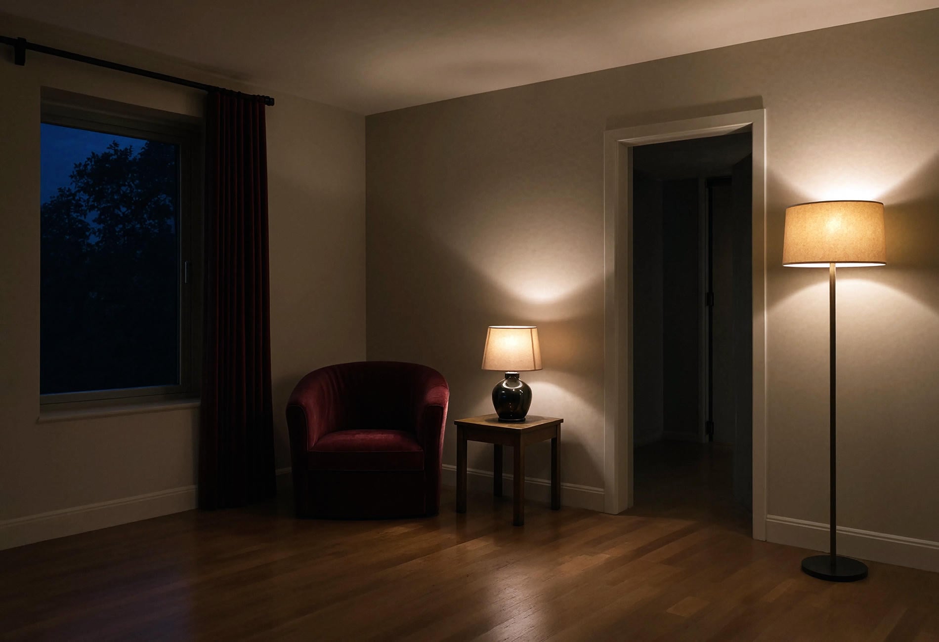
Artificial Light Gets a Separate Audition
After sunset, the same paint can look flatter, warmer, cooler, or more saturated depending on the bulb, shade, fixture position, and surrounding surfaces. That's a long way of saying you must check it after dark.
Use the lamps you actually live with. A shaded table lamp may spread a soft warm pool across the wall, while a bare overhead fixture can create glare and hard patches. Move the sample into both areas and notice which version bothers you.
Quick honest note: I'm not an electrician, and nothing here is professional advice. Any hardwired lighting work belongs with a licensed electrician because shock and fire risks are real, and local code matters; plug-in floor lamps, table lamps, rechargeable lights, and battery fixtures let you test light placement without touching the wiring.
I would rather adjust a plug-in lamp than reject a paint color that looks lovely through most of the day. Sometimes the paint is wrong. Sometimes the room has one lonely bulb interrogating it from the ceiling.
Low-Light White Should Still Have a Point of View
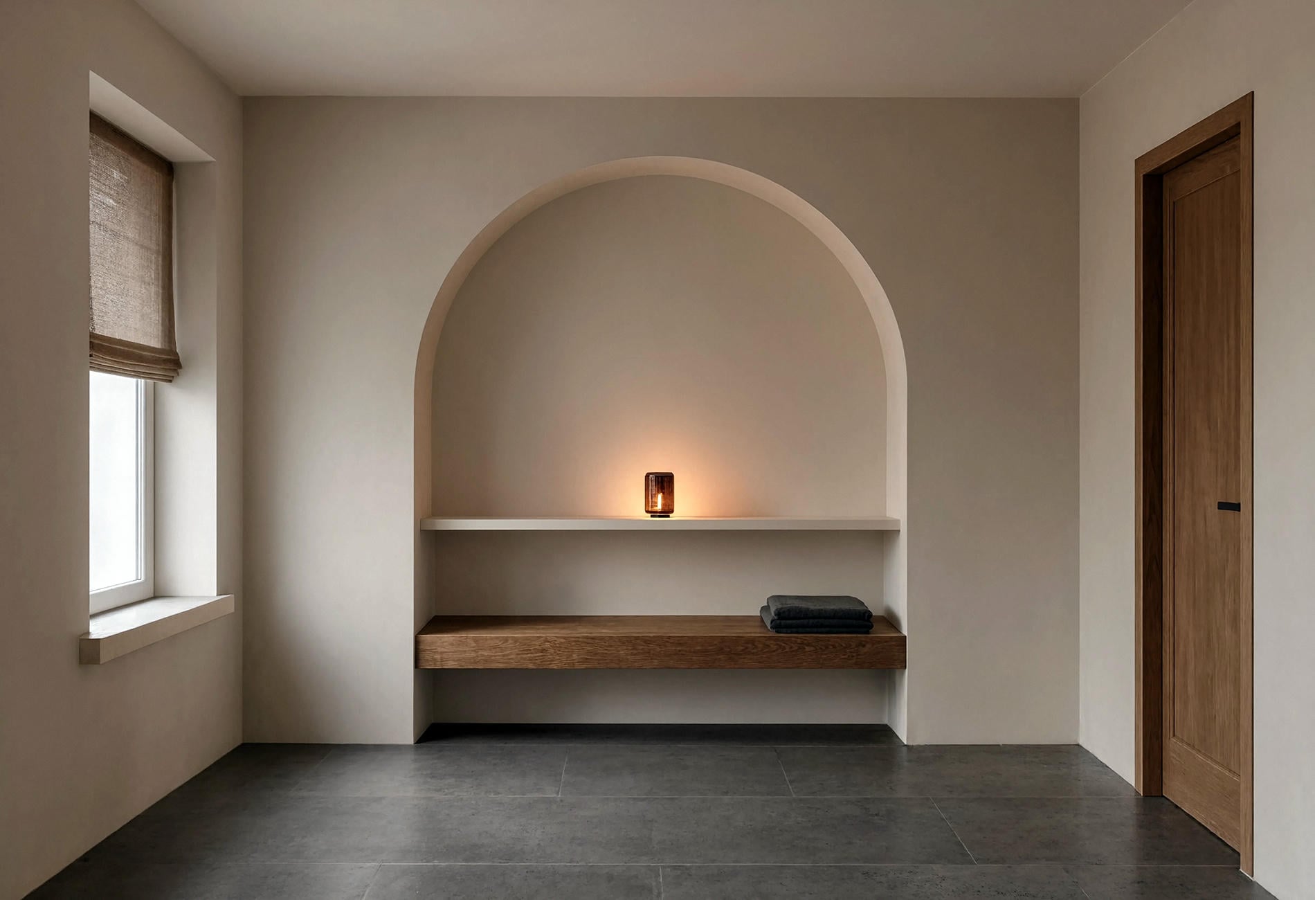
I find the phrase "bright white" misleading in a dim room because paint can't supply light that isn't there. A white may keep the room feeling gentle and open, though it won't turn a shadowy corner into a sunny one.
For low light, I'd test warm white, parchment, pale mushroom, and the faintest stone color. Compare each against the trim and ceiling; a slight difference can look deliberate, while two almost-matching whites may seem dingy beside each other.
Sheen deserves a sample too. A higher sheen can catch more glare and reveal surface imperfections, while a flatter finish may look softer to my eye. Practical needs vary by room, so test the actual finish you plan to use rather than judging color alone.
Use One Board, Four Checkpoints
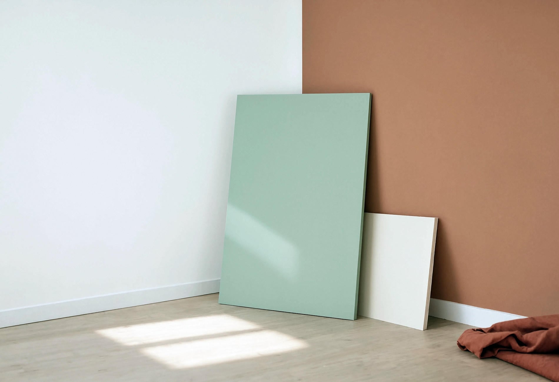
Make each sample large enough to read as a field of color, then keep it movable. I use four checkpoints: morning daylight, the room's dimmest daytime wall, early evening, and full artificial light.

At each checkpoint, ask the same questions:
- Does the undertone still feel welcome?
- Does it work beside the fixed finishes?
- Does the color hold enough depth in shadow?
- Would you want to see this version most days?
Take a quick phone photo if it helps you remember, though don't use the image to judge the precise color. Your phone may adjust brightness and color in ways that make comparisons unreliable. Let the photo remind you which board was where; let your eyes in the room make the decision.
This part is boring in the most useful way. Paint drama is much more entertaining when it stays on the wall instead of arriving as regret.
Nearby Color Can Push the Paint Around
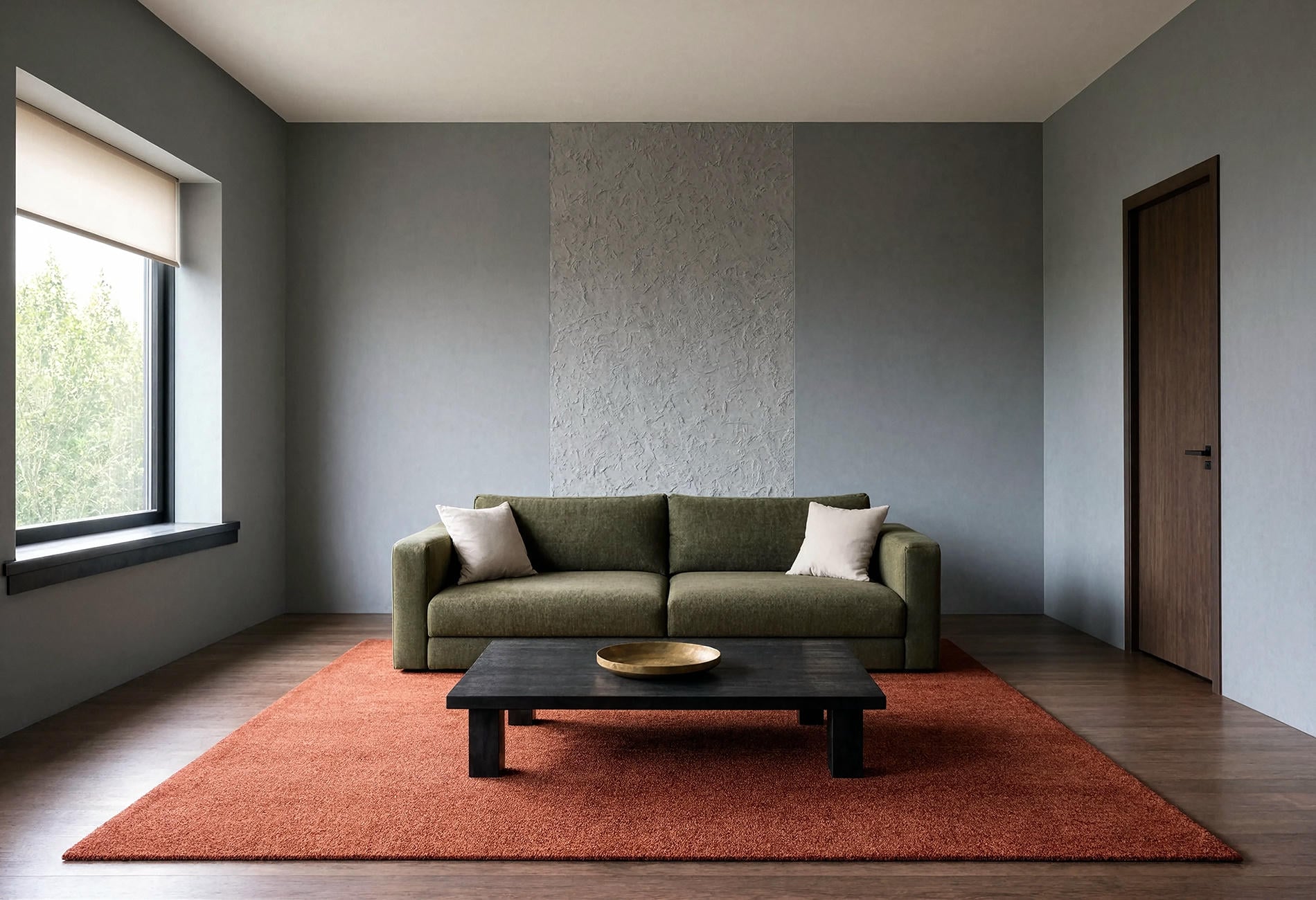
A large red rug, honey-toned floor, green view, or dark sofa may alter how you perceive the wall beside it. The paint hasn't mixed itself a new formula. Your eye is reading colors in relationship.
Temporarily place the sample near the biggest fixed color in the room. Then cover that nearby color with a plain light sheet and look again. If the wall suddenly seems less blue or less green, you've learned something useful about the pairing.
Be careful with white trim, too. A crisp blue-white can sharpen a wall's warmth, while cream may make a cool gray look cooler to my eye. Neither is automatically wrong. The question is whether you like the conversation between them.
Paint and Light Questions, Answered
Why does my gray paint look blue?
It may have a blue undertone that becomes easier to see under cool daylight or beside warm flooring and trim. Compare the sample with plain white paper and a differently biased gray, then check it on several walls before deciding.
What is the best white paint for low light?
There isn't one universal white for dim rooms. I'd test warm white, parchment, pale mushroom, and a light stone tone, then choose the one that stays pleasant beside your trim and fixed finishes after dark.
Do paint colors look different in artificial light?
They can. Bulb color, shade material, fixture position, wall sheen, and nearby finishes may change how the paint appears, so view movable samples under the lights you actually use.
How long should I watch a paint sample before choosing?
Give yourself enough time to see the sample in the lighting conditions that matter to your routine, including daytime and evening. I'd rather watch it through an ordinary light cycle than judge it during one unusually sunny moment.
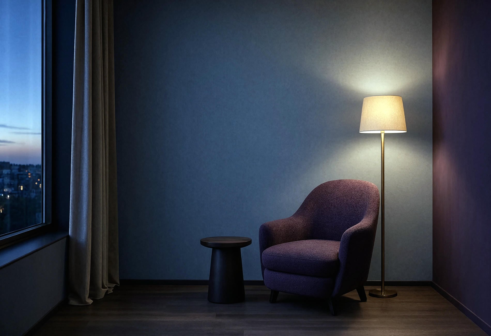
At dusk, the wall loses its last stripe of daylight and the lamp takes over. The color settles into its evening self, quieter at the edges, with a soft pool of light resting near the chair.