
Color Drenching Color Palette Ideas With Real Depth
Three paint chips are fanned across the kitchen table, and somehow the palest one looks green beside the window, grey near the door, beige at noon, and faintly ill by the fruit bowl. Paint is rude like that. It refuses to behave under a single bulb just because you have a deadline.
Color drenching raises the stakes because one hue moves across the walls, trim, doors, and often the ceiling. The payoff can be enveloping and unusually calm. The wrong undertone, though, gets a very large microphone.
My strong opinion is that the best drenched rooms aren't built around the loudest swatch. They start with a color that can carry shadow and daylight while ordinary life piles up in front of it. The palettes ahead move from pale pistachio to chocolate brown, with enough range to help you find your own level of nerve.
Color Drenching Works Best When The Undertone Earns Its Keep
The way I think about a drenched room is as a color family rather than one flat block. Use the same paint color across broad surfaces if you love that cocooned effect, then let finish and material make the quiet changes: matte walls, satin trim, slubby linen, dark timber, or chalky stone.
Small shifts matter. A green with a yellow undertone can feel garden-soft in morning light, while a blue-leaning green may turn cooler after sunset. Neither is wrong; one may simply suit your window direction and flooring better.
Before committing, paint large sample boards and move them around for a few days. Look beside the floor, behind the sofa, near the doorway, and close to the ceiling after dark. A tiny square stuck in the brightest spot is basically paint-color propaganda.
Green Palettes Can Whisper Or Go Full Velvet Curtain
Green stretches much farther than one tidy label suggests. A pistachio nook and a dark teal dining room barely speak the same language, which is exactly why the feeling has to come first: leafy lightness or smoke and depth.
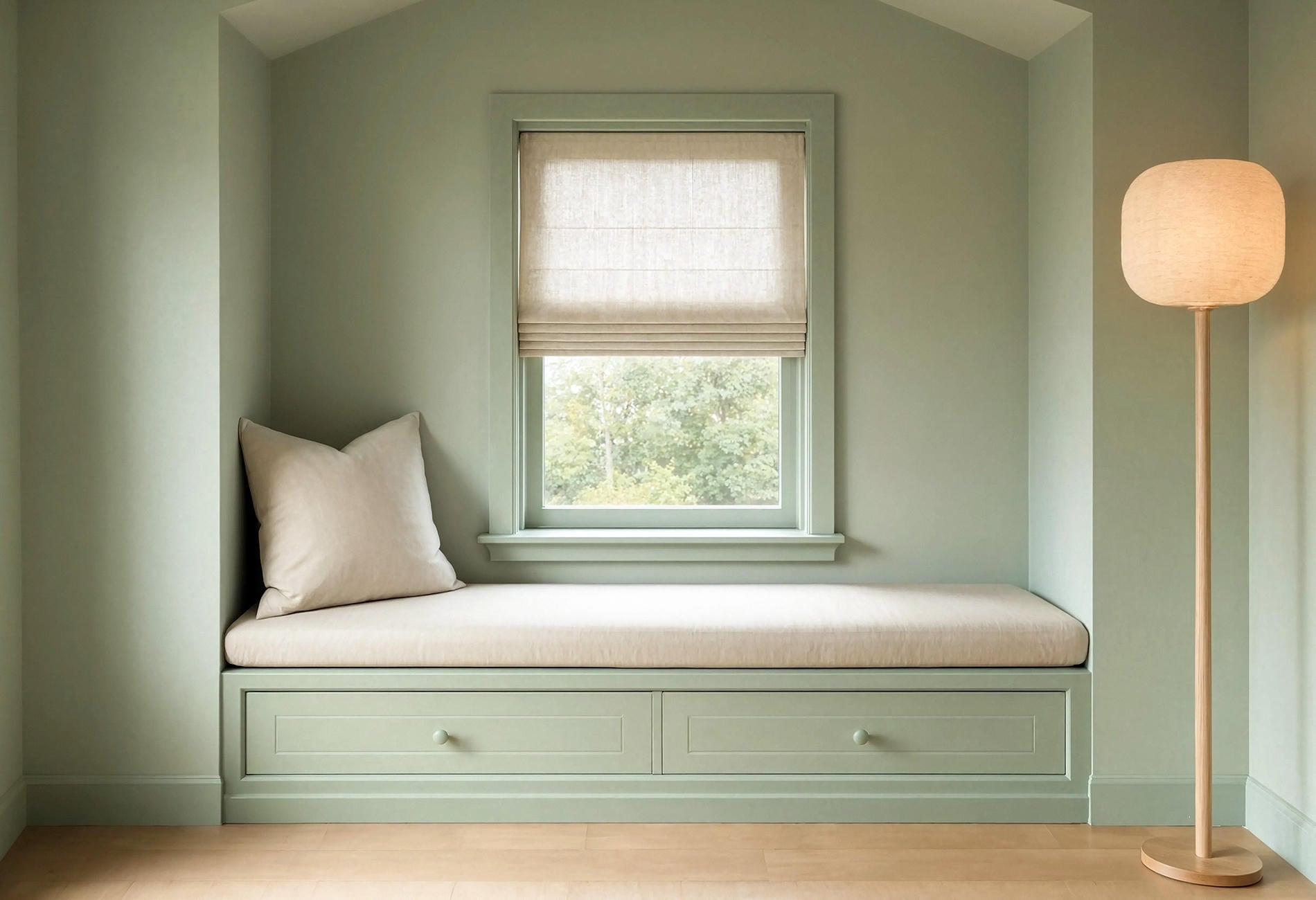
Pistachio with chalk white and pale oak
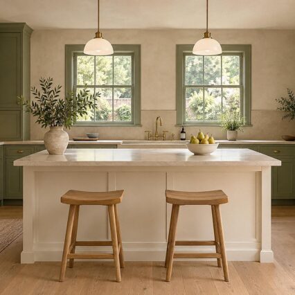
Pistachio is the breezy choice. Wrap the walls and ceiling in muted yellow-green, repeat it in satin on the trim, then ground the whole thing with pale oak and a little chalk-white textile. Keep the green slightly dusty; too much sugar and the room starts to resemble a macaron with a mortgage.
This palette suits a reading nook or breakfast room where you want lightness without defaulting to plain white. Natural woven fiber gives the color a dry, tactile counterpoint.
Olive with tobacco brown and muted blue
For a grounded green, try an olive that carries brown beneath it. Tobacco-colored leather or timber warms the scheme, while one muted-blue textile keeps the room from feeling overly autumnal.
Go easy on bright white here. To my eye, cream or unbleached linen sits more comfortably beside olive because the contrast stays gentle.
Dark teal with parchment and blackened bronze
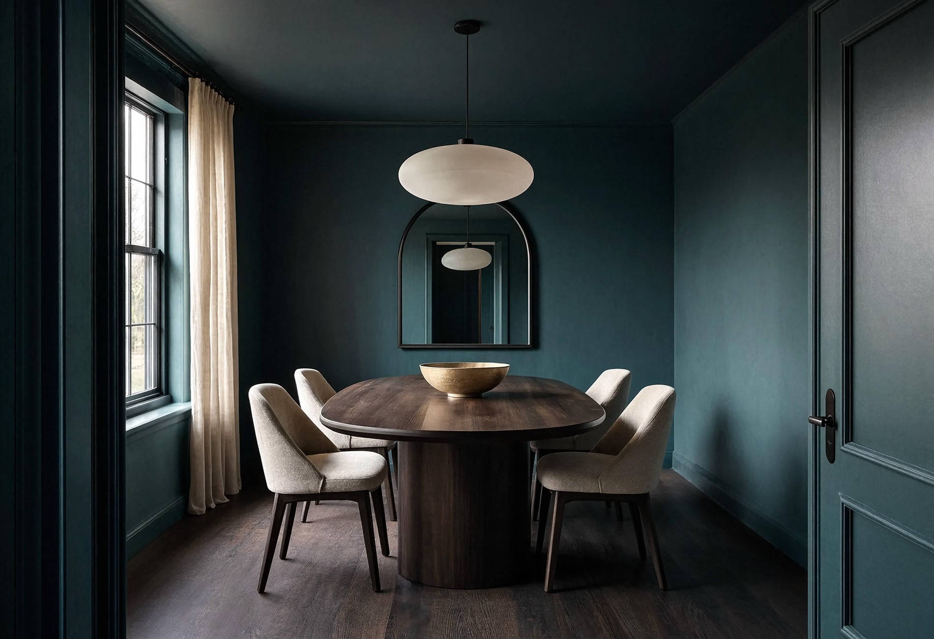
A dark teal room needs to stay visibly blue-green in low light. Parchment upholstery and blackened-bronze details give it definition, while a few broad empty surfaces let the paint carry the scene.
This one has presence. In a dining room, the same deep teal across the ceiling and trim can make lamplight feel gathered rather than scattered, though the effect will depend on your light sources and paint finish.
Navy And Cornflower Blue Create Two Entirely Different Moods
Navy lands with weight; cornflower catches light and lets it wander. Both are convincing choices, but asking one to behave like the other leads to disappointment.
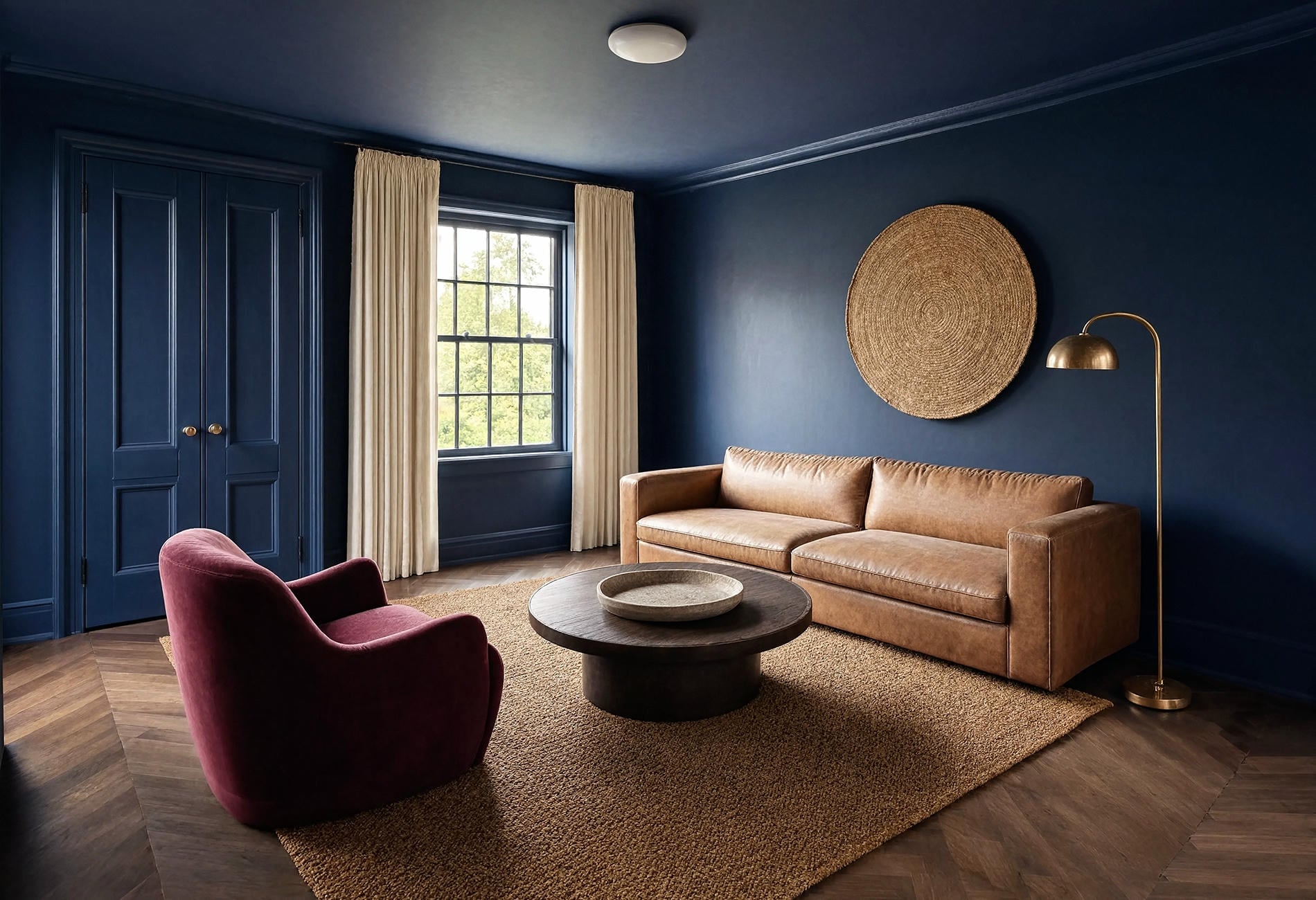
Navy with camel and warm white
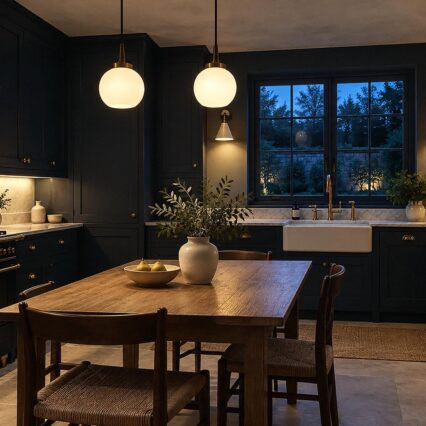
White accents can send a navy-drenched room straight toward nautical. I'd pull the scheme inland with camel upholstery and warm-white linen, then let one dark timber piece anchor it. The atmosphere shifts toward an old reading room. Mercifully, no rope on the wall.
Choose a navy that still reads blue in the dimmest corner. If the sample collapses into black by late afternoon and you wanted visible color, move one step lighter or a touch more saturated.
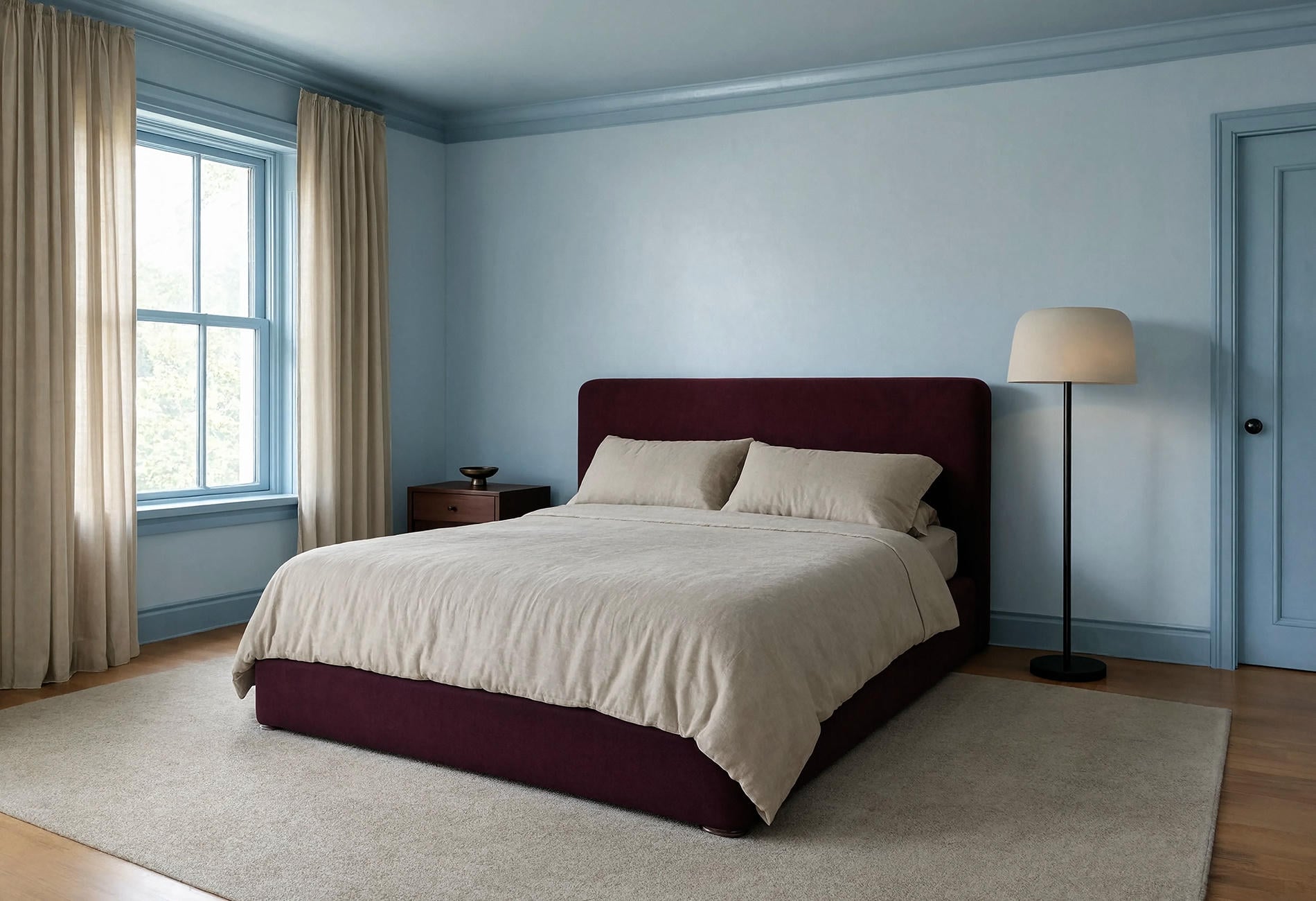
Cornflower blue with oxblood and flax
A cornflower room feels open when the paint is a little greyed rather than nursery-bright. Add one oxblood chair against flax-colored linen. That deep red-brown accent gives the blue a spine.
Sunlight on a pale blue ceiling can look almost silvery at noon. Later, as the corners deepen, the room seems to hold onto a scrap of sky.
Burgundy, Plum, And Pink Need A Little Earth In The Mix
Red-based colors can turn sugary or stagey when every supporting piece is equally sweet. Bring in brown, stone, wool, or aged metal and the room settles down fast.
Dusty pink with mushroom and smoked oak
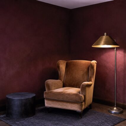
Dusty pink settles into a bedroom when the shade carries a beige or grey undertone. Run it over the walls and ceiling, use satin on the trim, then bring in mushroom linen with smoked oak for some welcome weight.
I'd keep the ceiling fully pink. A sudden white cap can make the room look unfinished, like someone remembered the ceiling five minutes before the paint shop closed.
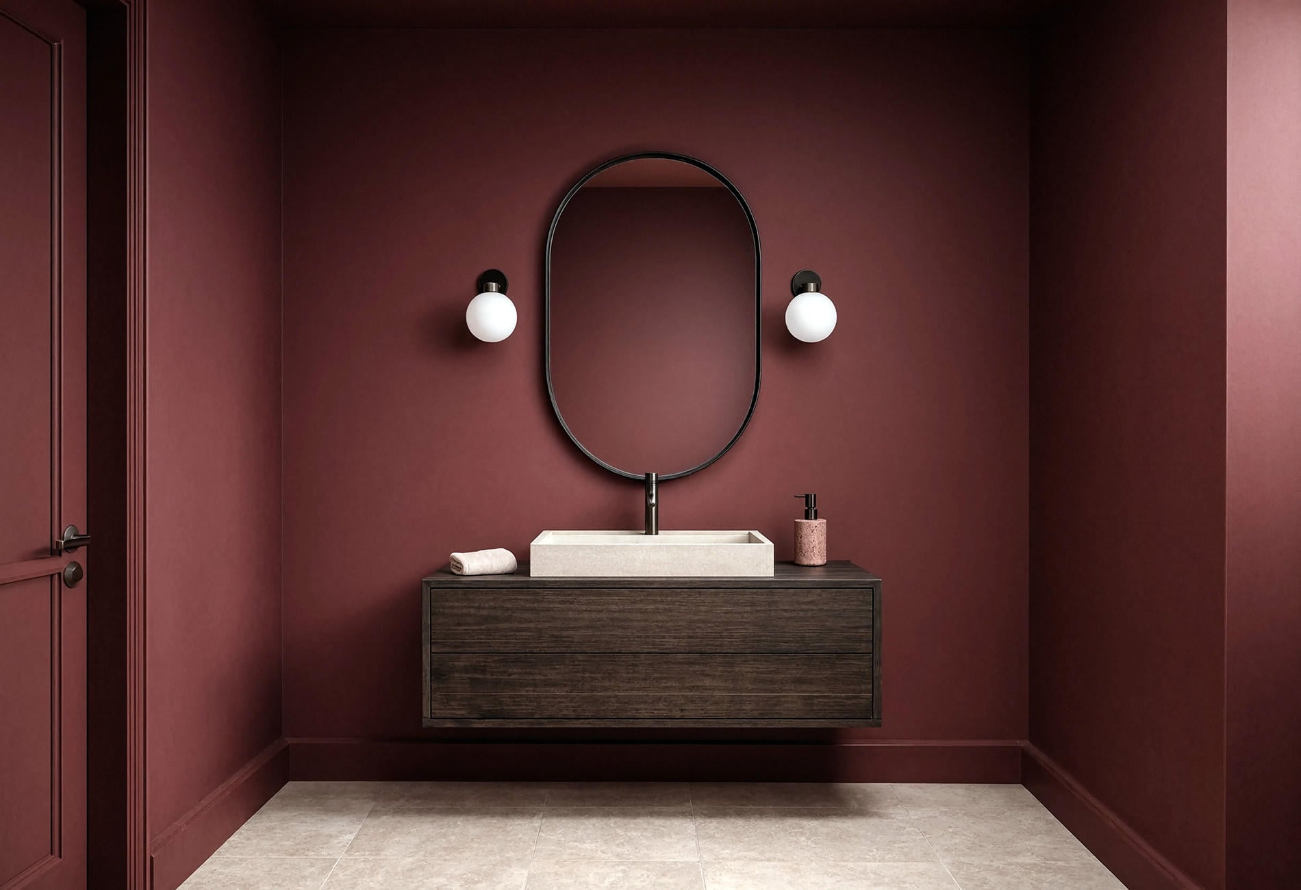
Burgundy with dusty rose and walnut
Compact rooms can carry burgundy surprisingly well because depth is already part of their charm. Dusty-rose towels or upholstery soften the wine-dark paint, while walnut gives it a familiar earthy note.
In a powder room, let the mirror and simple fittings provide clean edges. Rich color already brings drama; it doesn't need twelve tiny objects cheering from the counter.
Plum with parchment and dark bronze
A plum swatch can swing from brown and smoky to sharp violet under a different lamp, so move that sample around. To my eye, the earthier version feels settled beside parchment fabric and dark bronze; the clearer violet wants more playfulness.
It is moody. Good.
Terracotta with bone and blackened steel
Terracotta shifts between adobe warmth and pinkish clay depending on the light. I prefer the earthier end beside a bone-colored sofa and blackened-steel details. Matte paint gives that broad color field a chalky finish instead of a glare.
Late-day light will often pull more orange from the walls, while cool morning light may reveal their muted pink side. Test accordingly. The room is going to have opinions at both hours.
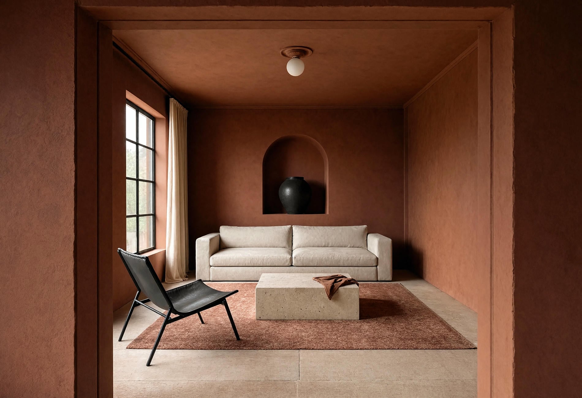
Chocolate brown with mineral blue and cream
Chocolate brown is overdue for a fair hearing. Against true cocoa walls and ceiling, pale upholstery looks crisp to my eye, and a single mineral-blue accent cuts through the warmth like a cool shadow.

Pick a brown with enough depth to feel intentional beside your floor. If the undertones fight, the room may read muddy. A sample board touching the baseboard tells you more than a heroic speech in the paint aisle.
Light Color Drenching Is Airy, But It Still Needs Contrast
Pale paint doesn't remove the architecture; it changes how quietly you notice it. Can you color drench with light colors? Absolutely, and the most convincing versions use texture, sheen, and shadow so moldings and door panels don't disappear into visual oatmeal.
Butter yellow with cream and honey wood
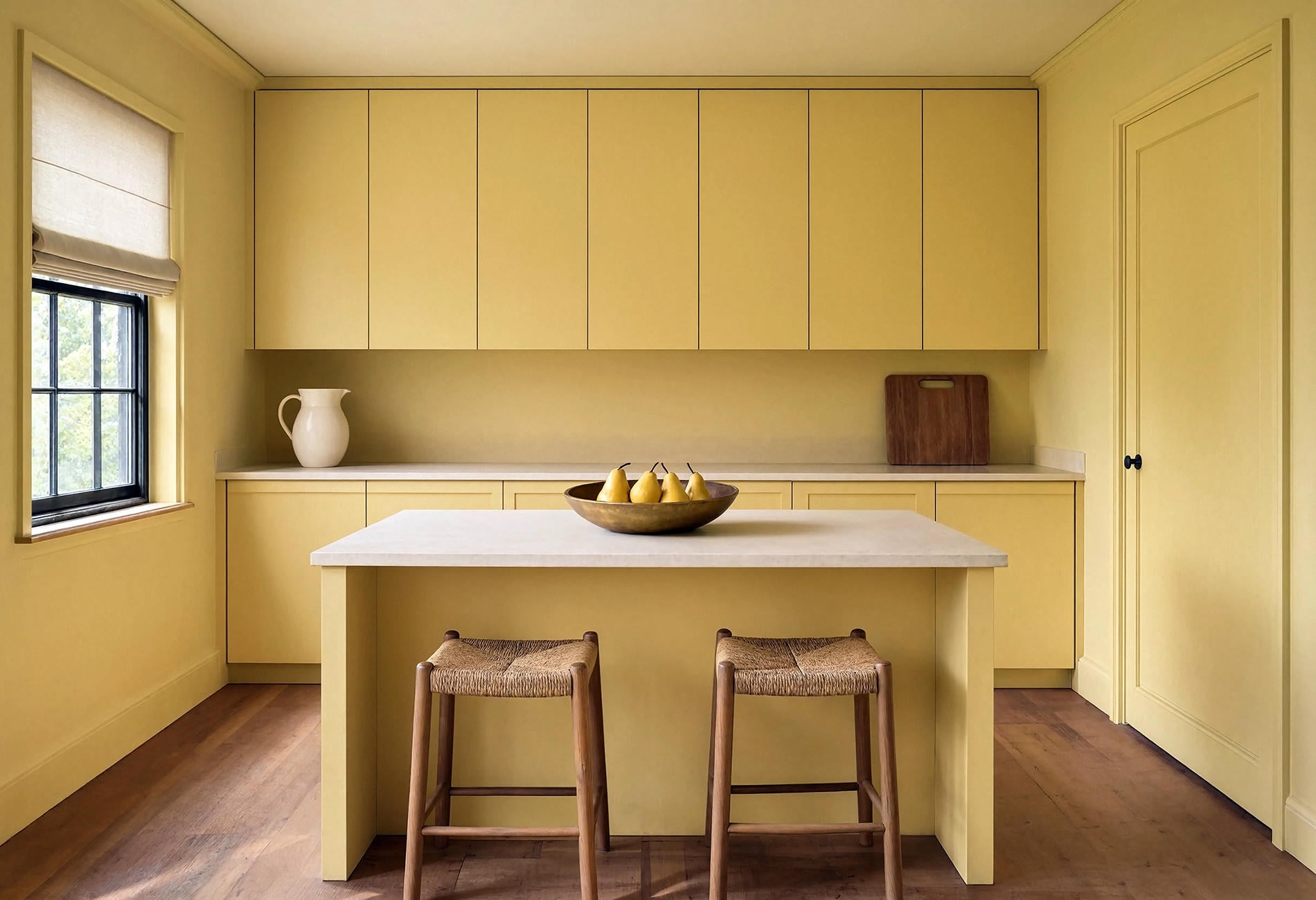
Butter yellow ought to resemble daylight resting on the walls, even on a cloudy morning. Look for a muted shade with a soft brown undertone, then pair it with cream and honey-toned wood.
Keep the yellow across the ceiling for the full effect. In a kitchen, closed-front cabinetry painted in the same family can make the room feel composed, while stone counters and woven seating interrupt the color just enough.
Warm greige with rust and limestone
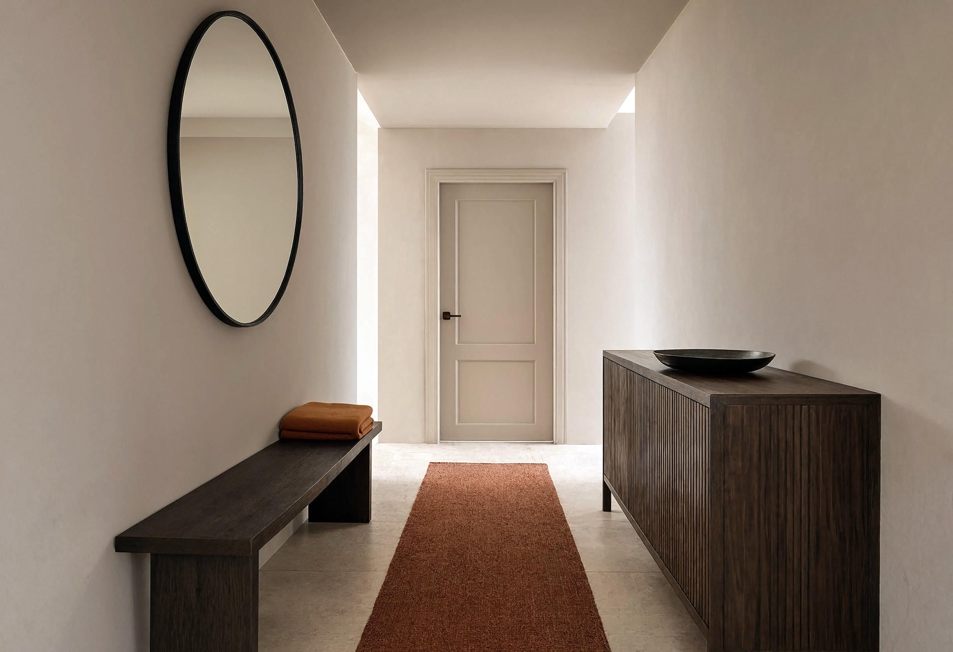
A house with several wood tones gives warm greige a real job to do. The key is warmth you can actually see. If the sample turns icy beside the floor, that chill will follow it onto every painted surface.
Rust linen and pale limestone give it dimension without shouting. And yes, greige has been badly behaved in plenty of houses, but the right one can be exceptionally useful. I remain suspicious, not unreasonable.
Choose Your Color By Mood, Light, And The Things You Already Own
Start with the room's immovable surfaces: flooring, counters, tile, or a large sofa you genuinely plan to keep. Hold your candidates beside those materials. Undertones that looked invisible on a screen become hilariously obvious next to pinkish oak or cool grey stone.
Then name the mood in plain language. For a hush, look at warm greige or pistachio; dusty pink takes that quiet in a warmer direction. Navy, chocolate, burgundy, plum, and dark teal can pull the walls closer. Terracotta glows warmer, while cornflower keeps more air in the room.
Limit the supporting palette. I like one main paint color and one grounding material; a restrained accent can come later if the room asks for it. Color drenching loses its calm when every cushion auditions for a speaking role.
Finish creates its own complication. Matte trim can look wonderfully hushed, yet in a busy hall it may show the grubby fingerprints and pet rubs of actual life sooner than you'd enjoy. Satin in the same color may be the practical compromise, depending on the paint, and that thin line of reflected window light gives doors and moldings a quiet outline.
Color Drenching Questions, Answered
What are the best colors for color drenching?
The best color is one that looks good beside your fixed materials and stays appealing through the day's light changes. For my money, muted midtones and deep colors are forgiving starting points because their undertones remain visible. Pale pistachio, butter yellow, cornflower, and warm greige can work beautifully too.
Can you color drench with light colors?
Yes. Carry a pale shade across walls, trim, doors, and ceiling, then use changes in finish and material to keep the room dimensional. Light color drenching feels especially convincing when the paint has a clear undertone rather than reading as vague off-white.
Should the ceiling match the walls in a color-drenched room?
It can, and matching the ceiling gives the most enveloping result. If that feels too intense, choose a lighter relative from the same color family; just test the transition in your own light so it reads intentional.
Does color drenching work with white?
Yes, especially with a warm white or a softly greyed one that has enough character to show shadows along the trim. White drenching can quiet a busy room and make texture more noticeable. You don't owe the ceiling a bright-white escape hatch -- paint it with the rest if that's the room you want.