Halfway down the paint aisle, an emerald chip lands beside a square of warm brass and suddenly every timid beige sample looks as exciting as cold oatmeal. That little collision explains Art Deco color better than a museum label ever could. The style wants contrast, polish, and one shade with enough nerve to hold the room.
You don't need a black lacquer ceiling or a marble foyer to get there. The most useful Art Deco color schemes pair one confident anchor with a metallic note, a calmer bridge color, and a small repeat that makes the choice look intentional. Think emerald with black and aged gold, or dusty blush sharpened by charcoal.
The restraint matters. Scatter six jewel tones around one room and it starts resembling a box of fancy chocolates after someone lost the little paper map. Give one color the starring role, and the geometry and sheen can do the rest.
Build the palette around one color that can carry a wall
Start with the largest painted field you can actually see from the doorway. That might be one wall, a ceiling, built-in cabinetry, or every wall in a small powder room. An Art Deco paint color earns its keep when it reads clearly across a broad surface rather than appearing as a handful of nervous accents.
For my money, deep colors usually carry the mood more convincingly than several metallic accessories. Emerald, navy, teal, aubergine, and oxblood all have enough visual weight to sit beside black or brass without disappearing. If that sounds intense, use the saturated shade on the lower half of a wall and let a pale upper wall give your eye somewhere to rest.
Finish changes the reading, too. A matte wall absorbs light and feels velvety; satin trim throws a narrow highlight around doorways. I'd keep the wall quieter and put the gleam on the edges. Otherwise the room can start looking slightly dipped in lip gloss.
Black, gold, and emerald make the clearest Deco statement
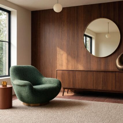
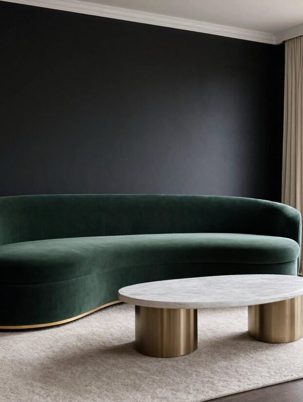
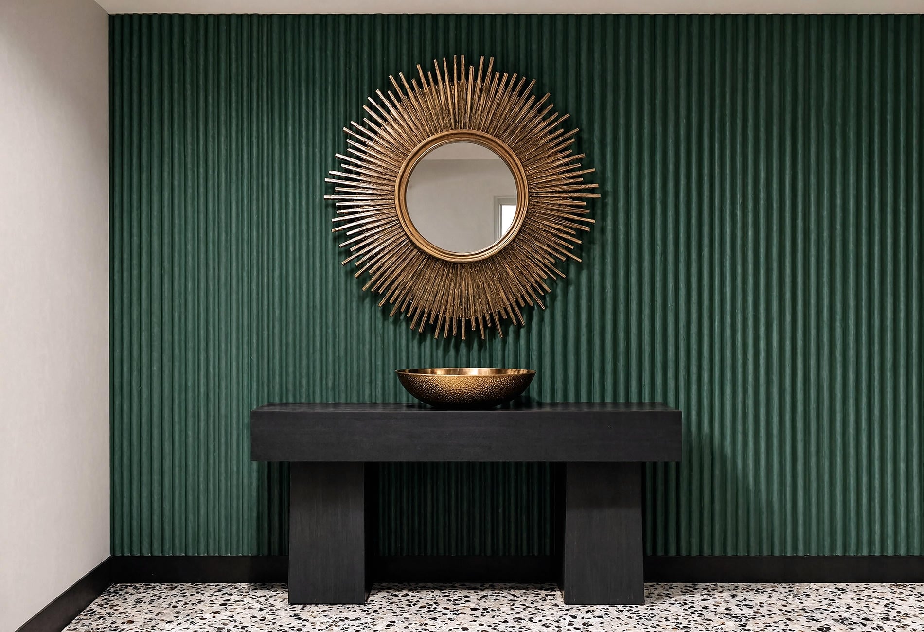
Against a black-painted door, an emerald wall looks greener. Add aged gold and both colors seem warmer, especially once a shaded table lamp comes on in the evening. This is the black and gold Art Deco combination people recognize instantly, yet emerald keeps it from feeling like a formal event venue.
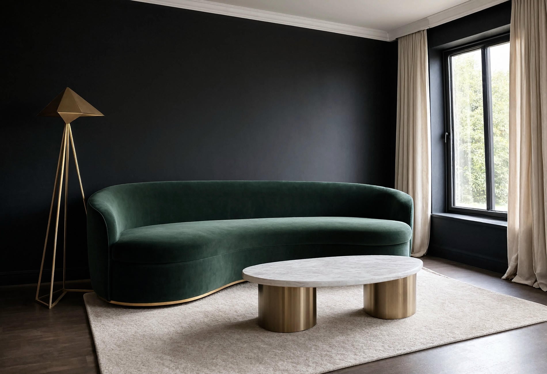
Let black define the lines: baseboards, a door, the narrow frame of a mirror, or the legs of a curved chair. Use gold at the points where light would naturally catch, such as drawer pulls and one lamp base. Tiny gold objects sprinkled everywhere feel busy to my eye; a single broad brass edge has much more authority.
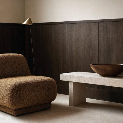
Emerald green Art Deco rooms also need a dry texture somewhere. Boucle, flat-weave wool, honed stone, or even plain cotton curtains can take the shine down half a step. That friction is good. Glamour without friction is just a showroom waiting for fingerprints.
Navy and teal offer drama without leaning on black
Late in the day, a very deep navy can read almost like ink. In morning light, the blue comes forward again. That shift makes Art Deco navy blue especially useful in a dining room, a study, or a narrow hallway where the color gets to change as you pass through it.
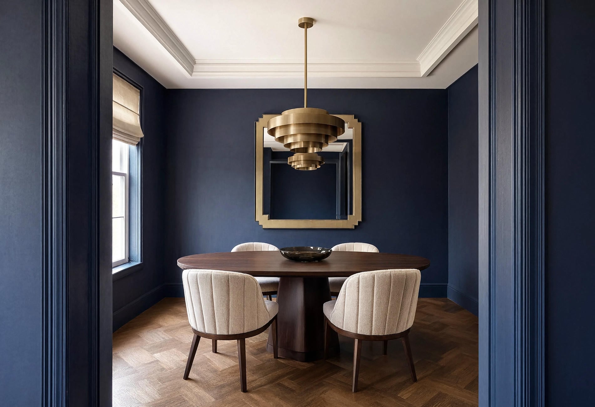
Pair navy with parchment, cream, or pale stone if you want the room to feel formal without becoming stern. Brass works beautifully here, though I prefer it in a softened finish. High-polish gold beside glossy navy can be a lot before coffee.
Teal has a stranger energy. It sits between blue and green, which means it can look cool beside gold and earthy beside walnut. An Art Deco teal and gold palette is lovely on a fluted cabinet wall, especially with a rust or saffron seat nearby to interrupt the obvious pairing.
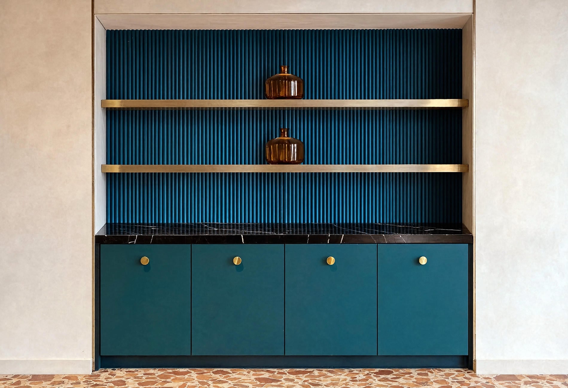
Keep the teal broad and the gold precise. A painted wall and two clean metal lines will read more clearly than a flock of little gilded objects. Your eye needs to understand the room before it admires the details.
Blush looks sharper when you give it a dark edge
Soft pink can turn sugary fast. Charcoal fixes that. Put blush on the walls, use black at the floor line or on a substantial headboard, then add one warm metallic surface and the pink becomes smoky and grown-up.
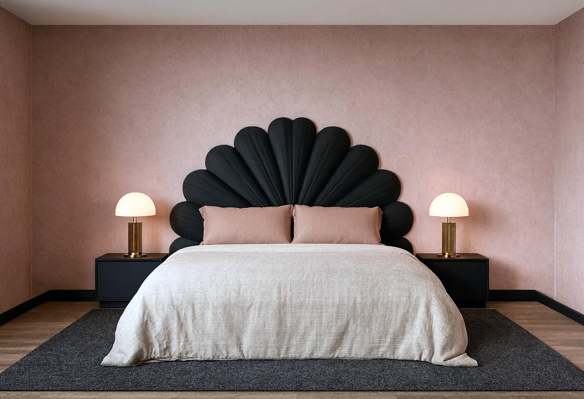
The trick with Art Deco blush pink is choosing a version with dust in it: less candy, more faded rose petal. Warm white can sit beside it, though bright white may make the blush look too sweet. To my eye, mushroom or pale putty is the better companion because it lets the dark outlines stay crisp.
And don't underestimate geometry here. A stepped mirror, channel-tufted upholstery, or a fan-shaped headboard can signal the period with no pattern at all. One strong silhouette saves you from wallpaper that looks as if it wants its own dressing room.
Plum brings depth to smaller, quieter corners
There is a patch of evening when rich plum stops looking purple and starts reading almost brown at the edges. It is gorgeous. A reading nook or home bar can hold that shadowy quality without asking an entire living room to commit.
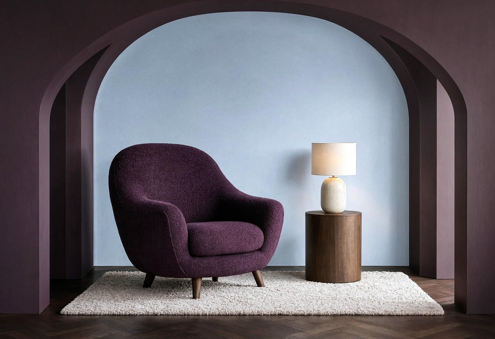
A rich plum Art Deco palette likes warm wood, muted brass, and a pale mineral color. I'd use the plum on a wall or one curved chair, then repeat it once in a small area such as piping or a lampshade. Stop there. Repetition is useful; matching every movable object feels a little too pleased with itself.
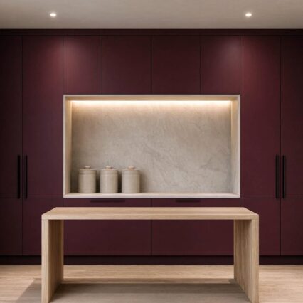
Burgundy can do similar work if purple isn't your thing. It has more red, so cream and gold pull it toward warmth while charcoal gives it a moodier edge. Test either shade through the day, because dark reds can lean brown or magenta depending on the room's light.
Silver and charcoal make Art Deco feel cool and architectural
Polished chrome catches daylight with a clean, almost watery flash. Beside charcoal paint, it feels crisp and urban. Silver and charcoal Art Deco rooms suit anyone who loves the graphic bones of the style and finds gold a little too honeyed.
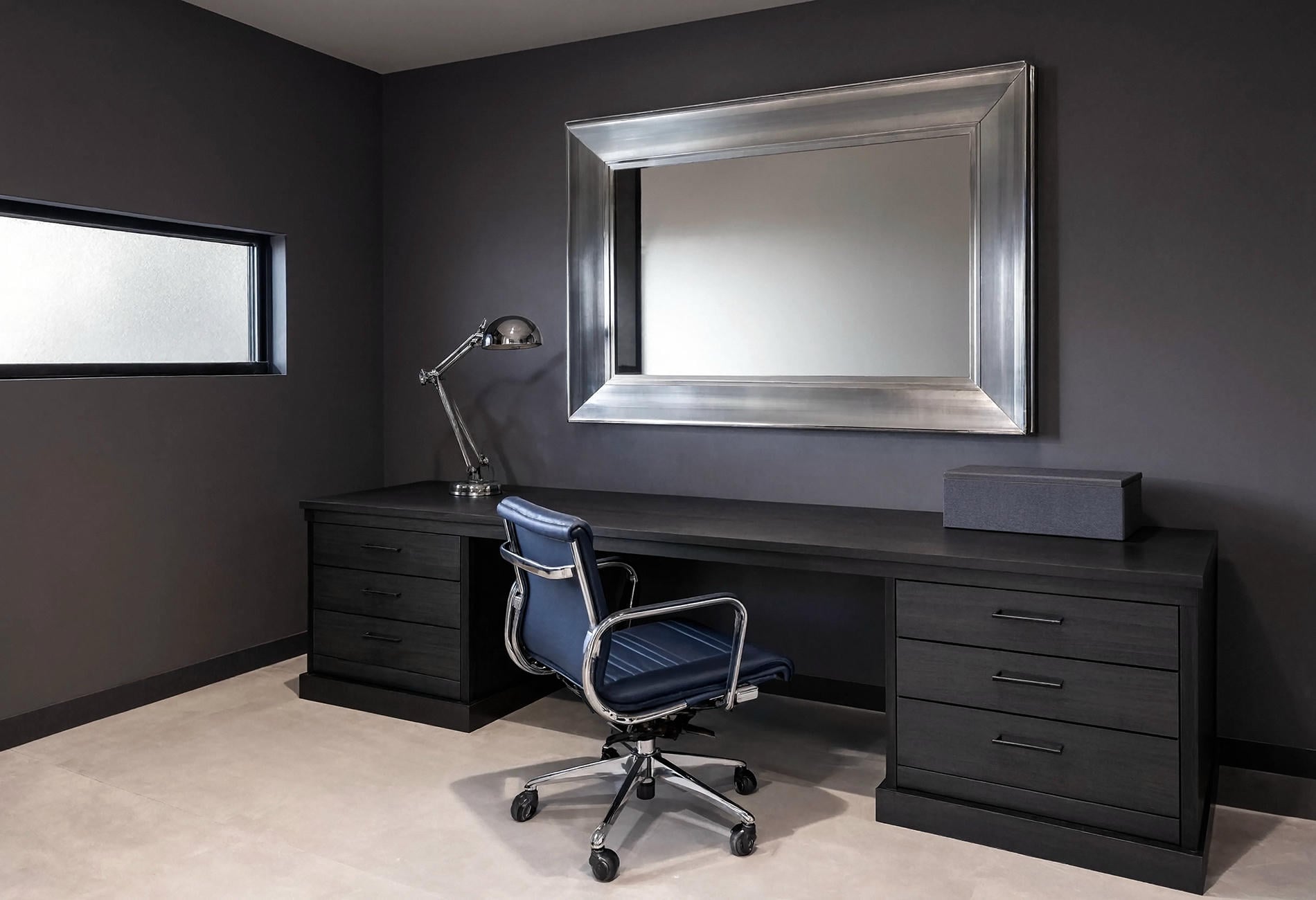

Use charcoal as a field rather than a collection of grey bits. One painted wall, one dark desk, and a broad silver mirror can establish the idea. Then bring in sapphire or icy blue as the color note. For my money, blue has more life here than another layer of grey.
Texture prevents the palette from going flat. Smoked glass, ribbed wool, and a matte painted wall catch light in very different ways. You can keep the color range narrow as long as the surfaces don't all behave alike.
Muted Deco colors work when the shapes stay confident
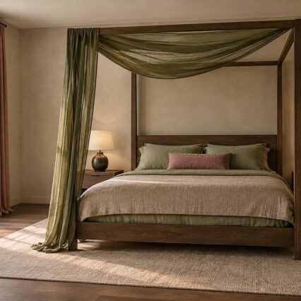
Maybe you love the fan forms and rounded furniture yet don't want your living room dressed for midnight. Muted Art Deco colors can still carry the style. Olive, mineral blue, dusty rose, tobacco brown, and parchment have enough pigment to feel deliberate while sitting comfortably in a quieter home.
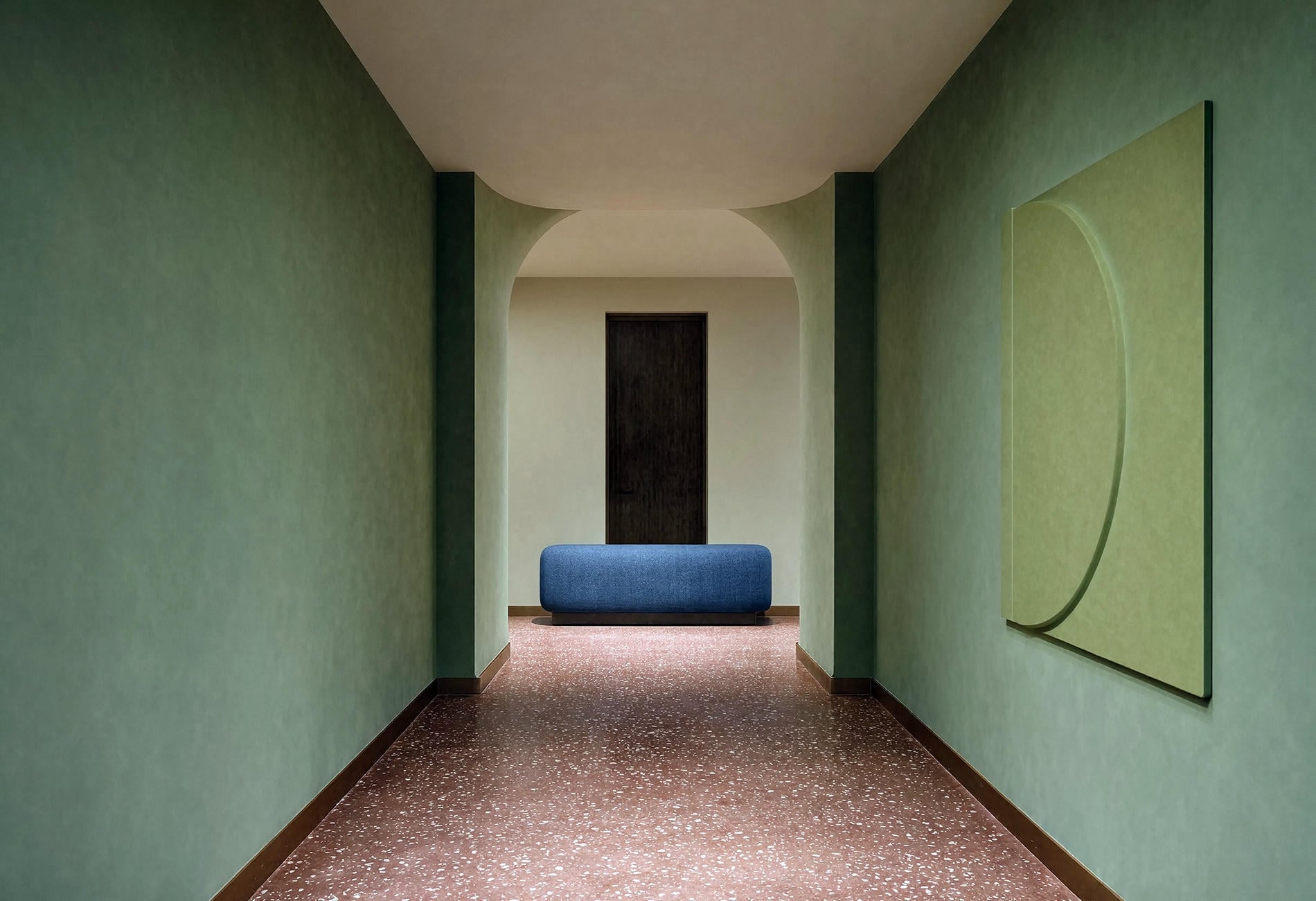
Pull the volume down on color while keeping the contrast at the edges. An olive wall beside dark bronze trim can feel just as considered as emerald with black. Add one curved bench or stepped mirror and leave some wall bare. The empty patch is doing work, even if it never gets a compliment.
This softer jewel tone color palette is also friendly to renters. A large painted panel, removable floor cloth, velvet curtain, or secondhand side table can carry the whole idea without changing the bones of the room. Choose one move big enough to register from the doorway.
Use this four-part method to make your own palette
Lay the samples on the actual floor or counter before you decide. Color changes beside timber, stone, and existing tile, and the undertone you ignored online may become the loudest person at dinner once it meets your home.
- Choose one anchor color for the largest field. Decide if you want depth from emerald, navy, teal, plum, or a muted olive.
- Pick one metal temperature. Warm brass and aged gold soften green and red tones; chrome and nickel make blue or charcoal feel cooler.
- Add one bridge neutral taken from something already in the room, such as parchment plaster, pale stone, mushroom fabric, or warm white trim.
- Repeat the anchor once in a smaller place, then stop. A cushion, lamp shade, or narrow painted edge is enough.
Move the group to three different parts of the room and look again in morning and evening light. If one sample keeps shouting, shrink its role rather than throwing out the whole palette. And if everything looks polite, deepen the anchor. Deco needs one guest who arrives wearing the good coat.
Art Deco Color Questions
What are the traditional colors of Art Deco?
Traditional Art Deco colors include black, cream, emerald, sapphire blue, burgundy, and metallic gold or silver. You don't need all of them together; a dark anchor, a pale bridge, and one metal can suggest the style with far less visual noise.
How do you create an Art Deco color palette?
Start with one saturated or smoky anchor color, choose either a warm or cool metal, and borrow a quiet neutral from the room's fixed finishes. Repeat the anchor once in a smaller detail so the scheme feels connected, then judge every sample in the home's real light.
Can an Art Deco palette be light and subtle?
Yes. Try dusty blush with mushroom and aged brass, or mineral blue with parchment and dark bronze. Keep the geometry bold and let one color cover a generous area, because pale shades still need a clear structure.
Paint the plum ceiling. Keep the cream sofa. Your home doesn't owe anybody a timid resale palette.