If you're about to scatter orange cushions across the house and declare autumn handled, pause. Persimmon deserves better supporting actors.
This color sits between ripe orange, red clay, and warm coral, depending on the light and material. In velvet it can look deep and burnished; in washed linen it turns chalkier; on a painted wall it may lean almost terra-cotta by evening.
A good persimmon autumn palette isn't a harvest display. It's a color relationship you can live with after the leaves are gone. Build it around one broad orange field, add a grounding tone, then bring in something cooler or softer so the room can breathe.
Decide which persimmon you actually mean
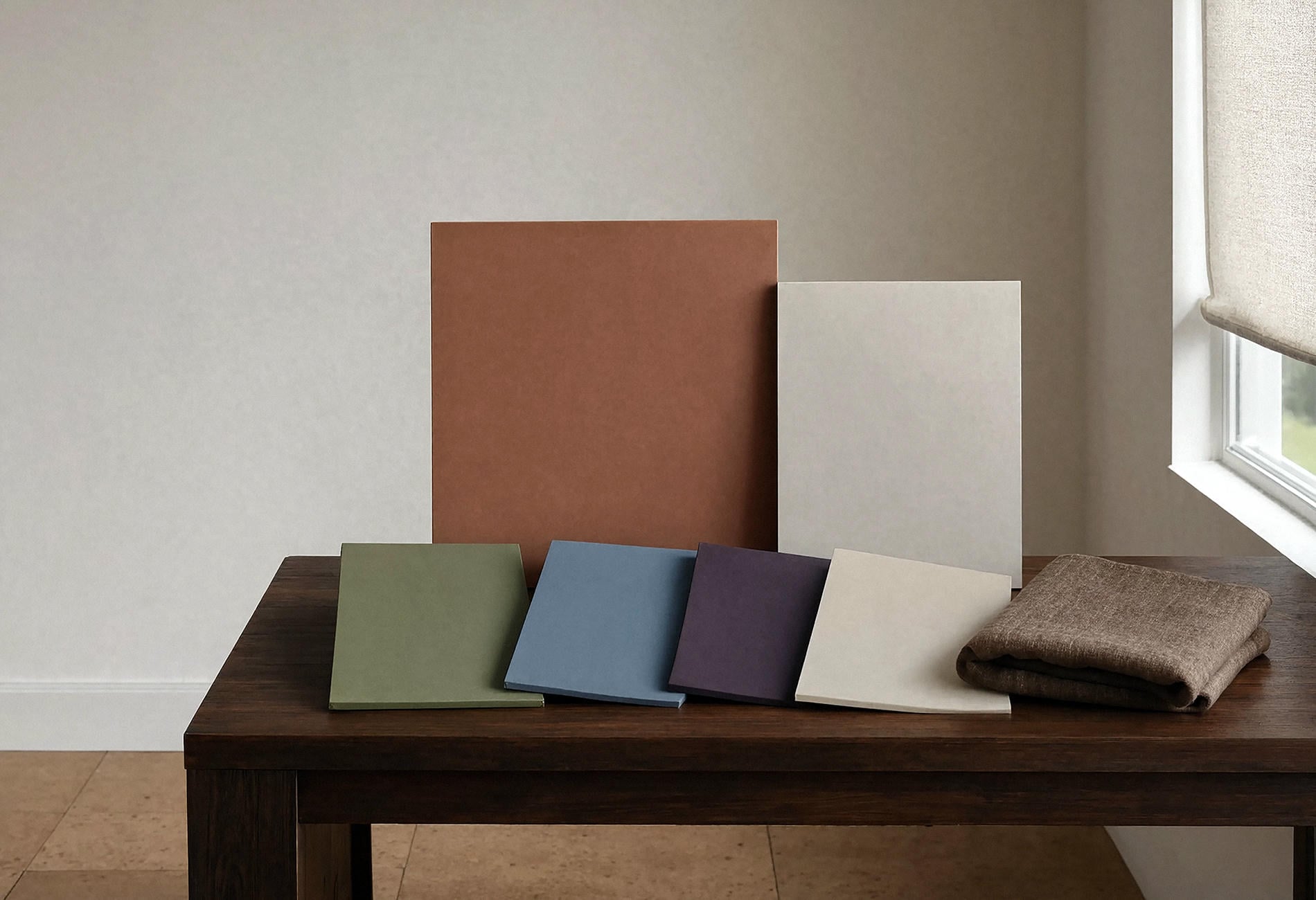
Put several orange samples beside one another and the differences become obvious. Some lean tomato red, some drift toward peach, and others carry a brown undertone that feels like fired clay.
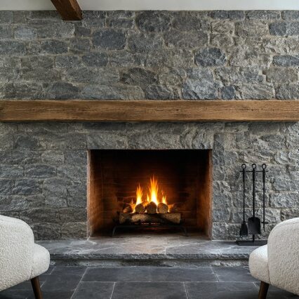
Your fixed materials narrow the choice. Honey oak tends to amplify yellow in nearby colors to my eye, while dark walnut can make a red-orange look richer. Grey stone may sharpen coral notes; creamy plaster can soften them.
Seasonal warm-orange schemes are easiest when the hero orange appears on one large plane: a sofa, coverlet, curtain, cabinet, or painted wall. Tiny orange objects scattered everywhere start to resemble a produce section that lost its manager.
Test the color in the morning and late afternoon. Orange is particularly sensitive to warm light, and a sample that feels earthy at noon may glow much more strongly under lamps.
Pair persimmon with olive for the grounded version
What colors go with persimmon orange? Olive is where I'd begin if you want the room to feel settled rather than sugary.
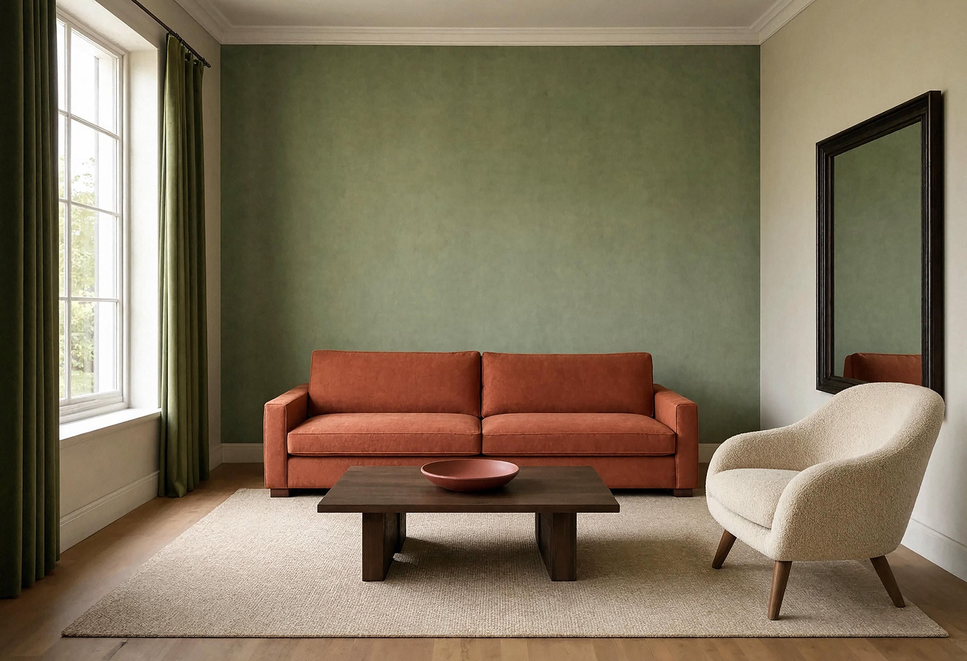
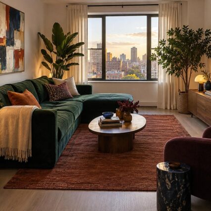
The green and orange echo foliage and fruit without requiring literal fall motifs. Use persimmon on upholstery or a broad textile, olive on a wall or rug, and let dark timber draw a line beneath both.
Add parchment or warm white in a smaller supporting role. The pale note keeps the combination from becoming dense, especially in a living room with limited daylight.
For rusty terracotta home accents, vary texture before adding another shade. A matte clay bowl, ribbed rust cushion, and washed persimmon throw may share a family while reflecting light differently. Three identical orange objects would feel more staged; actually, make that two objects. The bowl can sit this dance out.
Let blue cool the whole composition
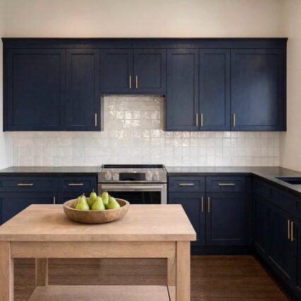
Mineral blue, smoky navy, and muted teal give persimmon a crisp edge. The contrast feels less expected than cream, and to my eye it lets the orange look sophisticated without becoming solemn.
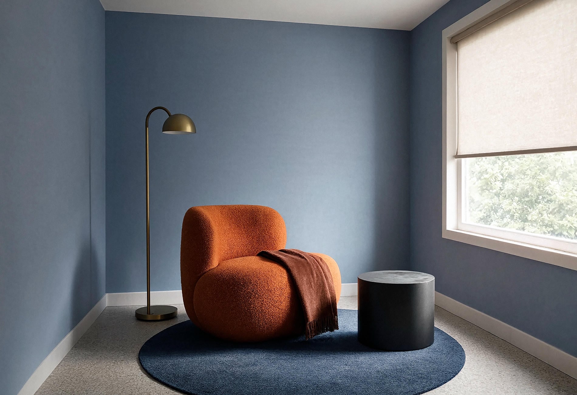
Try a mineral-blue wall behind a persimmon chair, or a faded blue rug beneath a rust-colored sofa. Keep both colors slightly greyed if you want calm. For a sharper room, use a deep blue field and one clear orange object.
Blackened metal works well as punctuation here. A lamp, slim table, or cabinet pull is enough. You aren't outlining a cartoon.
This pairing can carry from October into spring because neither color depends on leaves, gourds, or seasonal wording. It reads as a room first.
Use plum and dusty rose when you want depth
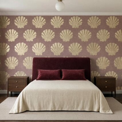
Persimmon beside plum can feel almost edible: figs, citrus peel, dark jam. Add dusty rose and the palette becomes softer without losing weight.
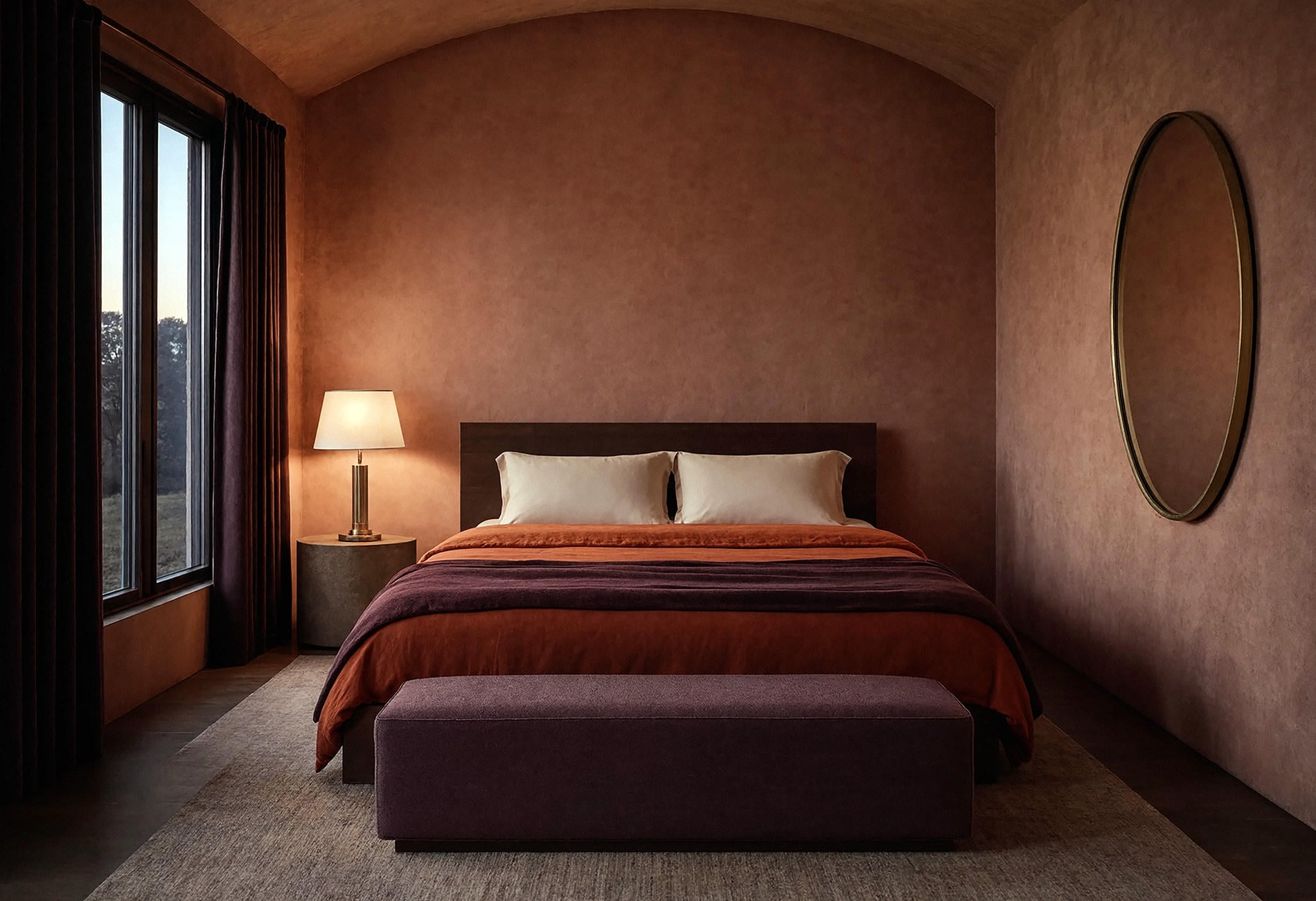
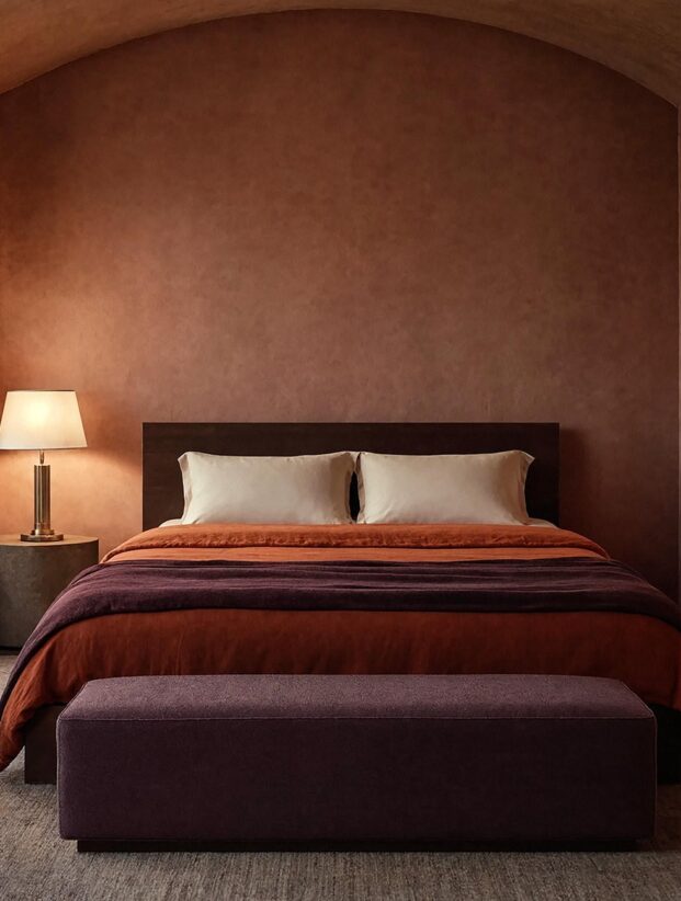
For a bedroom, put the quieter color on the broadest area. A dusty-rose wall with persimmon linen and an aubergine bench can feel enveloping. If the room is dark, keep the ceiling and one textile pale so the deeper colors retain their edges.
Is persimmon a good color for bedrooms? Yes, if its energy suits you. A muted, brown-based version is calmer to my eye than a brilliant orange, while a small saturated accent may be enough for someone who wants a quieter sleep setting.
At night, plum falls back and persimmon catches the lamp light. The bed looks warmer before you've added a single seasonal object.
Build a burnt orange living room around material
Burnt orange living room decor can go flat when every surface is the same nubby fabric. Mix one soft hero with harder, quieter materials.
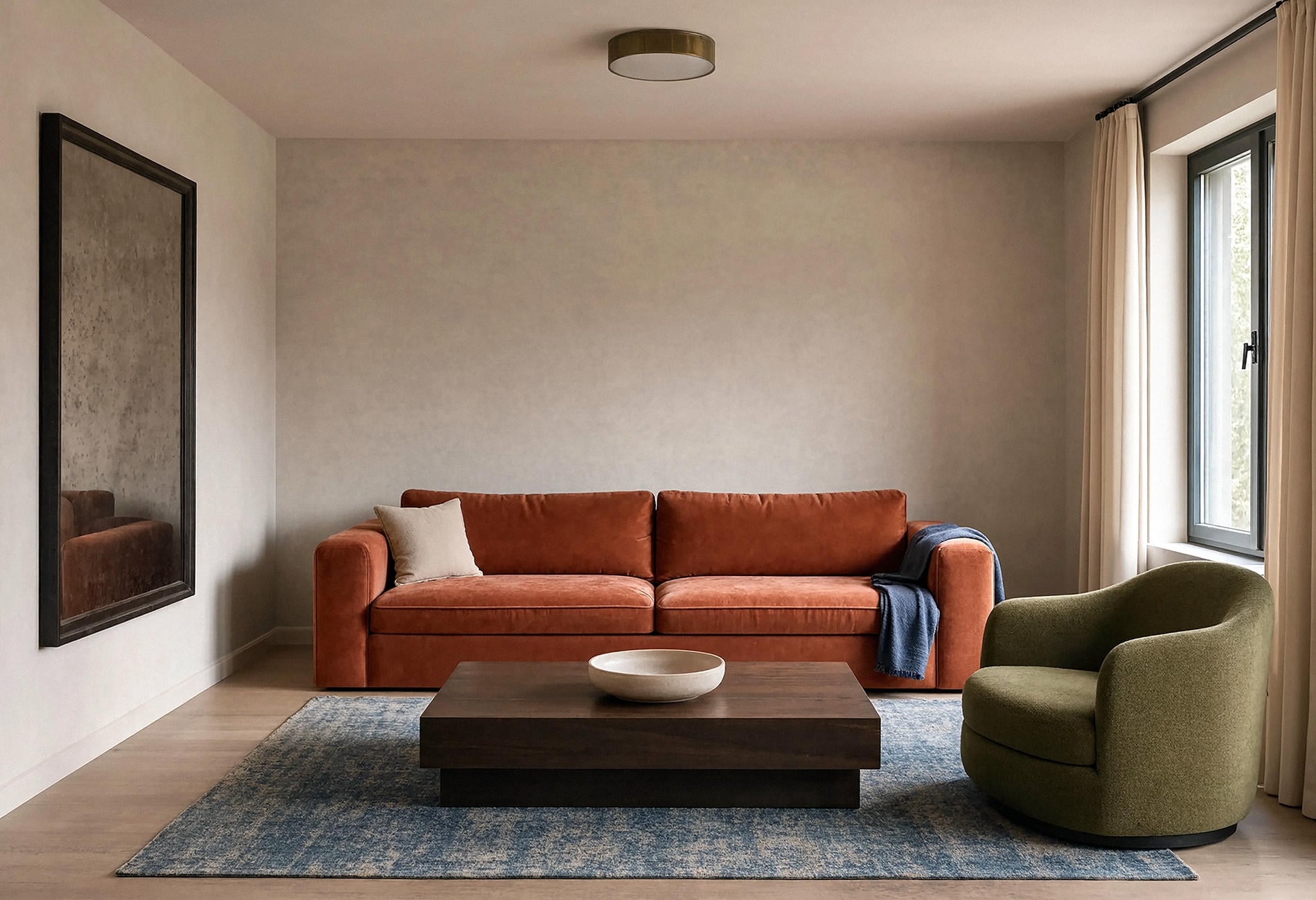
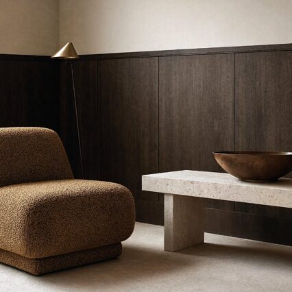
A burnt-orange velvet sofa against mushroom plaster can carry the room. Add a smoked-oak table, a pale stone bowl, and an olive or dusty-blue rug. Each material handles the color differently, which gives the scheme depth without a busier palette.
Keep the coffee table nearly clear. Orange already brings movement, especially when the cloth has a visible pile. A crowded tabletop makes the eye work overtime.
If you're choosing a new sofa, bring fabric samples into the room and compare them with the floor, wall, and evening light. Color on a screen is a suggestion at best; upholstery under your own window is the real audition.
Make fall changes at the textile scale
If you're working out how to decorate for fall with warm tones without buying a new room every year, change the broad soft layers you already use.
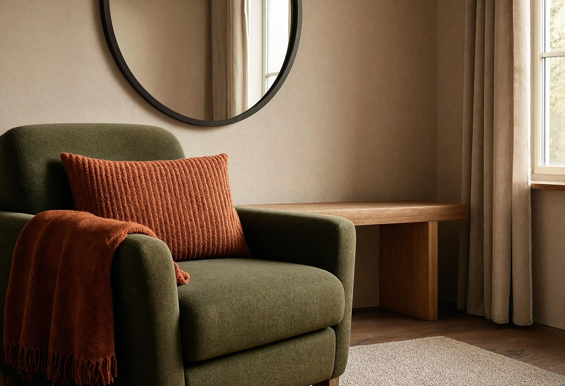
Swap a light throw for persimmon wool, add one rust cushion to an olive chair, or bring a red-clay runner to the table. Keep a few year-round colors visible so the room still belongs to itself.
Natural textures can carry seasonal feeling without obvious motifs: ribbed linen, brushed cotton, felted wool, dark timber, dull brass. A basket of plaid blankets isn't mandatory. Neither is a wooden sign announcing the month, thank goodness.

For fall harvest interior tones, I'd use actual produce only where it makes sense, such as a broad bowl on a dining table. Elsewhere, let color do the work. A bedroom does not require decorative squash watching you sleep.
Turn the palette earthy with clay and bone
Spiced earthy color combinations often work through value as much as hue. Persimmon supplies the middle note, bone gives light, and dark clay creates an anchor.
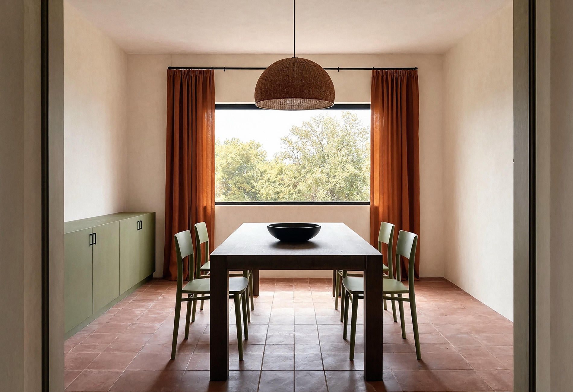
Painted plaster, terracotta tile, and washed timber make this palette feel tactile. Keep metals aged or blackened rather than brightly reflective if you want the mood to stay quiet.
A dining room can hold persimmon on curtains, clay on the floor, and bone on the walls. An olive-painted sideboard adds a cooler counterpoint, though I'd stop there. Four main colors are plenty when each occupies a broad area.
The loveliest part is how late-day light moves across these pigments. Bone turns honeyed, clay deepens, and the orange curtain briefly looks almost lit from within.
Transition gradually instead of staging a reveal
When you're deciding how to transition decor to autumn colors, leave the foundation alone and change one layer at a time.
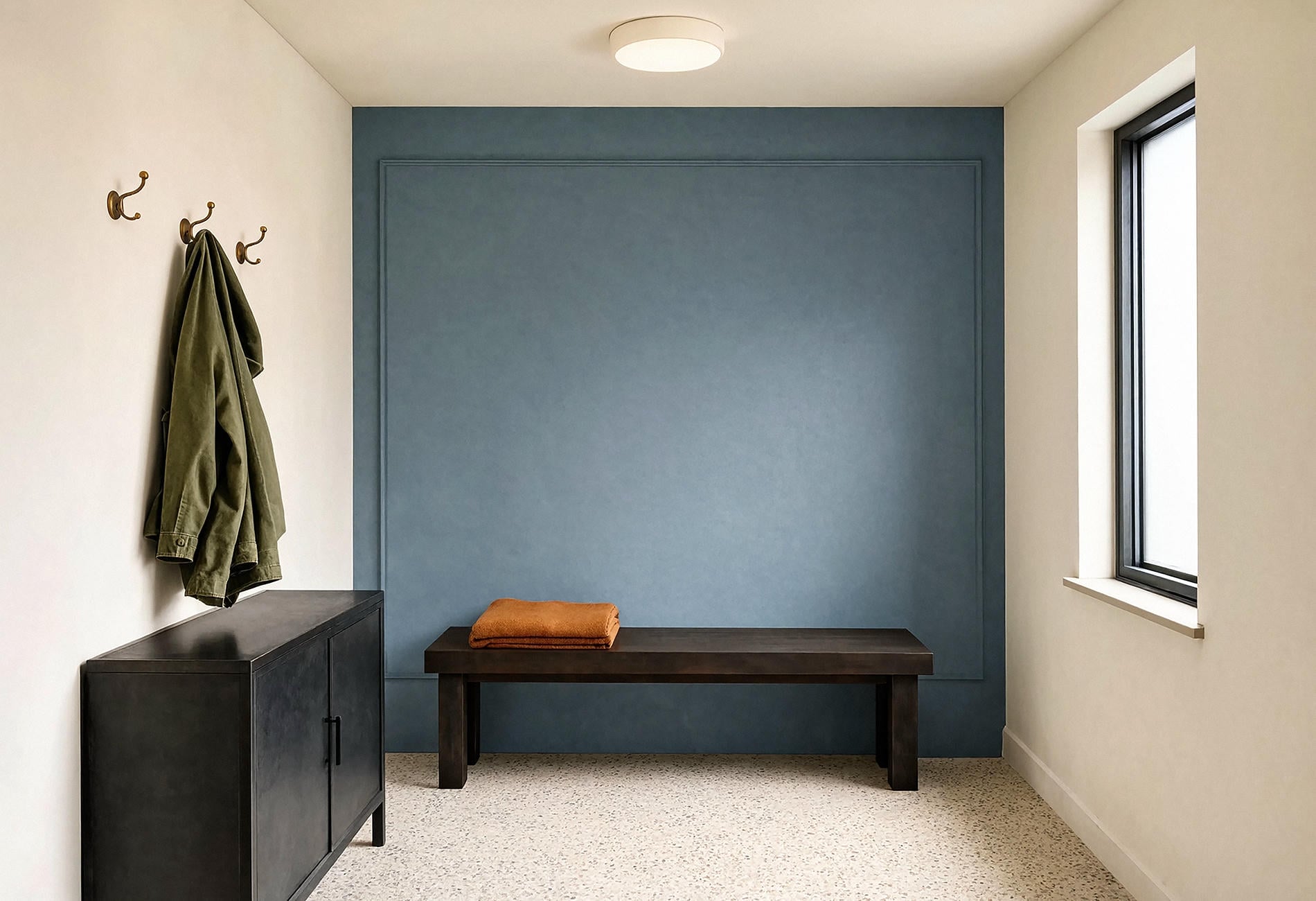
Begin with the piece you touch: a throw, cushion cover, table runner, or bed blanket. Then change one surface, perhaps a bowl or lamp shade, and live with it for a week. You may discover the room needs less orange than the seasonal aisle suggested.
Carry a small amount of persimmon into an adjoining area to create continuity. A folded textile on an entry bench can echo the living room sofa without turning the whole house into a coordinated set.
Store only what you genuinely want to see again. Seasonal bins have a mysterious talent for filling with objects nobody remembers choosing.
The lingering question isn't whether persimmon looks like autumn. Of course it can. It's whether you want the color to disappear when the season changes, or whether this warm, unruly orange has earned a longer life in your home.
Persimmon Autumn Palette Questions
What colors go with persimmon orange?
Olive, mineral blue, smoky navy, plum, dusty rose, bone, mushroom, and dark walnut can all pair well with persimmon. Choose one grounding color and one lighter or cooler counterpoint rather than using every option together.
How do you decorate for fall with warm tones?
Change broad textiles such as throws, cushion covers, runners, and blankets, then repeat one warm color in a useful object. Keep year-round materials visible so the room doesn't read as a temporary display.
Is persimmon a good color for bedrooms?
Yes, if you enjoy warmth in a sleep setting. Muted brown-based persimmon can feel quieter than brilliant orange, and pairing it with dusty rose, plum, or warm cream softens the contrast.
How do you transition decor to autumn colors?
Introduce one textile first, then add a second echo only if the room needs it. Gradual changes make it easier to judge the palette in your actual light and prevent seasonal pieces from taking over.