Exterior Paint Color Trends That Still Respect the House
What makes an exterior color feel current without making the house look dated before the painter's ladders are gone? The answer isn't a single color of the year. It's the relationship between the new shade and the roof, masonry, architecture, climate, and plants that will still be there after the trend report gets recycled.
The 2026 exterior paint color trends I find most useful lean warmer, earthier, and a little more complicated: khaki-tan neutrals, muted eucalyptus, blue-green, mineral whites, burnt umber with charcoal, and red-clay or mahogany notes. To my eye, jewel tones work best as controlled accents. That's a generous palette, not an order to make your garage door look like an emerald ring.
The New Neutrals Have Soil Under Their Fingernails
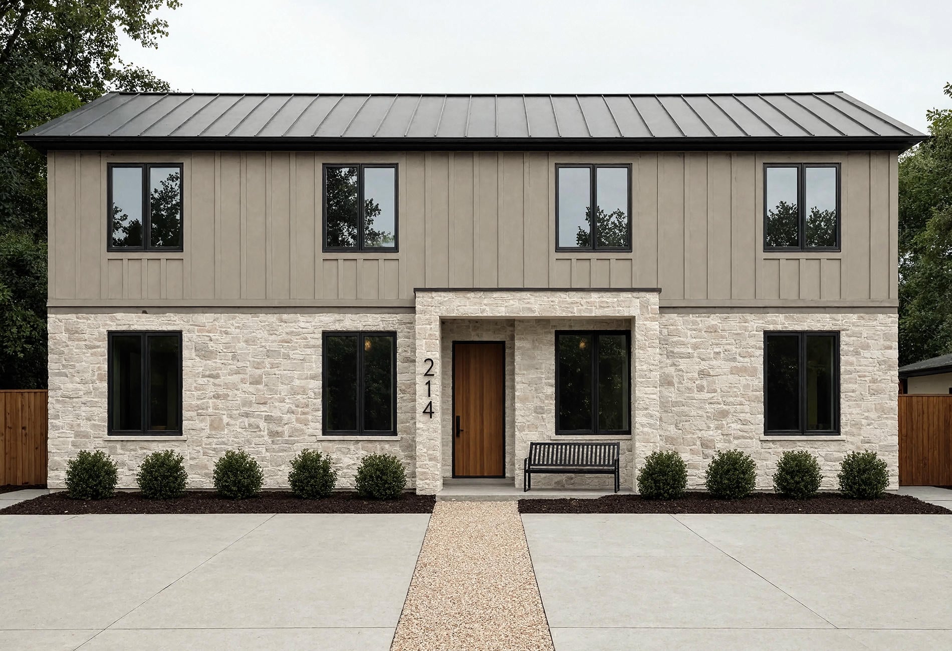
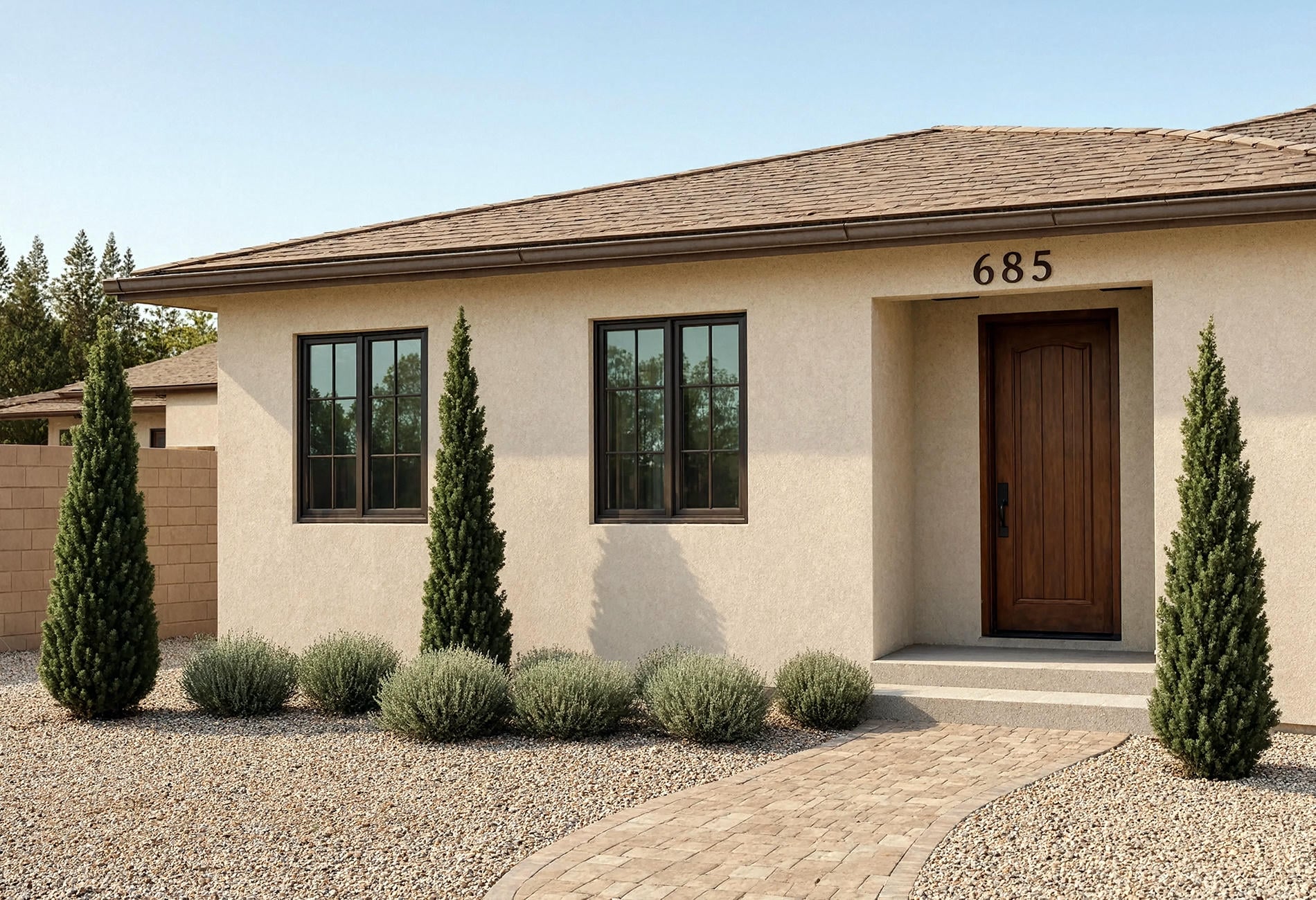
Across several official 2026 manufacturer palettes reviewed for this article, warm khaki and tan recur alongside fewer icy grey notes. These aren't the yellow beiges of old rental apartments. The better versions have mineral depth, a trace of olive, or a softened clay undertone that connects with stone, gravel, brick, and dry-season planting.
On a modern house, khaki siding beside charcoal windows can feel quiet and architectural. On a ranch, a deeper tan may settle an orange-brown roof. Warm white trim keeps the result clear, though I'd sample a putty trim too; high contrast isn't mandatory for curb appeal.
Mineral neutrals are especially useful when the facade already has several materials. They can mediate between cool concrete and warm timber without insisting that either one change personality. A helpful test: if the color looks good beside the roof and the least attractive fixed material, it has earned another round.
Watch the sheen as closely as the hue. A smoother door can carry a little light, while broad stucco or brick usually looks more convincing when its texture stays visible instead of flashing like a raincoat. The exact coating choice depends on the surface and local conditions, so follow current professional or manufacturer guidance. Color is the visible decision; compatibility is the one keeping it there.
And don't ignore the driveway. A vast cool-grey concrete plane can pull blue out of khaki, while warm gravel may make the same sample look greener. The ground occupies a surprising amount of the view from the street, even though it never appears in the cute little palette graphic.
Green Has Moved Beyond the Front Door
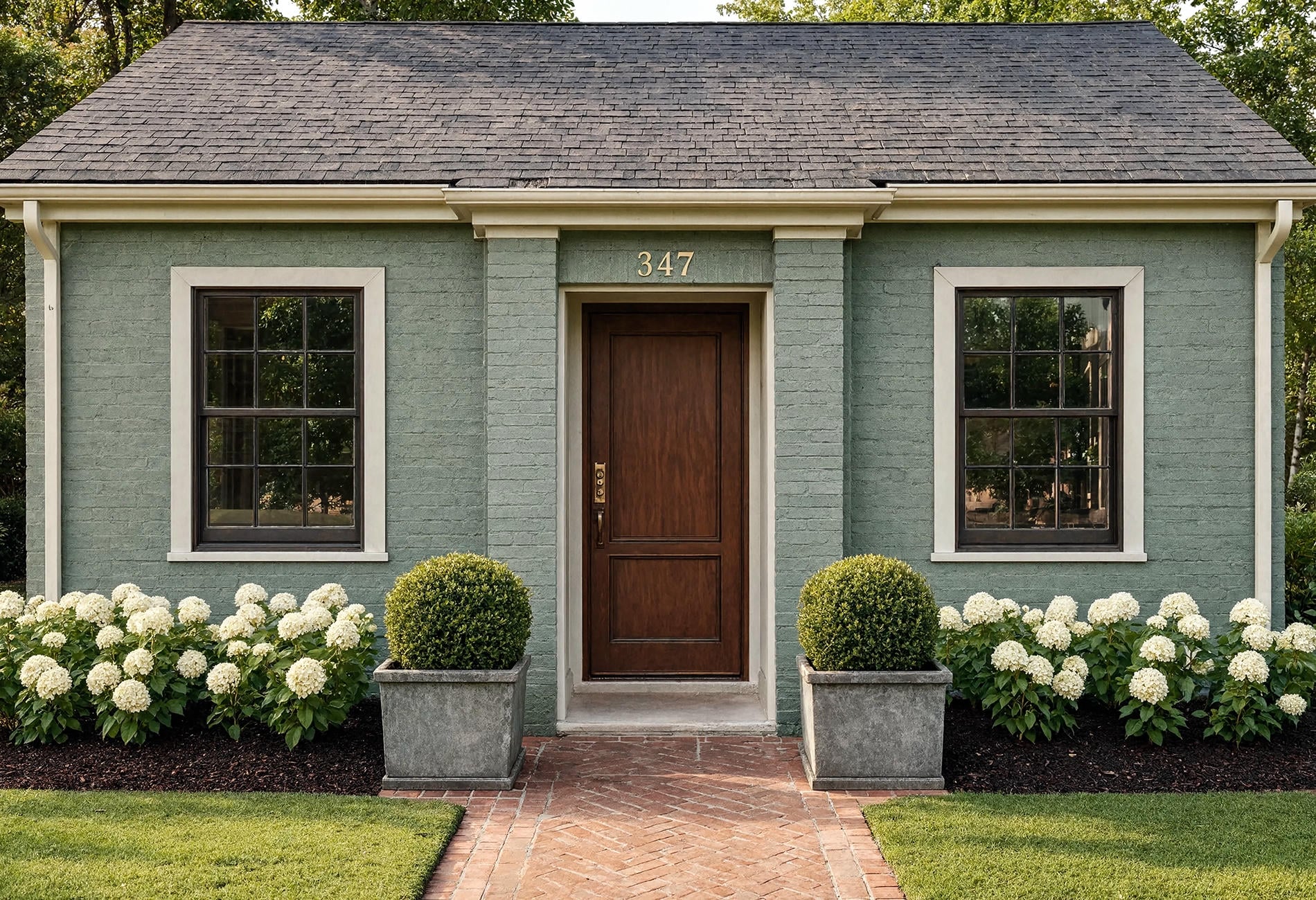
Muted eucalyptus and blue-green now appear across larger exterior elements in official color direction, including siding and selected accent applications. The appeal is easy to understand. These colors can sit between landscape green and sky blue, shifting with weather rather than flattening into one note.
For siding, greyed eucalyptus works well with warm stone, charcoal metal, or aged wood. Blue-green has more presence and may look almost slate under cloud cover, then visibly green in sun. Test both a sheltered wall and the brightest elevation before you commit.
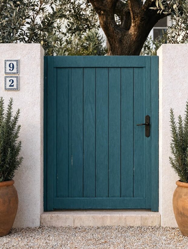
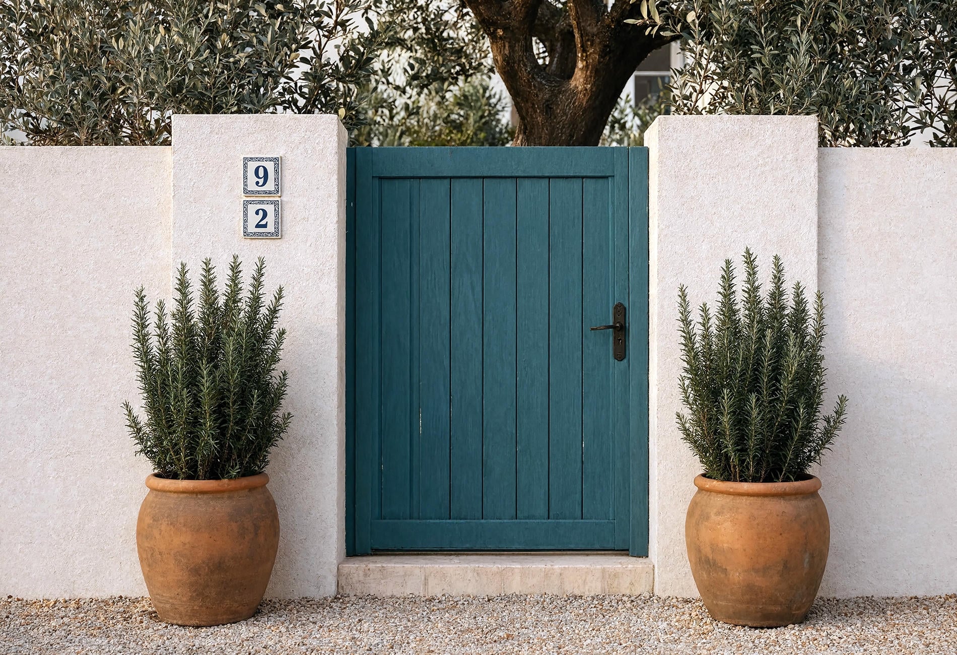
A gate or garage door lets you use the richer version without asking it to carry the full house. I'd repeat that accent once in planting, a bench cushion, or the front door's undertone, then stop. Matching every planter to the garage is how a thoughtful palette turns into a company uniform.
Earthy Darks Are Warmer Than the Black-House Moment
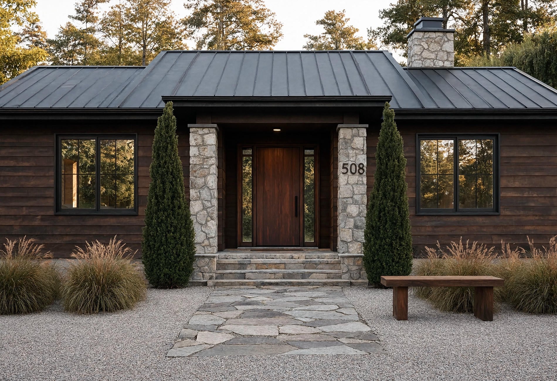
Burnt umber paired with charcoal gives a dark exterior more soil and less ink. Warm mahogany or red-clay accents can sit beautifully beside brown-black siding, pale limestone, or weathered cedar. These colors are moody, but they aren't trying to swallow the architecture whole.
This direction suits homes with strong shadows, natural masonry, or woodland settings. A dark umber body may relate to tree trunks and roof shadow, while charcoal trim sharpens windows without the brittle contrast of bright white. To my eye, it feels richer than pure black on houses with a lot of texture.
Use mahogany-red carefully at garage-door scale. A front door can carry a saturated clay note like lipstick; a broad garage plane may read louder than the little swatch suggested. Scale is the prankster in every exterior palette.
Seasonal Light Changes the Trend You Think You Chose
Spring exterior painting ideas often lean fresh because the surroundings are fresh: soft greens, wet bark, cool sky, flowering trees. A blue-green sample may feel beautifully balanced in April and considerably brighter against dry late-summer grass.
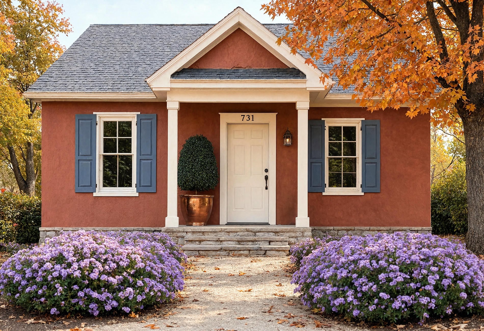
Fall curb appeal adds a different filter. Red leaves can pull warmth out of taupe, low sun can turn cream golden, and long shadows deepen charcoal. If you live with strong seasons, save photos of the facade across the year before settling on a color family.
You don't need to wait twelve months to decide. Compare samples under sun and cloud, near green foliage and dry mulch, and against both wet and dry masonry if your climate makes that relevant. The point is simply to remember that the house has more than one lighting appointment.
Front Doors Can Carry the Jewel Tones
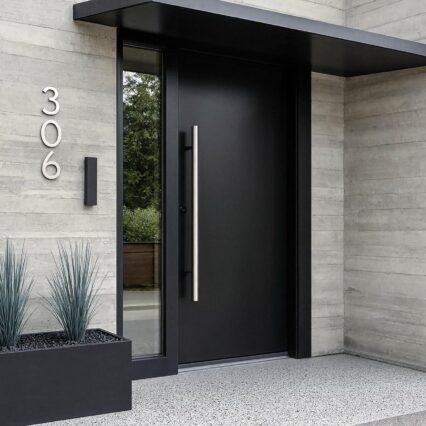
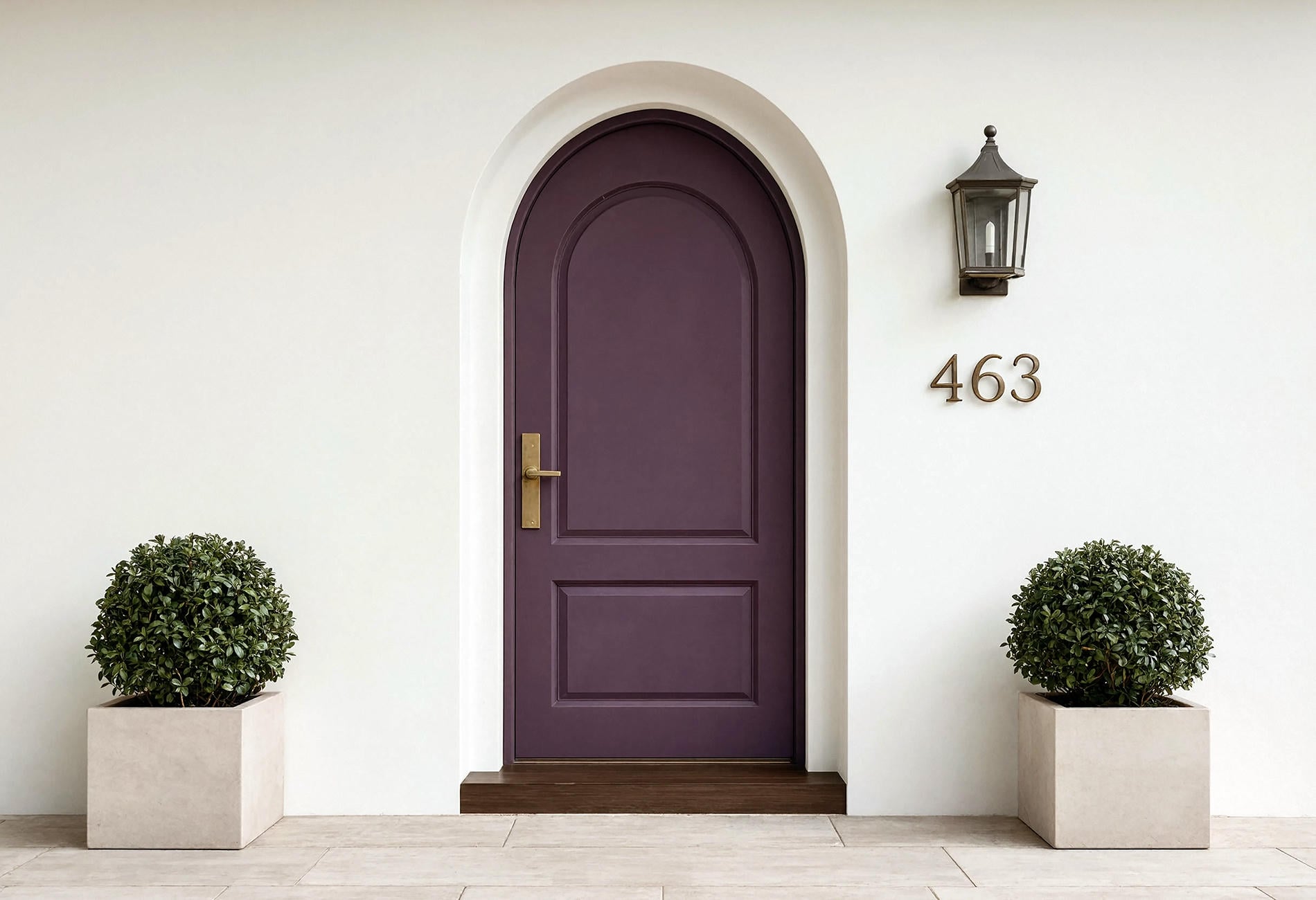
Trending front door colors are the easiest part of the forecast to enjoy because the commitment is contained. Deep teal, oxblood, plum, and saffron can add the sharper edge appearing alongside earthy 2026 palettes. One saturated door can wake up a mineral facade without turning the whole property into a color experiment.
Look for a cue already on site. Plum can echo dark foliage. Teal may pull a cool note from slate, while saffron gets much louder beside warm brick; oxblood is quieter and heavier. If the accent has no relative anywhere else, it may still work -- but make sure you love the contrast rather than merely recognizing it from a saved image.

For the finish and application, use an exterior-rated coating suited to the door material and follow current professional or manufacturer instructions. Doors work hard. The color gets the compliments; preparation gets the longevity.
White Houses Aren't Leaving; the Contrast Is Softening
White houses aren't disappearing, and declaring an entire exterior color obsolete is design fortune-telling with better lighting.
What is changing is the kind of white and the way contrast is handled. Mineral whites, chalky warm whites, creamier stucco, and lower-contrast trim feel more connected to natural materials than a sharp white-and-black formula applied to every architectural style. White still works; it just benefits from specificity.
If your house has warm stone, choose a white that doesn't make the stone look dirty. If the roof is cool charcoal, a cleaner mineral white may hold its own. And if you love a white facade because it looks incredible in your light, that's stronger evidence than a prediction about what's "in."
A Filter for Any Color Forecast
Before you save another palette, ask four questions:
- Does it work with the roof and masonry?
- Does it suit the house's architectural lines?
- Does it hold up on the brightest and darkest walls?
- Would you still choose it without the year attached?
That final question is ruthless and useful. Trends can help you discover a blue-green or red clay you hadn't considered. They shouldn't make you apologize to a perfectly good cream house.
Exterior Color Trend Questions
What is the most popular exterior house color for 2026?
There isn't one verified universal winner across every market and home type. Current manufacturer directions include warm khaki-tan neutrals, mineral whites, muted greens, blue-green, earthy darks, and warm clay notes, so sample within the family that fits your fixed materials.
What are the new exterior house colors?
Look for softened eucalyptus, blue-green, burnt umber with charcoal, warm mahogany, red clay, and mineral neutrals. Jewel tones are useful for doors and gates when you want a concentrated accent rather than a full-facade statement.
Are white houses going out of style?
No. Warmer mineral whites and gentler contrast are broadening the look, but white remains a versatile exterior choice when its undertone suits the roof, stone, brick, and local light.
How should I use exterior paint trends by season?
Use seasons as a light and landscape check, not a rulebook. Photograph your house under different conditions, test large samples on more than one wall, and notice which color still belongs when foliage or sky changes. Keep the warm white if it makes the stone sing. Your house isn't required to audition for a forecast.