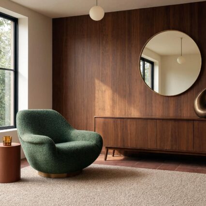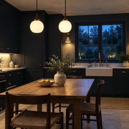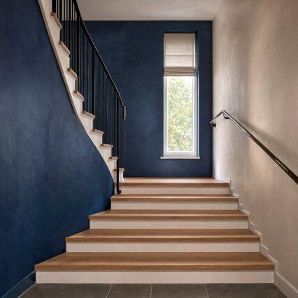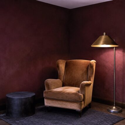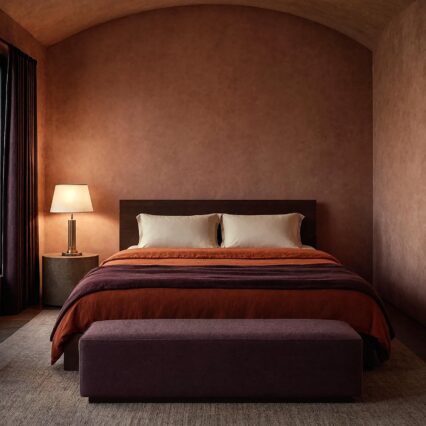
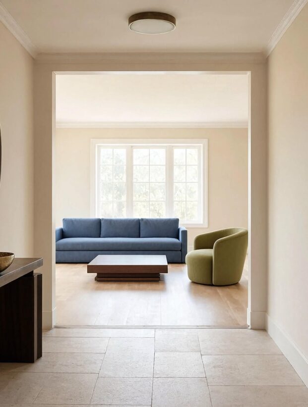
Before: a blue-grey entry, a buttery hall, one taupe living room, and a kitchen so white it looks startled. After: several of those same colors, rearranged around a shared undertone so every doorway finally makes sense.
That is the useful promise of a whole house paint color palette. You aren't choosing one obedient color and marching it through every room. You're deciding which colors belong in the same family, where each one gets the lead, and what a person sees as she walks from one room into the next.
My own preference is clear: flow should come from relationship, not repetition. A house painted the same pale neutral from baseboard to attic may be cohesive, yet it can also feel like nobody finished the thought.
Build the Palette Around Roles, Not a Stack of Swatches
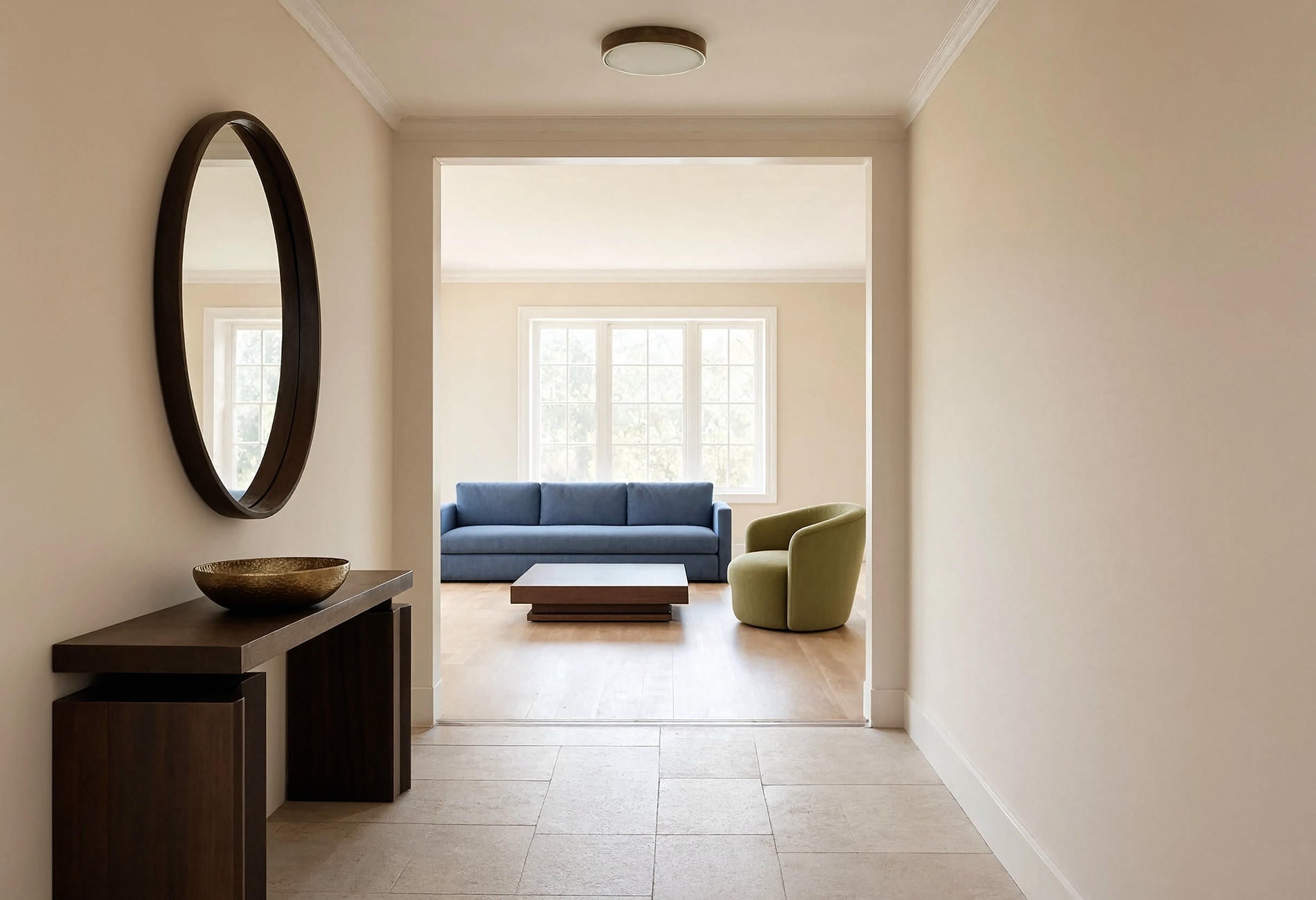
Begin with the parts that are expensive, fixed, or simply staying. Flooring, stone, tile, woodwork, and large upholstered pieces already cast votes in your color election. The paint needs to join that coalition.
I like to give each color a job:
- An anchor neutral for the connected halls and main circulation areas
- A supporting neutral with a warmer or cooler shift for private rooms
- A light trim and ceiling color that agrees with both
- One deeper color that can carry a study, bedroom, island, or built-in
- One flexible accent that appears in smaller doses through wallpaper, cabinetry, or textiles
That makes a five-color whole house paint palette, though nobody is required to use every color in every room. Some houses need three. A larger home with distinct wings may need more, especially when the architecture changes character along the way.
The three-color version
A three-color whole house scheme can be beautifully disciplined: one main neutral, one trim color, and one deeper room color. Use shifts in texture, sheen, wood, and fabric to keep the rooms from feeling copied and pasted.
This lean version suits open plans, smaller homes, and new builds where you want to settle in before making louder choices. Quiet first. You can always add a second accent once the house has revealed its habits.
Use Doorways as Your Color Test
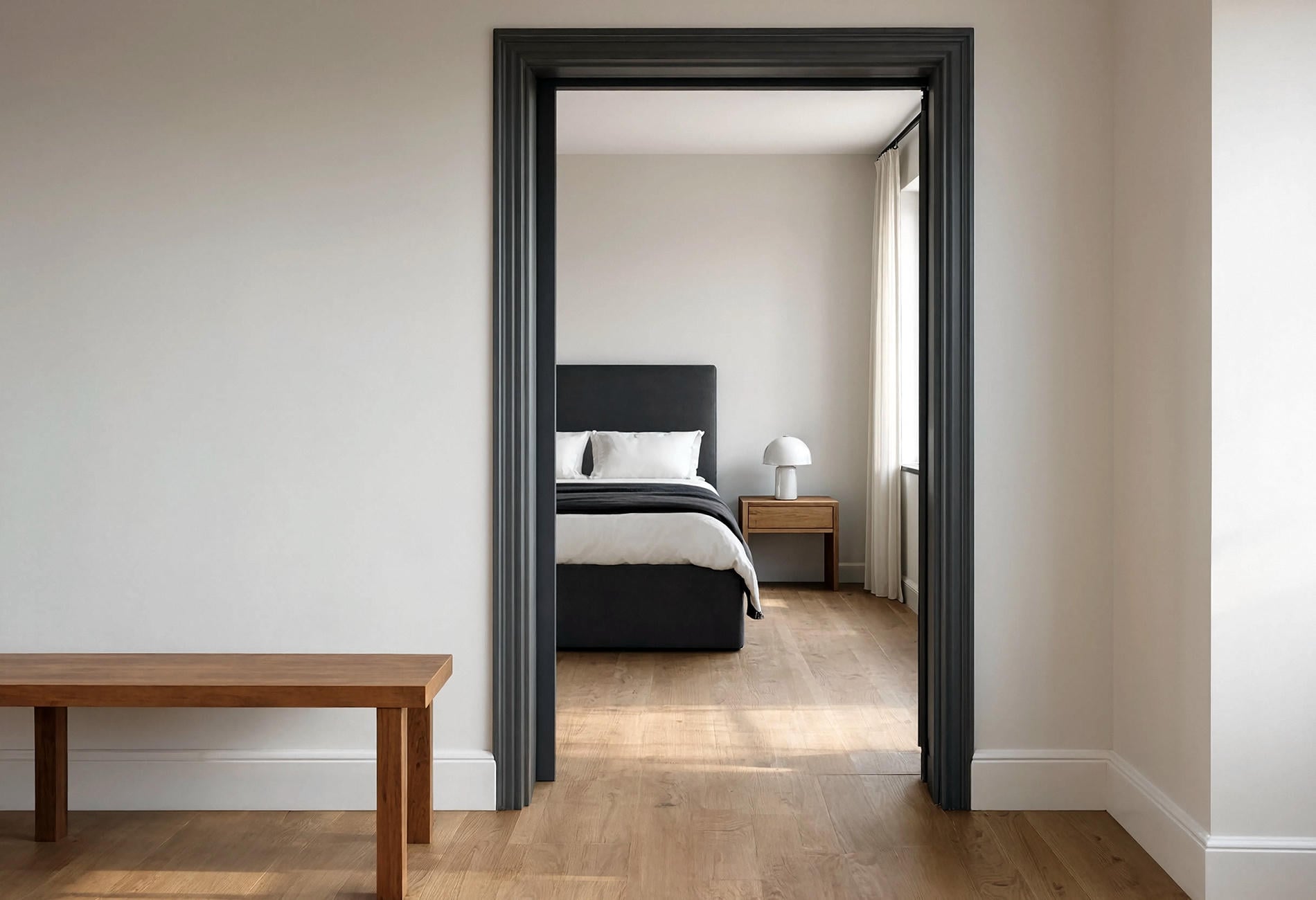
A doorway is brutally honest. When two or three rooms are visible at once, the paint colors that flow from room to room should look related in that exact view, because your eye reads the house as a sequence rather than a collection of sample cards.
Open floor plans need changes you can explain
Paint color palettes for open floor plans work best when a color change lands at a real architectural break: an inside corner, a cased opening, a ceiling shift, or the end of a cabinet run. A wandering boundary across a long wall looks accidental, and no amount of charming throw pillows will negotiate peace.
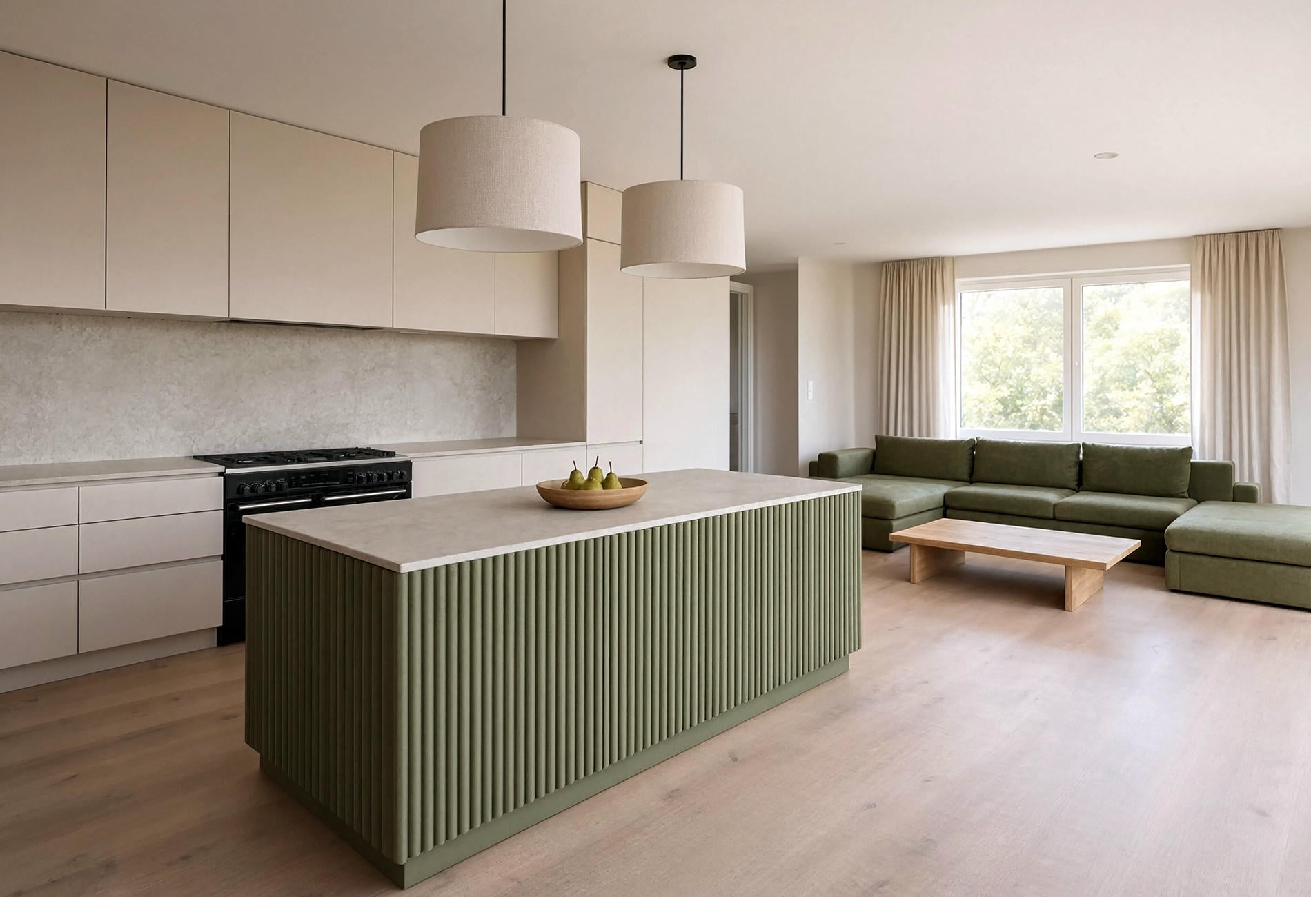
For a connected kitchen and living room, you might use a warm putty on the walls, a parchment trim, and an olive island as the deeper note. The living room could repeat olive in one chair while adding mineral blue through a rug or curtain. Same conversation, different speaker.
Look back through the opening. If one room suddenly appears pink, green, or icy beside the next, the undertones may be arguing. Sometimes the odd color is the one you loved most by itself (paint is petty like that).
Closed rooms can carry more personality
A door gives you permission. Bedrooms, studies, powder rooms, and snug little dens can take a deeper or more particular color because the hall provides a visual reset.
Keep one thread from the main palette: repeat the trim, echo the hall's undertone, or bring the deeper room color back in a runner. Cohesion doesn't require a matching wall in sight. It needs one believable handoff.
Choose a Style Dialect Without Turning It Into a Costume
Visual judgment matters here. "Transitional," "coastal," and "historic" are useful direction words, though a convincing palette still has to answer to the actual floors and daylight in your home.
Transitional palettes like measured contrast
A transitional paint palette for homes can begin with warm white, putty, or pale mushroom, then use charcoal, muted navy, or olive for weight. I would keep the contrast clear enough to notice and soft enough that the millwork, textiles, and wood can share the room.
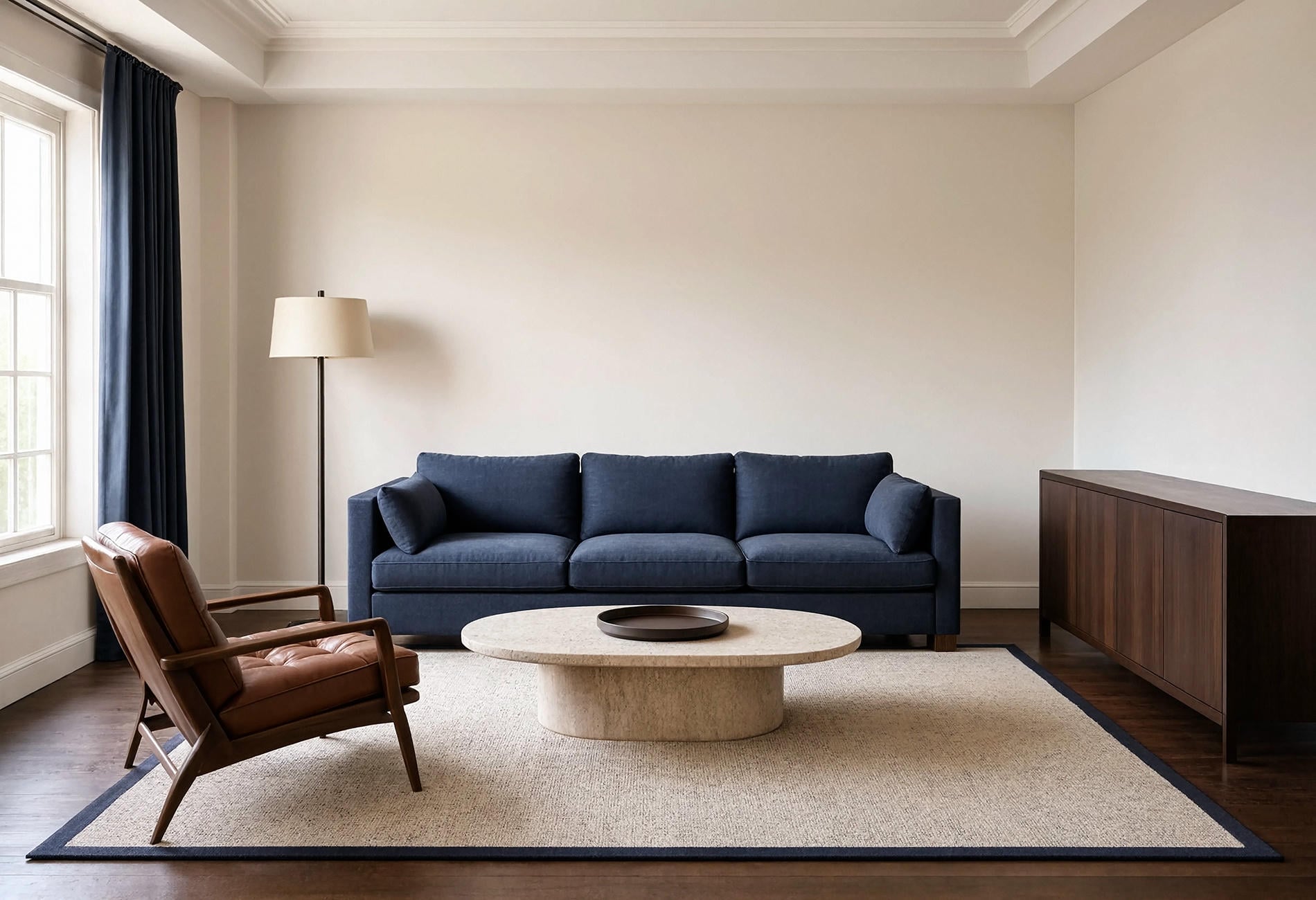
Clean satin trim beside matte walls gives this palette structure. If every surface is the same lightness, the effect may feel foggy; one substantial dark field makes the pale colors look deliberate to my eye.
Modern coastal colors need restraint
The modern coastal whole house palette I like has less obvious "beach" messaging and more weathered color: mineral blue, warm shell, pale oak, soft putty, maybe a deep teal in one contained area. I'd personally skip the room full of tiny nautical references unless you genuinely enjoy them. A home can remember the coast without dressing like a gift shop.
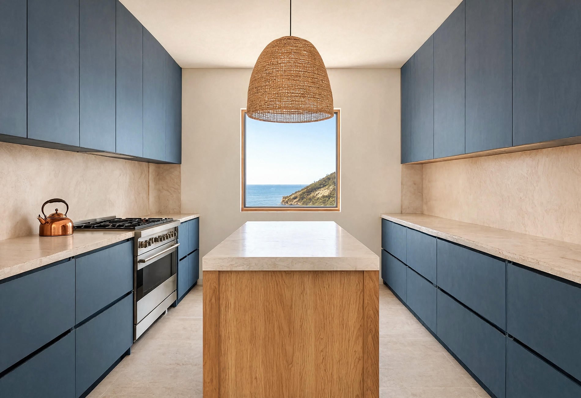
Use blue as a broad field on an island, pantry door, or bedroom wall, then let warm white and wood keep it grounded. The salt-air feeling comes from chalky color and washed texture. It doesn't require an anchor motif within ten feet.
Historic homes can support richer transitions
In a historic home, whole-house color can look convincing with earthy depth: parchment, red clay, tobacco, olive, oxblood, or smoky blue. That is an editorial preference, not a restoration rule; the house's period details and any preservation requirements deserve their own research.
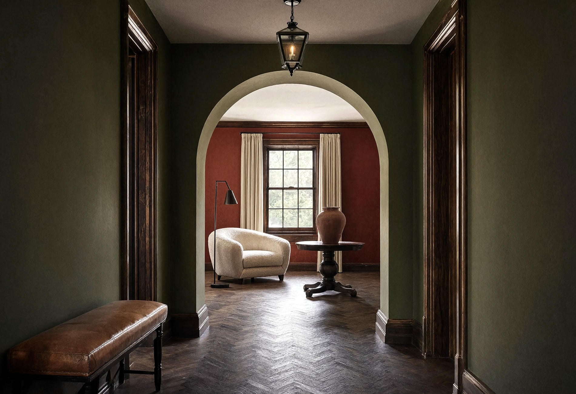
Let old woodwork lead if it is staying. Dark timber beside a pale greyed neutral can feel crisp, while the same wood beside earthy plaster may feel quieter and more enveloping. I'd test both before assuming the oldest-looking option is automatically the right one.
Fold Wallpaper and Ceilings Into the Plan Early
Wallpaper becomes awkward when it arrives after every paint decision has been made. Choose it while the palette is still flexible, then pull one background tone and one accent from the paper into nearby rooms.
Wallpaper is a bridge when the undertones agree
A large-scale botanical in flax, mineral blue, and red clay could sit in an entry between a putty living room and a blue study. The paper holds both sides of the transition. Suddenly the color jump looks intentional rather than brave in a slightly panicked way.

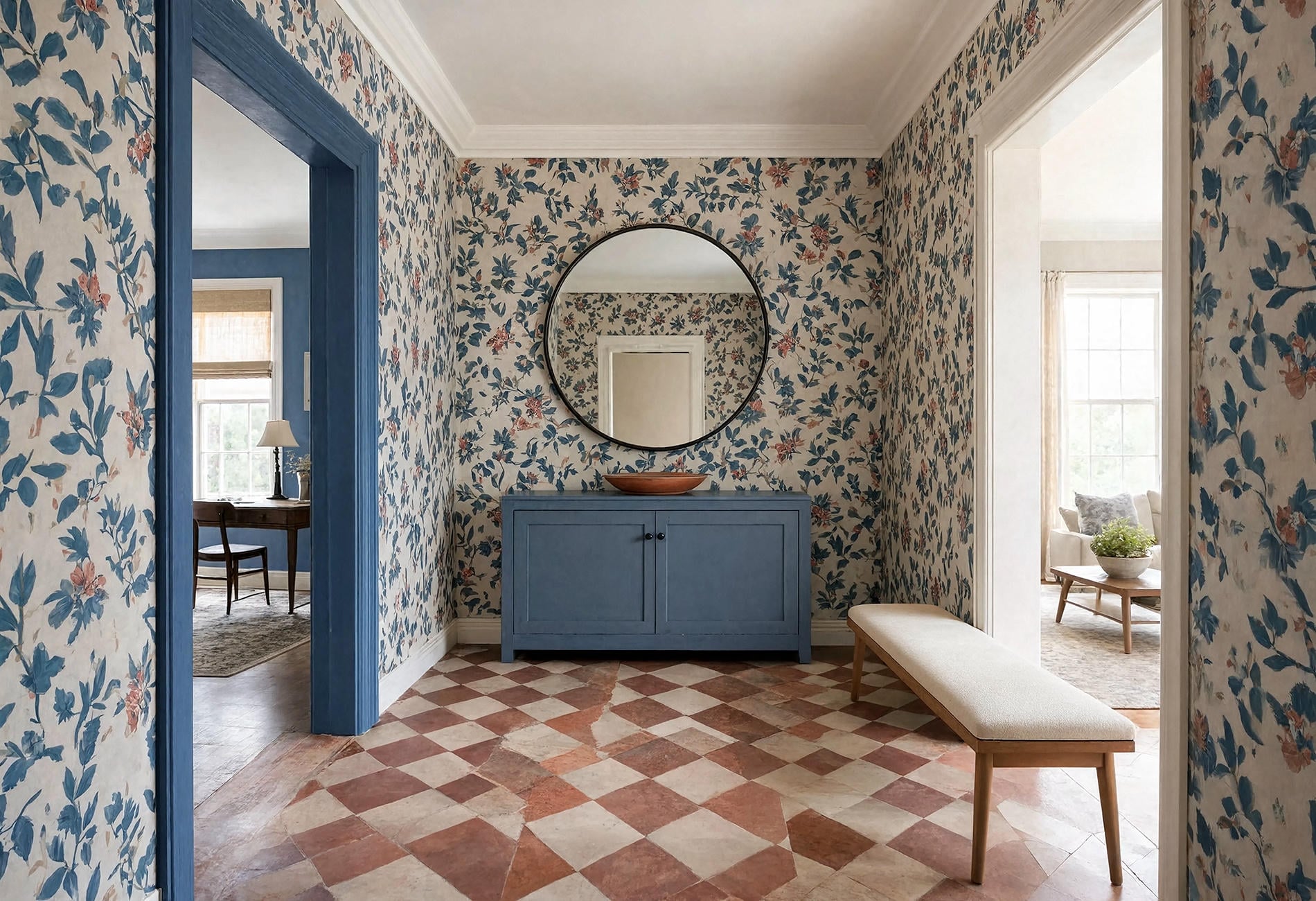
Keep the pattern scale generous and the surrounding surfaces calm. I prefer one confident wallpapered room over a trail of tiny patterns competing through every doorway.
Ceilings belong to the palette too
Should every ceiling in the house be painted the same color? They can be, especially when rooms connect and ceiling heights stay consistent. A shared ceiling color gives the eye a quiet line to follow.
But a bedroom with a low ceiling, a room with warm timber, or a saturated study may want a different version. You could tint the wall color much lighter, carry the wall color overhead for a wrapped feeling, or choose an off-white that suits that room's undertone. Test the edge where wall and ceiling meet; that thin line tells the truth quickly.
Make the Final Decisions in the House
Bring every candidate into the rooms together. Large movable samples let you compare colors at doorways, beside fixed finishes, and under the lamps you use at night.
Here is the order I would follow:
- Choose the anchor neutral after comparing it with floors, stone, and main upholstery.
- Choose trim and ceiling colors beside that anchor, then check them in the darkest hall.
- Add the supporting neutral and deeper color, using doorway views as the test.
- Bring in wallpaper and the smaller accent, removing any shade that duplicates another without doing a new job.
For a paint color palette in a new build home, resist finalizing everything from plans or digital renderings. Real daylight, installed flooring, and actual cabinet finishes can shift the relationship. Get the main framework ready, then confirm it on site.
For resale, the same whole-house method can use a quieter range. Keep the anchor flexible, let trim clarify the architecture, and use deeper paint in contained rooms where it reads as character rather than a surprise viewed from three doorways away.
Questions People Ask About Whole House Paint Palettes
How many paint colors should be in a whole house palette?
Three to five colors is a useful editorial starting point, depending on the home's size, layout, and existing finishes. A small open home may need one anchor, one trim color, and one deeper accent; distinct rooms can support a wider family.
How do you create flow with paint colors from room to room?
Repeat an undertone, trim color, or accent through connected views. Place color changes at architectural breaks and check every choice from the doorway, where several rooms may appear together.
What is the 60-30-10 rule in whole house paint palettes?
It is a decorating shorthand that divides a room into a dominant color, a supporting color, and a smaller accent. I treat it as a loose lens rather than a measuring exercise, and I apply it room by room instead of forcing one percentage across an entire house.
Should every ceiling in the house be painted the same color?
No. A shared ceiling color can help connected rooms read smoothly, while enclosed or deeply colored rooms may suit a tailored ceiling. When you stand in the doorway at morning and again after dark, which version makes the transition feel settled?