Pink has a strange reputation in kitchens. People either treat it like a timid accent that must apologize from behind the toaster, or they let it take over until the room resembles the inside of a frosted cake box.
The interesting version sits between those extremes. Vintage pink can be dusty, earthy, chalky, or almost terracotta. Pair it with cream, old wood, honest metal, and a little visual breathing room, and it stops feeling childish before the first cabinet door is hung.
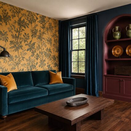
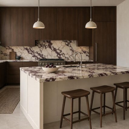
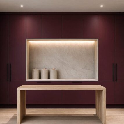
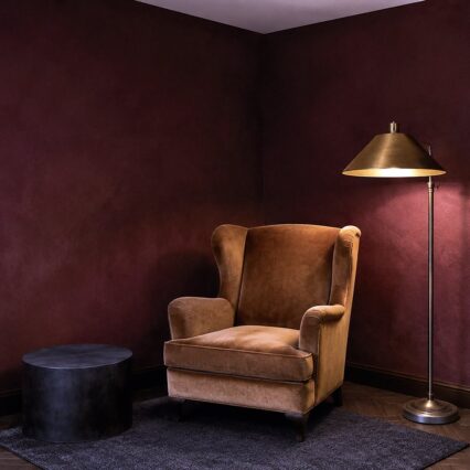
The most useful rule is simple: give pink something with age or weight beside it. Walnut, burgundy tile, cloudy stone, aged brass, and brown-veined terrazzo all keep the color grounded. You aren't trying to make pink less pink. You're giving it better company.
Choose a Pink That Can Handle an Entire Cabinet Run
Tiny paint chips are terrible witnesses. A dusty rose that looks restrained in your hand may brighten dramatically across twelve feet of cabinetry, especially beneath cool daylight.
Sample large boards and move them around the room for several days. Put one beside the floor, one beside the proposed counter, and one in the darkest corner. You want to see whether the color turns peach, mauve, beige, or bubblegum as the light changes.
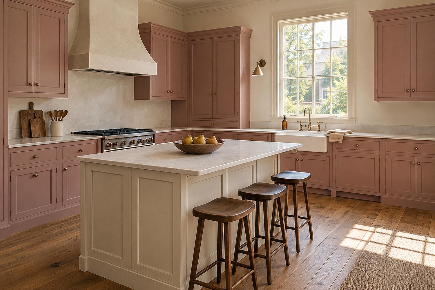
For full dusty pink kitchen cabinets, I prefer a softened color with a visible grey, brown, or clay undertone. The cabinet profile can carry some nostalgia -- a slim Shaker frame, a modest bead, or simple inset doors -- while clean spacing and an uncluttered counter keep the room current.
Finish matters too. A low-sheen painted surface tends to look more furniture-like than a sharp high gloss, though the coating still needs to suit kitchen use and the cabinet material. Ask the finish manufacturer or your cabinet professional about cleaning, curing, and durability rather than assuming every pretty paint is ready for steam and fingerprints.
Let Pink and Cream Do the Quiet Work
A pink and cream kitchen has the ease of an old cafe without needing a checkerboard floor or a chrome stool. Warm cream softens pink's sweetness and gives the eye somewhere calm to land.
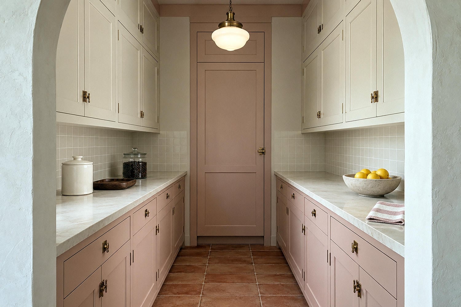
Use cream on the walls, counter, ceiling, or upper cabinets, then let pink occupy the lower half of the room. That value split is especially helpful in a small kitchen: the darker color gives the base visual weight while the pale upper area holds onto light.
The combination gets richer when the whites are not perfectly white. Think vanilla plaster, oatmeal linen, ivory tile, and stone with faint biscuit veining. Against those shades, even a fairly clear pink begins to look collected rather than confectionary.
One useful reality check comes from the NKBA's 2026 kitchen trends report: the report identifies backsplashes, wallpaper, islands, and accents among the places where color can make a statement. You can love pink and still choose one concentrated moment instead of commissioning a total immersion.
Make One Vintage Pink Appliance the Extrovert
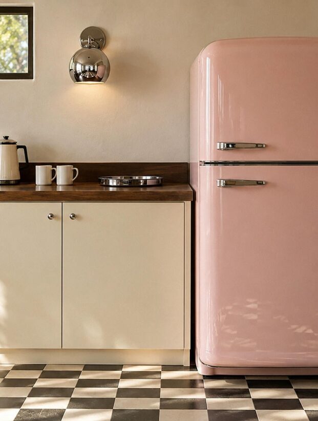
Vintage pink kitchen appliances are almost unfairly charming. A rounded refrigerator or compact range can become the room's main character before the cabinets have said a word.
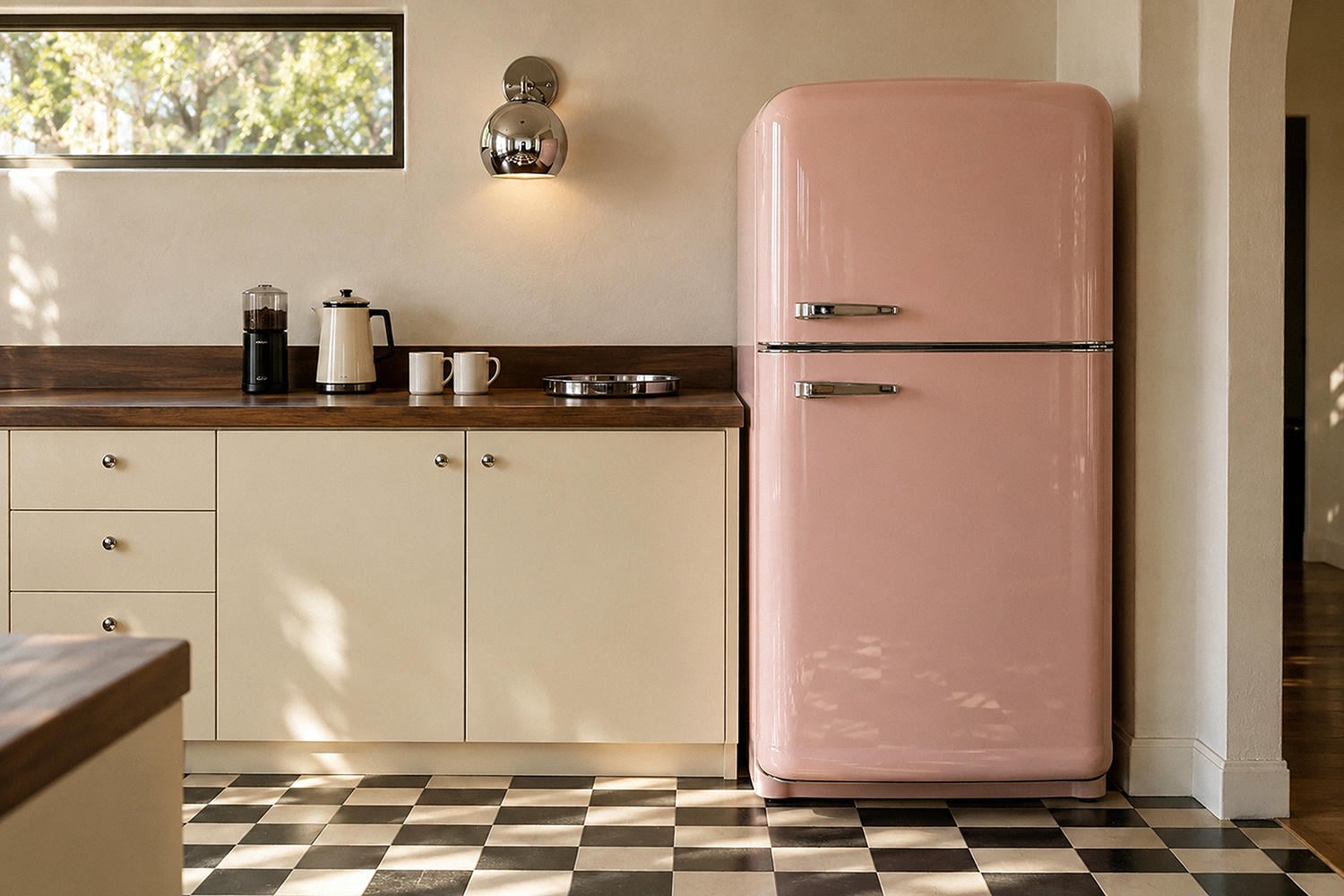
Let that appliance be the strongest pink in the palette. Surround it with cream cabinetry, dark counters, or plain square tile so its curves remain readable. If the cabinets match it exactly, the silhouette disappears and the room starts feeling more themed.
Actual vintage appliances deserve an expert inspection before daily use. Wiring, seals, ventilation, parts availability, energy use, and food-safe interior surfaces matter more than a perfect enamel color. A modern appliance with a period silhouette may be the saner choice when you want the look without adopting a restoration project.
And don't scatter several small pink appliances across the counter to force coordination. One handsome object is a focal point. Five are a sales display.
Use Retro Pink Tile Like Architecture
Tile gives pink texture, rhythm, and shadow. A retro pink tile backsplash can run from counter to upper cabinet, wrap a breakfast alcove, or form one strong panel behind the range.
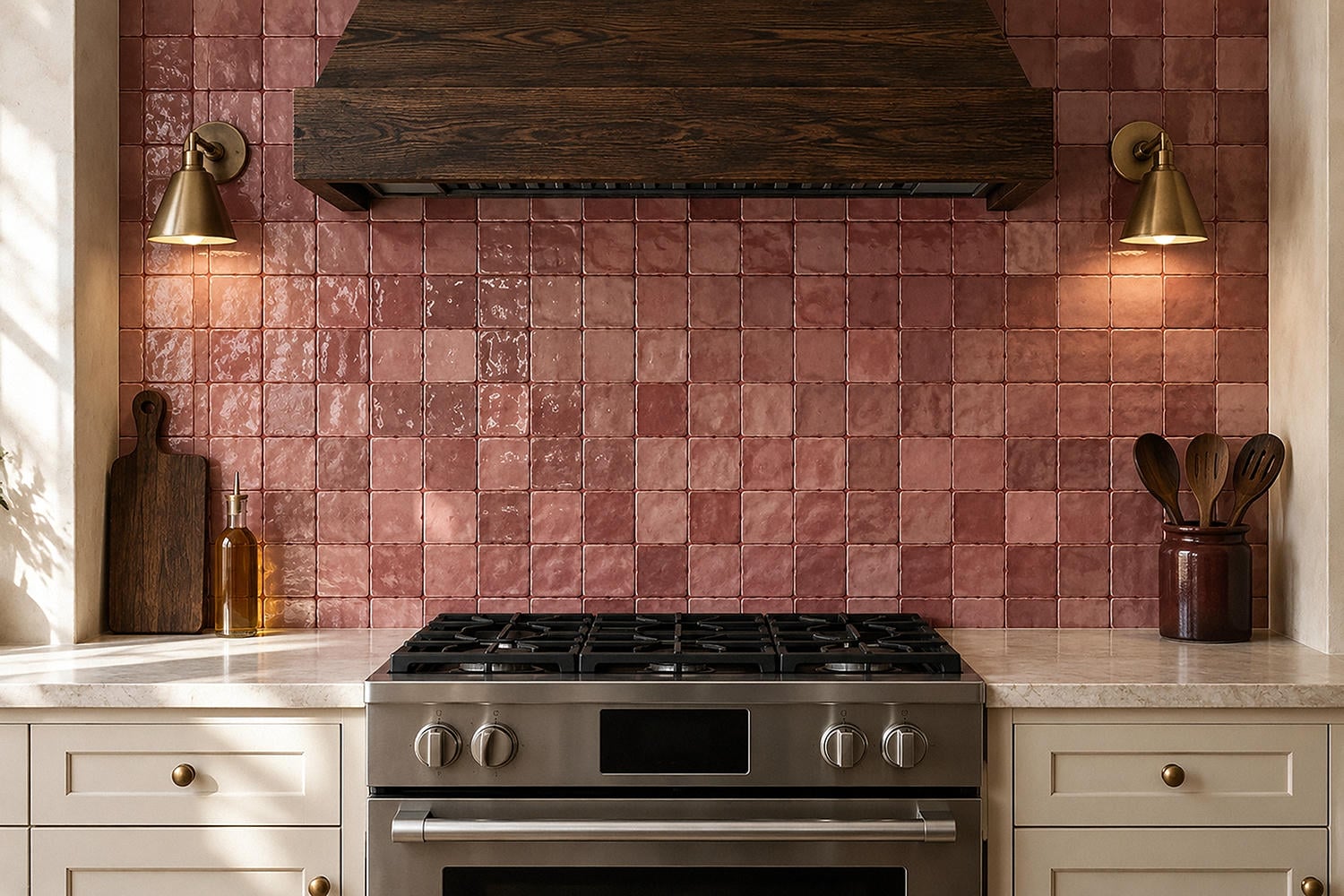
Small square tile feels convincingly mid-century, especially with a slightly varied glaze and warm-toned grout. Elongated tile looks cleaner and more contemporary. A pink-and-burgundy checker or vertical stack can bridge the two moods without pretending the kitchen has been untouched since 1958.
I would avoid a busy decorative border unless the room genuinely has the architecture to support it. The tile's color and joint pattern are already doing work. Add brass hardware, a veined counter, patterned flooring, and floral curtains on top, and every surface begins campaigning for mayor.
Order physical samples and view several pieces together. Handmade and natural-looking tile can vary beautifully, but one sample cannot show you the full range. Confirm installation, heat, and wet-area requirements with the manufacturer and installer, particularly around a cooking surface.
Put Dark Wood Beside Pink for Instant Gravity
Pink kitchen with dark wood is the combination I would trust most when someone worries the color will feel juvenile. Walnut, smoked oak, and mahogany tones bring depth without the hard graphic contrast of black.
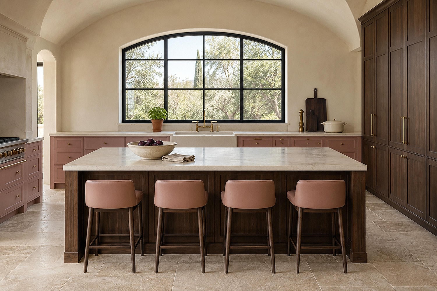
You can use dark wood on the island, a tall pantry bank, open shelving, or the dining table. It doesn't need to cover half the room. Even a single broad walnut cabinet can make dusty pink lowers look deliberate and expensive.
Brass hardware for pink cabinets works for the same reason: it adds warmth and a little age. Choose one simple shape and let the finish vary naturally. A modest unlacquered-looking knob or slim pull is more convincing here than ornate hardware on every door.
If brass feels too polished, try dark bronze or copper. Chrome can also be excellent in a true mid-century modern pink kitchen, especially when repeated in a pendant, chair frame, or appliance edge.
Keep the Mid-Century Version Crisp
The mid-century version of pink is not automatically kitschy. It becomes convincing through proportion: slab-front cabinetry, rounded corners, one graphic floor, and a disciplined amount of chrome.
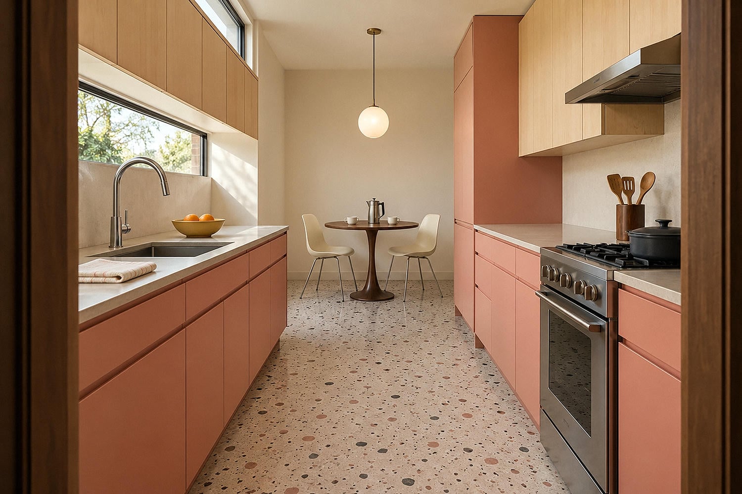
Pair muted pink lower cabinets with pale wood uppers or a cream wall of storage. Add one sculptural globe light and perhaps a compact tulip table if the plan allows. The room should feel edited enough that the color can carry the personality.
Pastel pink kitchen flooring can work, but I would keep it slightly dirty in tone -- clay pink, faded salmon, or terrazzo with pink aggregate. A perfectly uniform baby-pink floor can flatten the room, while small tonal shifts help it behave like a material.
Floor samples must meet the actual demands of your kitchen. Slip resistance, water exposure, cleaning, installation, and compatibility with the subfloor are practical questions for the manufacturer and installer, not matters of wishful thinking.
Let Floral Wallpaper Occupy One Dry, Visible Wall
Vintage pink floral kitchen wallpaper can turn a blank breakfast wall into the part everyone remembers. The pattern should be large enough to read from across the room: loose branches, blocky roses, or climbing leaves rather than a thousand tiny blossoms.
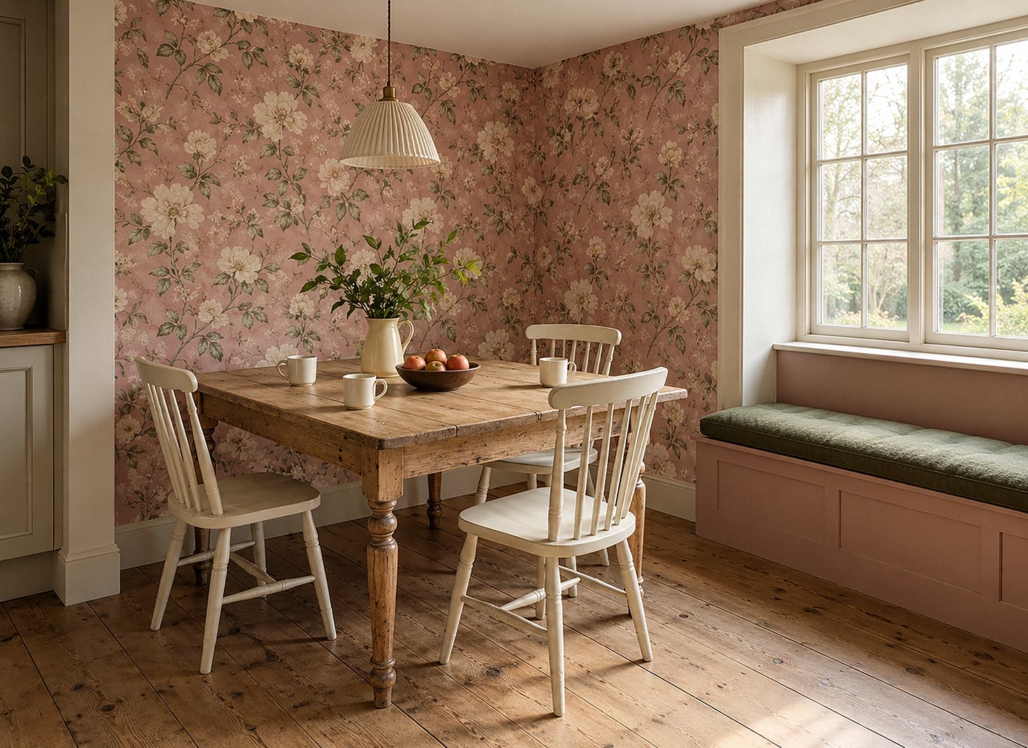

This is where shabby chic pink kitchen decor can become more composed. Pair the paper with one scrubbed pine table, cream-painted chairs, and a plain linen shade. Distressed finishes look intentional when the pieces have different ages and textures; a full matching set with identical fake wear looks suspiciously organized.
Keep wallpaper away from direct flame, heavy splashing, and persistent steam unless the product and installation method are explicitly suitable for that location. A breakfast nook, pantry wall, or framed panel behind glass gives you the pattern with fewer daily hazards.
And let the flowers own the ornament. Nearby shelves can hold plain bowls and pitchers rather than another layer of patterned objects.
Modernize the Room by Editing, Not Erasing
If you already have a retro pink kitchen, modernization does not require painting every surface white. First identify what is genuinely good: solid cabinet boxes, unusual tile, a terrazzo floor, or an appliance niche with excellent proportions.
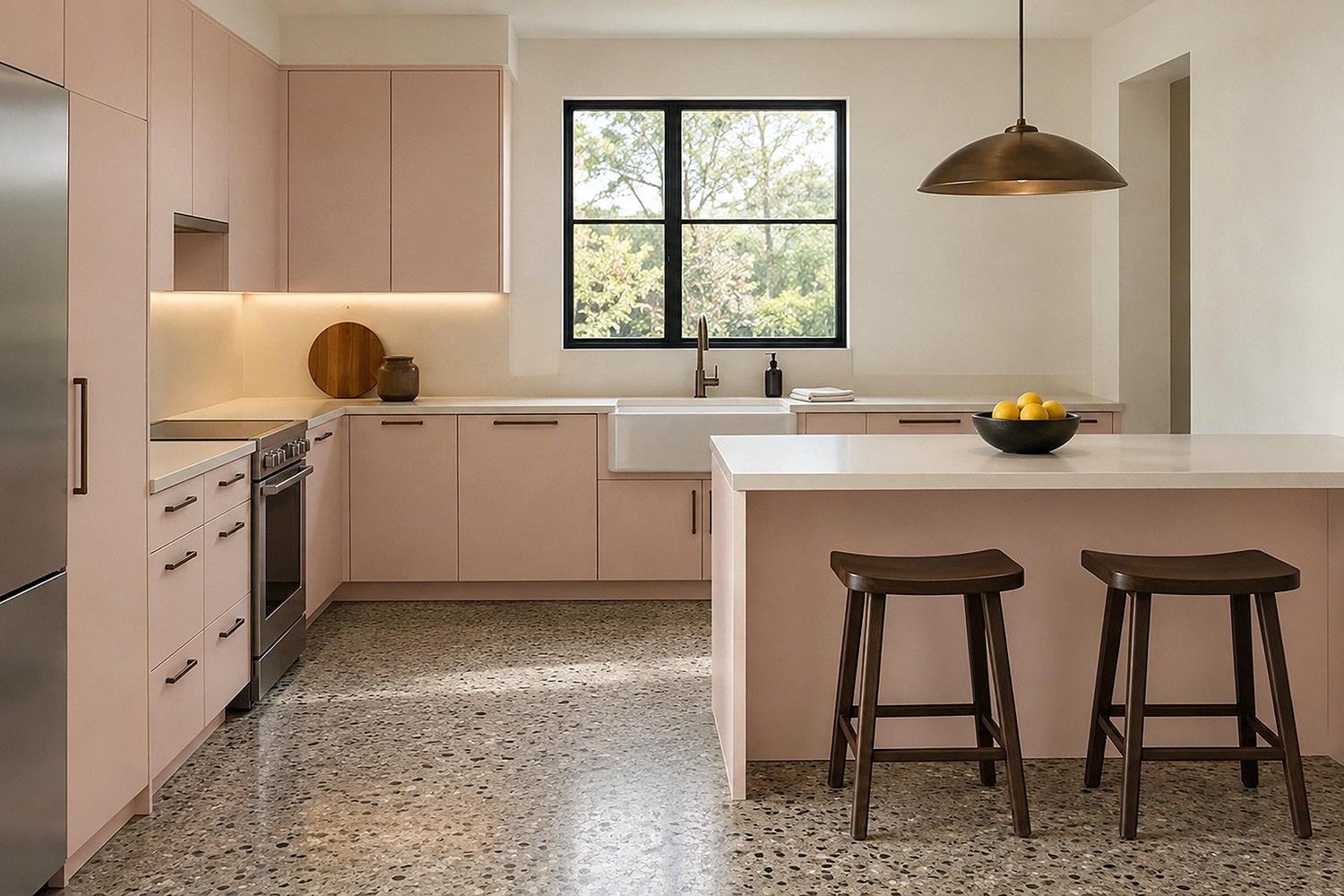
Then remove the elements that make the room feel muddy or busy. Swap fussy valances for a clean shade. Replace a yellowed laminate counter with quiet warm stone or a compatible composite. Simplify hardware, improve task lighting, and give the counter back some empty space.
The best countertop for pink cabinets depends on the pink. Dusty mauve likes creamy stone with restrained brown or burgundy movement. Peachy pink settles beside honed soapstone or a deep wood tone. Clear pastel pink looks sharper with pale terrazzo or warm off-white quartz composite.
Bring cabinet, counter, tile, and flooring samples together before committing. Materials that behave beautifully alone can produce an undertone argument when they meet under your actual lights.
Use Warm, Accurate Light Instead of Amber Gloom
Pink changes quickly under artificial light. A source that is too cool can turn dusty rose slightly purple; a very amber source can push it toward coral and make cream look yellow.
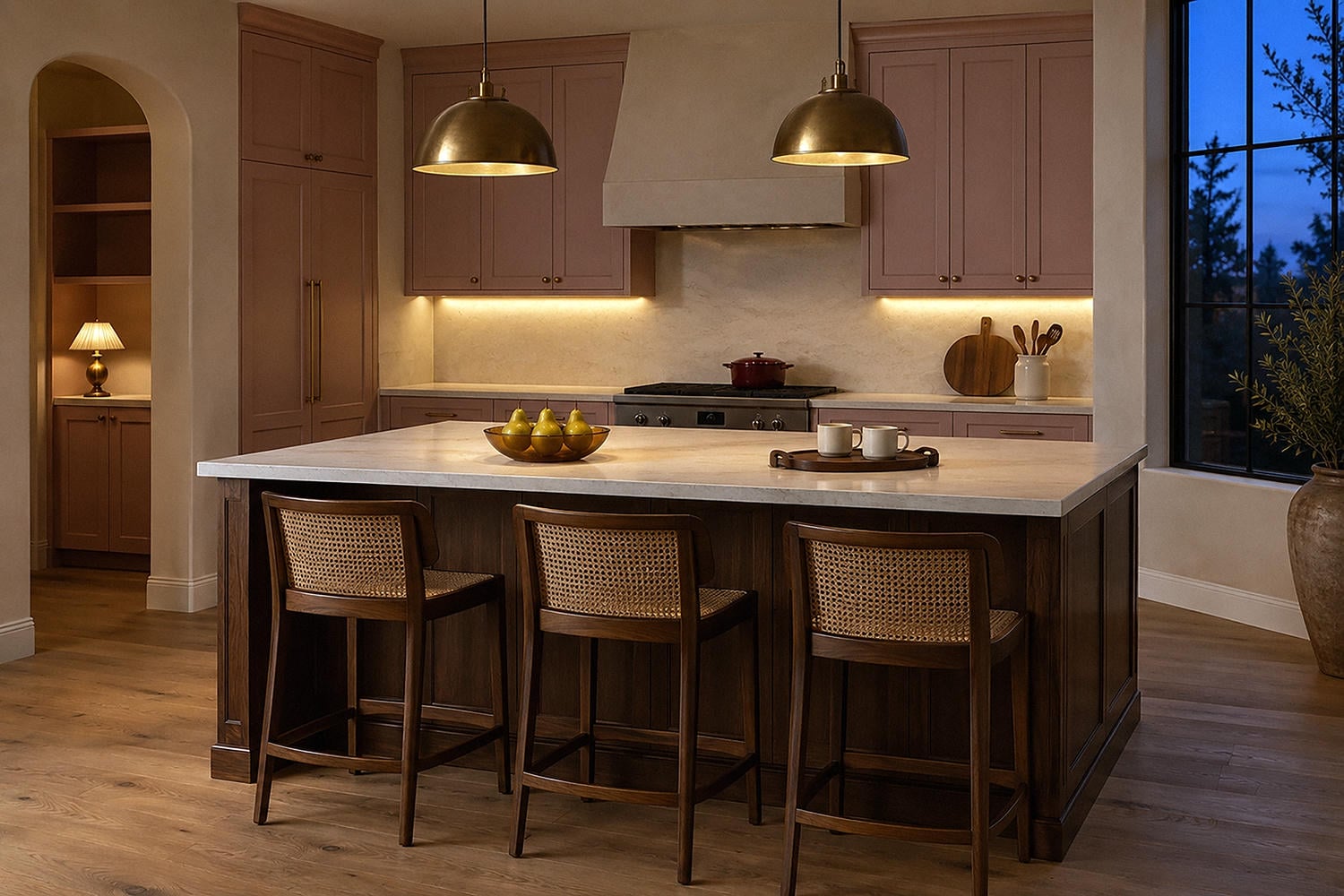
For my own first test, I would compare warm-white lamps around 2700K and 3000K, then judge them after dark against the samples. The U.S. Department of Energy's lighting guidance describes roughly 2000K to 3000K as warm in appearance, while also distinguishing color temperature from color rendering. In ordinary language: warmth and color accuracy are related decisions, not the same one.
Layer the room rather than asking one ceiling fixture to solve everything. Use practical under-cabinet light for counters, a soft pendant over a table or island, and perhaps one shaded lamp in a pantry nook. Hardwired changes belong with a licensed electrician who can assess the circuit, fixture, clearances, and local requirements.
The final room should make pink look like a material choice, not a novelty. When the color is balanced by cream, dark wood, aged metal, and clean light, it can feel nostalgic at breakfast and unexpectedly sophisticated after sunset.
Vintage Pink Kitchen Q&A
How do you use pink in a kitchen without making it look childish?
Choose a muted pink with grey, clay, or brown underneath it, then pair it with visually substantial materials such as walnut, burgundy tile, cloudy stone, or aged brass. Keep novelty accessories and overly coordinated pink objects to a minimum.
What colors go with vintage pink?
Warm cream, walnut brown, burgundy, olive, faded teal, charcoal, and aged brass all work well. The best partner depends on whether your pink leans peach, mauve, or clay, so compare physical samples in the room.
What is the best countertop for pink cabinets?
Creamy stone, warm off-white composite, pale terrazzo, soapstone, and dark wood can all be strong choices. Look for an undertone that relates to the cabinet color without matching it exactly, and confirm the material's care requirements before buying.
What lighting looks best in a vintage pink kitchen?
Warm-white, color-accurate light is a useful starting point, with separate task and ambient layers. Test 2700K and 3000K lamps against the actual cabinet sample after dark because pink can shift noticeably under different sources.